MOMO, a playful on & offline store for kids interiors
Identity
Identity
il Segreto del Vino
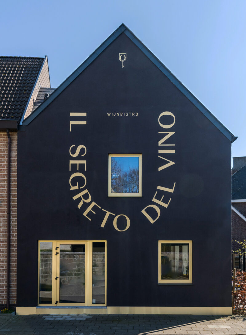
Handlettering facade,
Letterknecht (Maarten Leenknecht)
Photography,
Luc Roymans
Margot Van de Velde (images during shift)
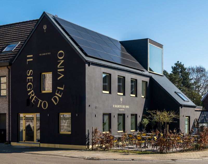
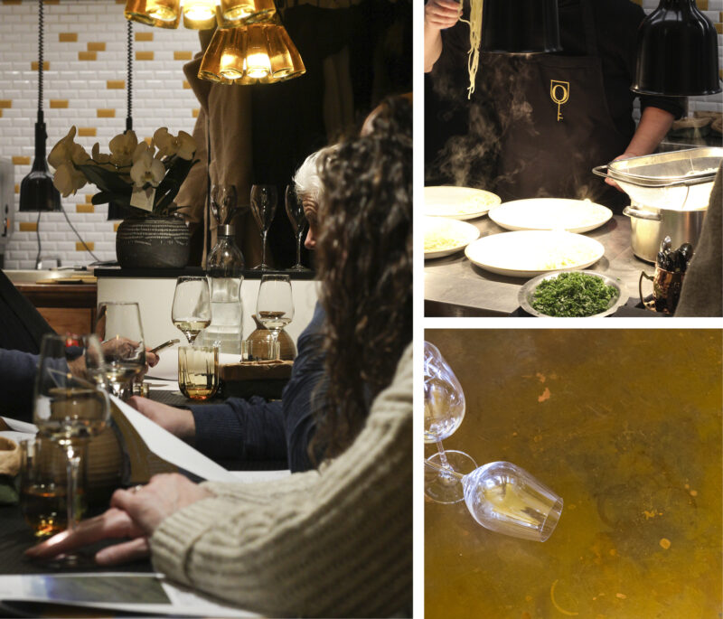
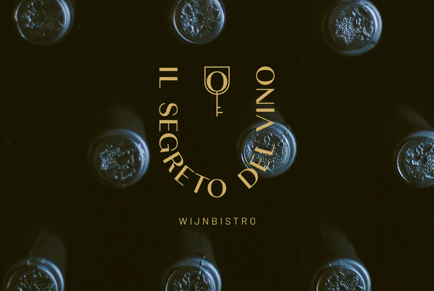
Context How to turn a trio of colours into a tasteful identity for a wine bistro? This was the brief owners Geert and Hilde approached us with at the start of il Segreto del Vino. With the location and interior already set in stone, it was crucial that the brand codes fitted well with the existing black / white / yellow colour-scheme of the building.
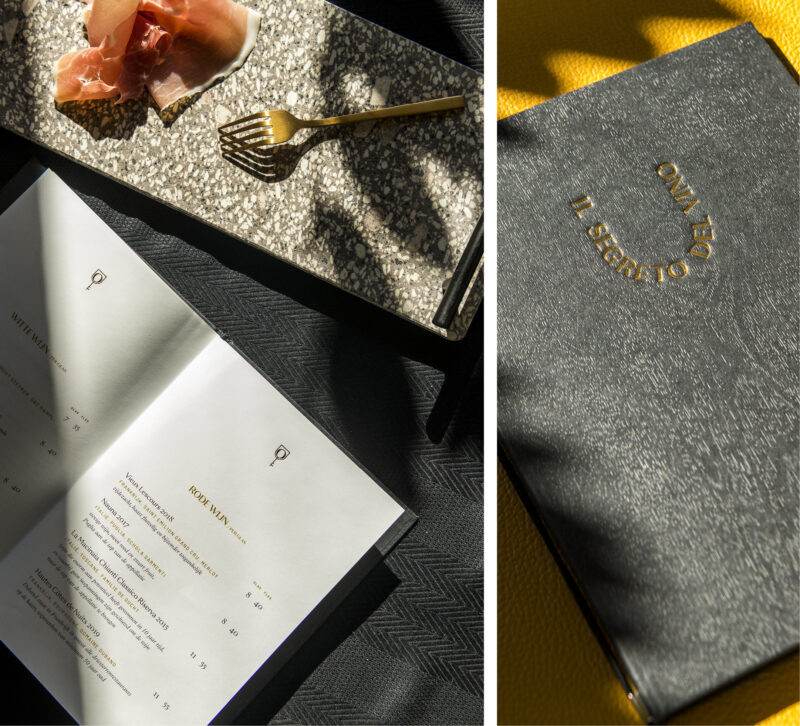
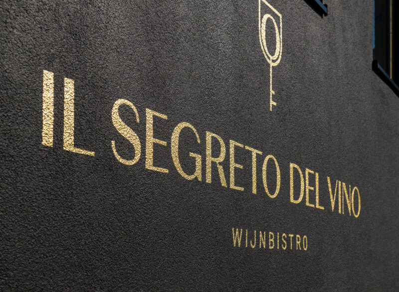
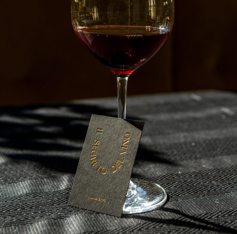
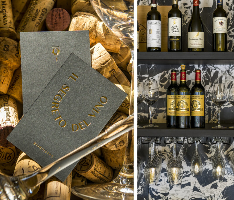
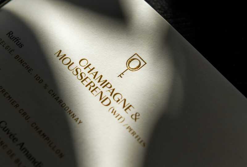
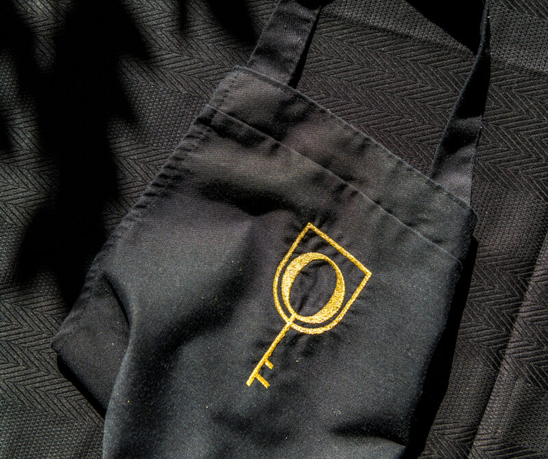
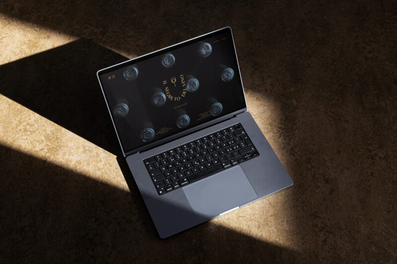
Concept & Design The identity embraces the richness of the matte black; using it as the main background from the bespoke printed menu’s to the entire facade, whilst elevating it with touches of gold as a reference to the yellow tones already present.
Result From menu to facade; a series of high quality materials were used, combined with artisanal production methods such as gold foil stamping, hand lettering and bespoke bookbinding.
il Segreto del Vino
Handlettering facade,
Letterknecht (Maarten Leenknecht)
Photography,
Luc Roymans
Margot Van de Velde (images during shift)
