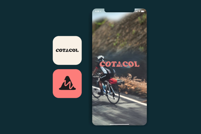
Cotacol, the app with Belgium’s 1000 toughest cycling climbs
Digital
Strategy, Identity, Digital
KAAP
Webdevelopment, Bits of Love
Animation,
Joren Peters
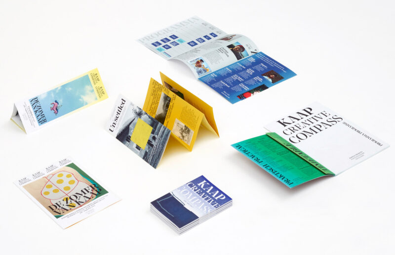
Context Four cultural centres, based in Bruges and Ostend, were to merge into one new multi-disciplinary arts centre, across city boundaries. A new name and identity were required.
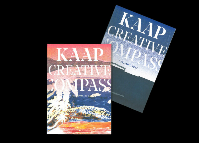
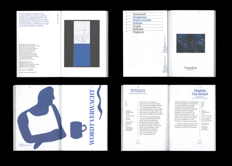
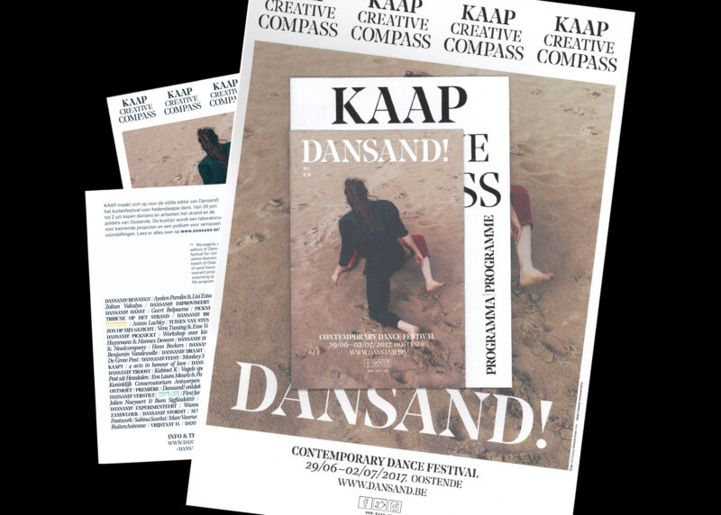
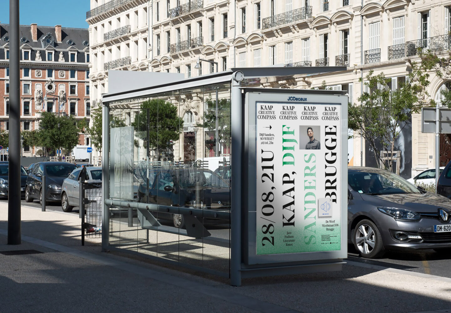
Concept The repeated logo represents the four locations and four disciplines of KAAP as their physical and artistic pillars. Visualised as a strong foundation, but filled with playful and flexible content. The name KAAP, references both its adventurous side as well as its landmark status. The tone of voice is both activating and personal.
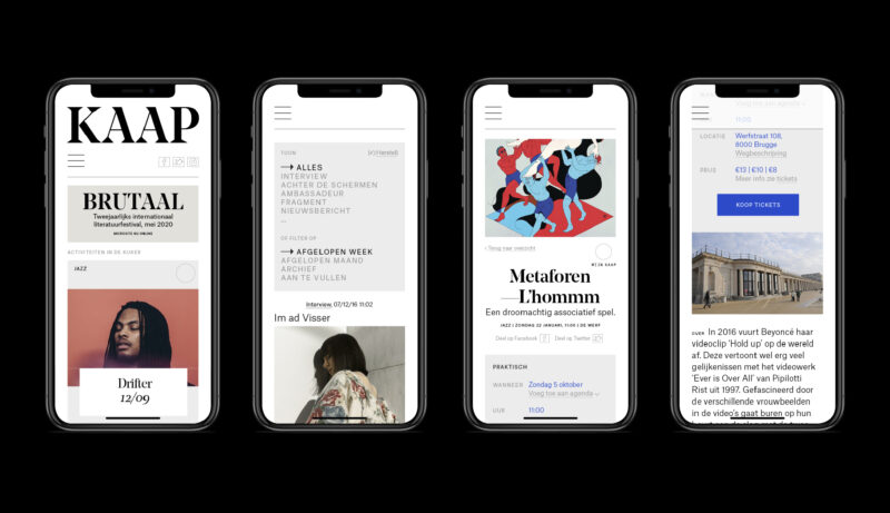
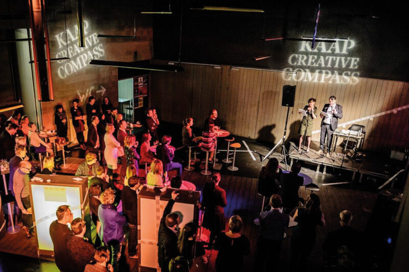
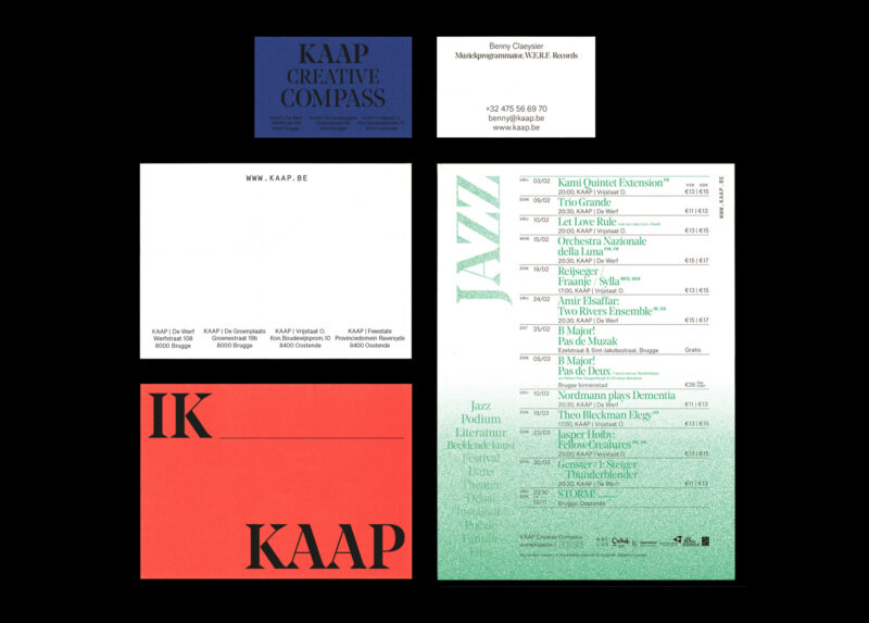
Result A comprehensive identity that carries the values of the various individual centres in a flexible yet recognisable way, applied across a wide range of print and digital media.
KAAP
Webdevelopment, Bits of Love
Animation,
Joren Peters
