


Carpets & Rugs, every home needs a soft spot
Editorial

Strategy, Identity, Packaging
René De Rop
Webdevelopment, Green Bananas
Animation,
Raoul and Me
Photography,
Luc Roymans
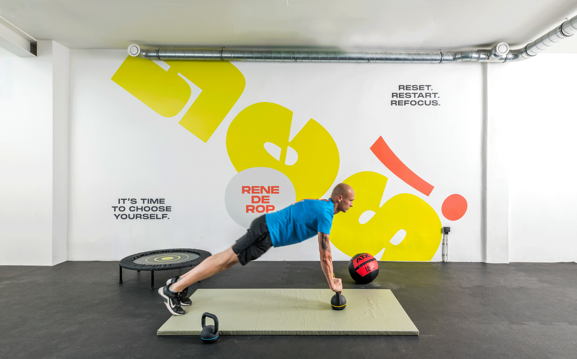
Context Life coach René De Rop came to us with the dream of growing his business from personal trainer to an overall fitness and health brand. His only condition: make sure it radiates the personal touch and endless energy for which he is known.
Concept The brand system is built arounds words that evoke energy and dynamics, each sound representing a specific segment of the brand. YES! promotes his personal coaching plan, BAM! encompasses his range of healthy granola and juices, while POW! represents his power training trajectory. Stacked together with the René De Rop logo, the sub-entities form an exclamation mark, symbolising the enthusiasm that marks the brand as a whole.
Result From logo, over copy, packaging and signage, the brand is a strong, positive and colourful brand that reflects the power and energy you from the René De Rop lifestyle.
René De Rop
Webdevelopment, Green Bananas
Animation,
Raoul and Me
Photography,
Luc Roymans
Editorial
Strategy, Identity, Digital
Editorial
Digital, Editorial
Editorial
Editorial
Identity, Space
Identity, Digital
Identity
Identity, Packaging
Editorial
Packaging
Strategy, Identity, Packaging
Identity, Packaging
Strategy, Identity, Digital
Space
Identity
Identity
Identity, Digital
Digital
Identity, Digital
Editorial
Strategy, Identity, Digital, Editorial
Strategy, Identity, Digital
Editorial
Strategy, Identity, Digital, Space
Strategy, Identity, Digital
Digital
Strategy, Identity, Editorial
Identity
Strategy, Identity, Packaging, Space
Identity
Identity, Digital
Strategy, Packaging, Digital
Editorial
Strategy, Identity, Space


