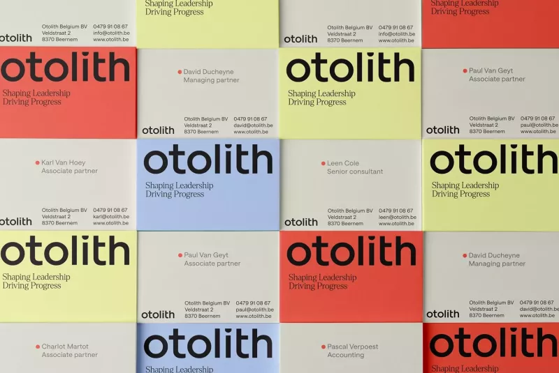
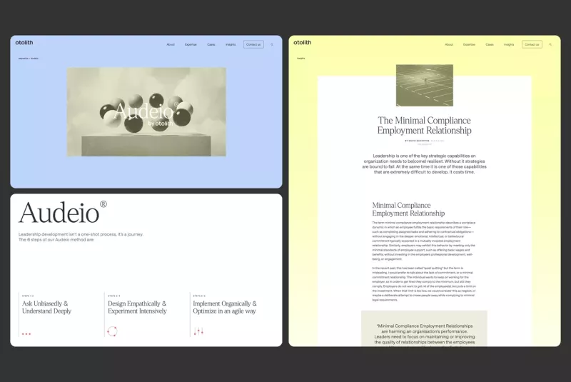
Happy to have worked with:
- coming soon {define} architecture Visual Identity, Website, Motion
- coming soon Oxfam coffee & bar Analysis & Recommendations, Strategy, Visual Identity, Packaging
- coming soon Timboo Visual Identity, Copywriting, Print, Packaging
-
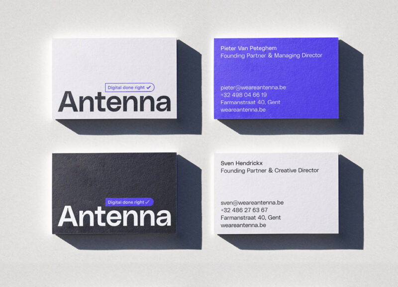
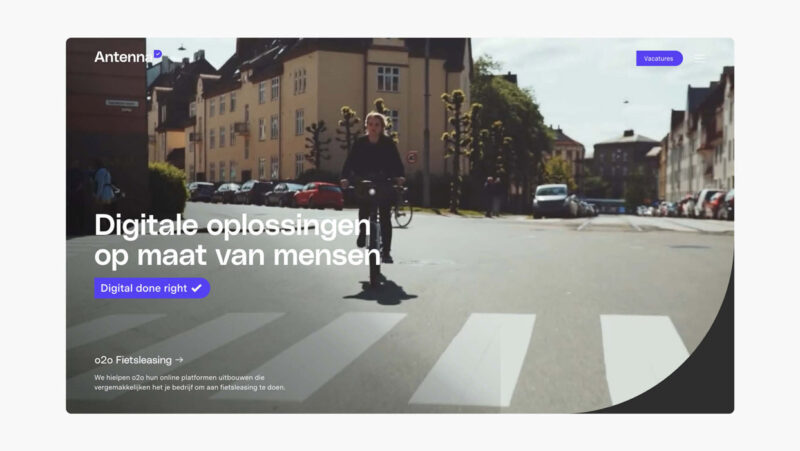
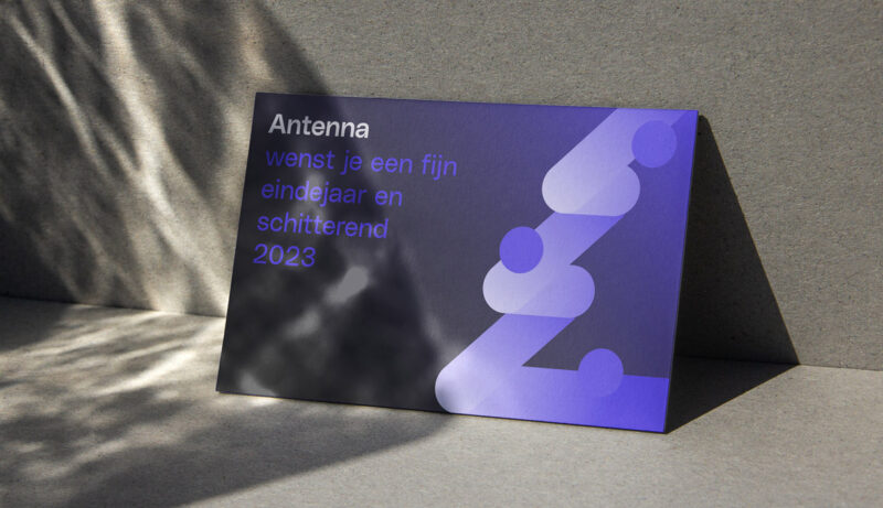
Scope of work
- Visual Identity
- Copywriting
- Website
- Social Media recommendations
Antenna tasked us with reimagining their identity as a creative digital studio beyond web design — conveying their technical expertise, pragmatic approach, and dedication to 'digital done right'.
See full case -
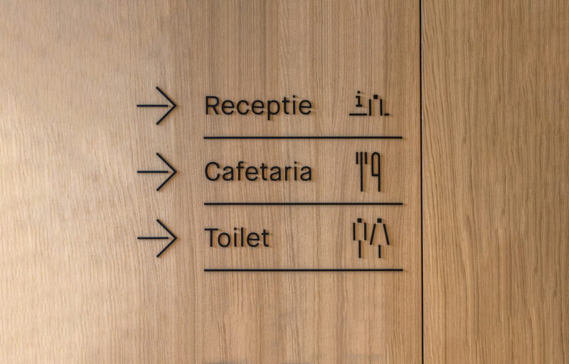
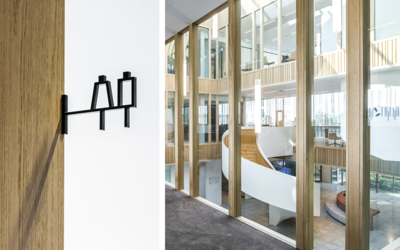
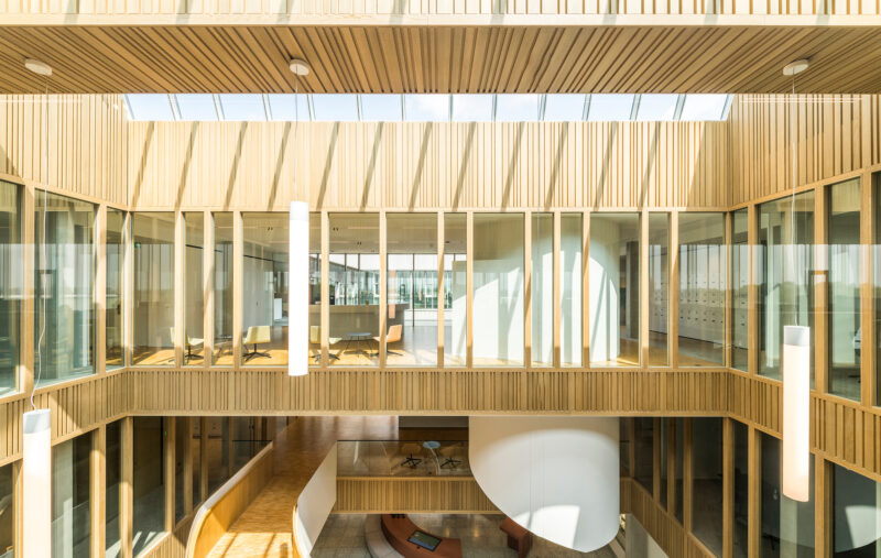
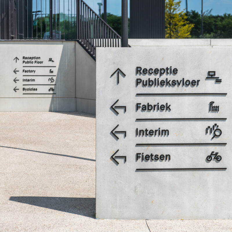
Scope of work
- Signage
- Iconography
Signage system for the new headquarters of Belgium's biggest frozen vegetables company, inspired by the vertical rhythm and angular architectural features of the building.
See full case -
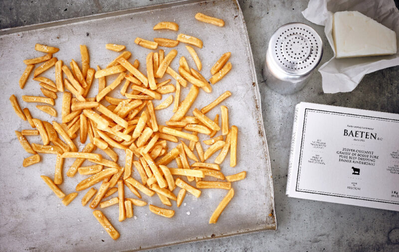
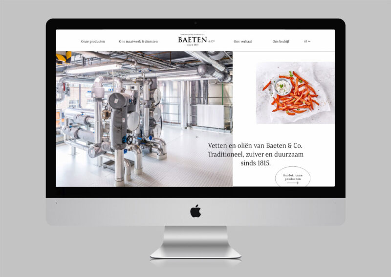
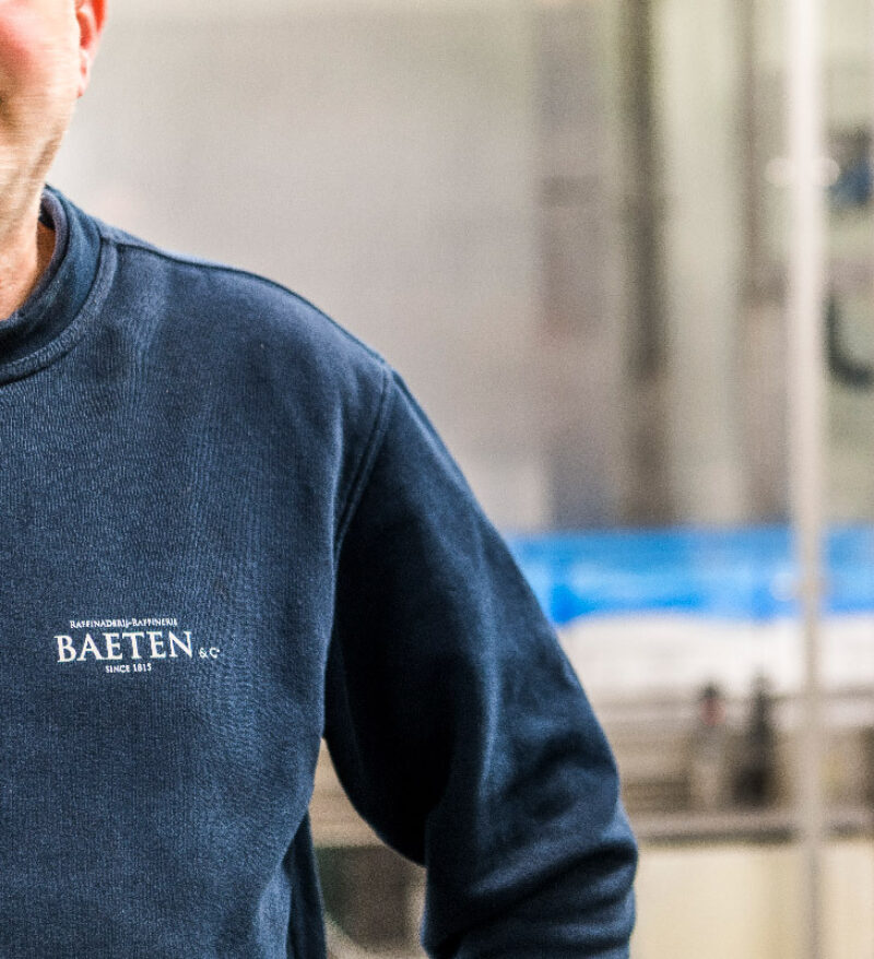
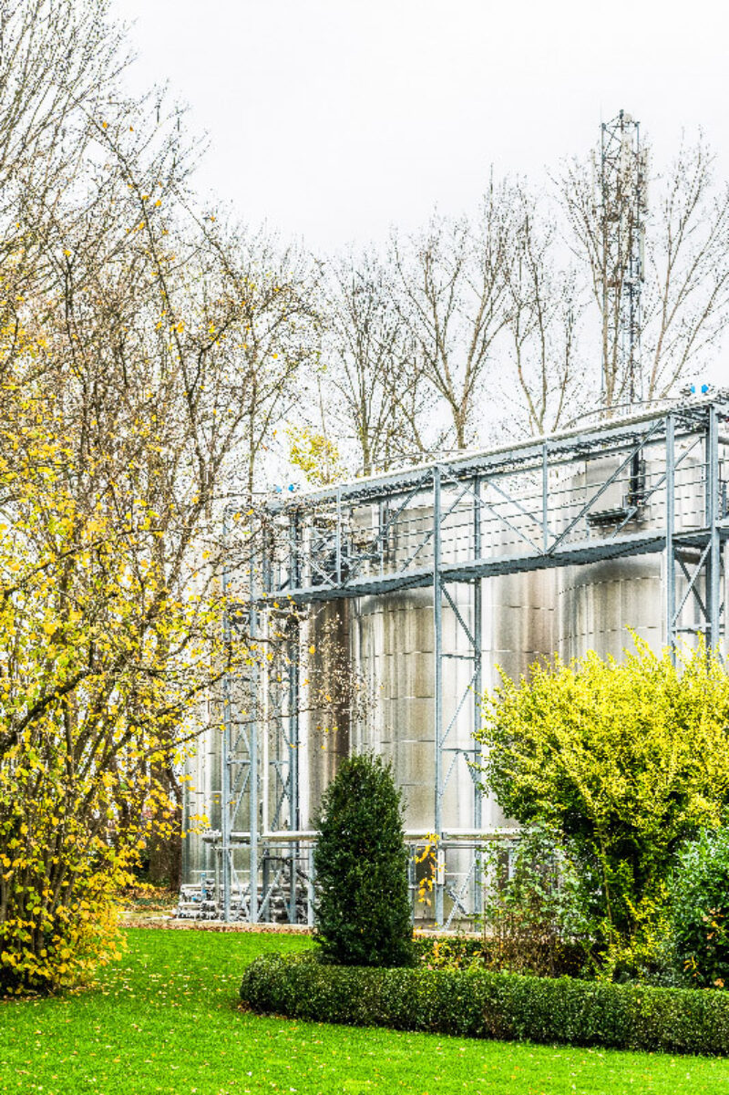
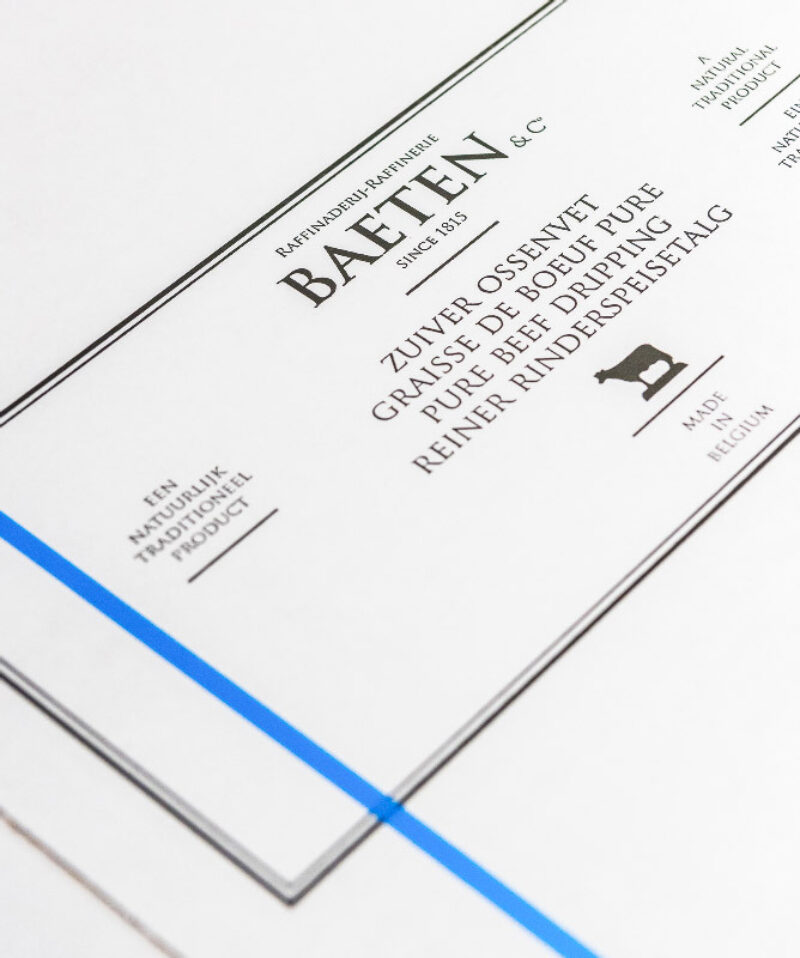
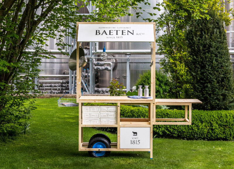
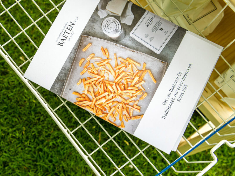
Scope of work
- Strategy
- Art Direction
- Copywriting
- Website
- Social Media
- Event Material
For Baeten & Co, a leading Belgian company of oils and fats, we helped them claim their position as best producer of beef dripping by helping them express the quality and pureness of their product, while at the same time sharing their elaborate knowledge of their trade.
See full case -
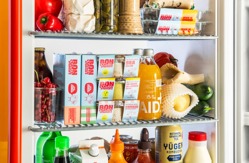
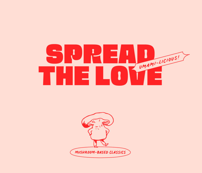
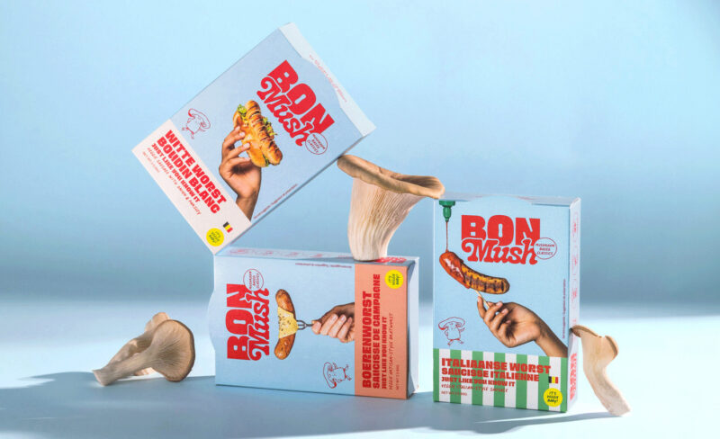
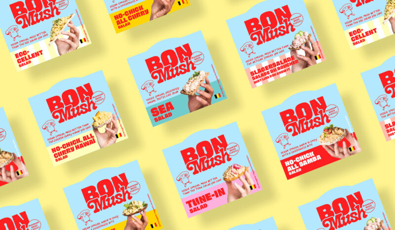

Scope of work
- Analysis & Recommendations
- Visual Identity
- Packaging
The rebranding of BonMush marks a bold departure from its butchery roots while staying true to its heritage of high-quality, flavourful food. The new identity reflects the brand’s rebellious, forward-thinking nature and ensures they stand out in a competitive plant-based market.
See full case -
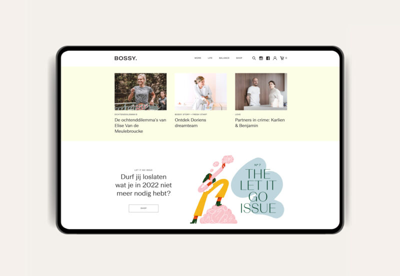
Scope of work
- Strategy
- Identity
- Art Direction
- Website
- Social Media recommendations
- Event Material
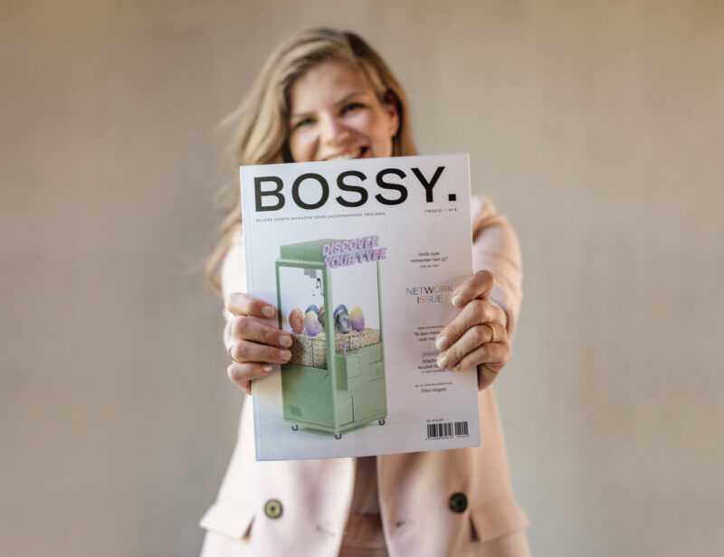
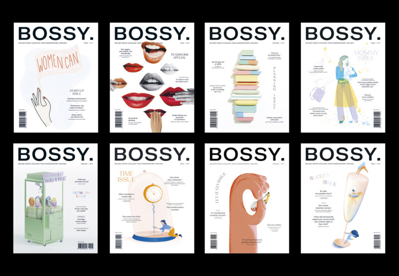
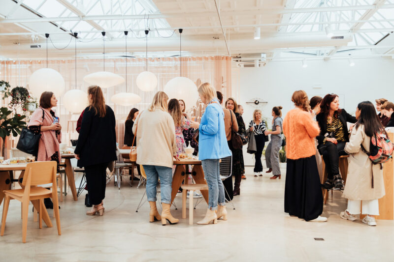
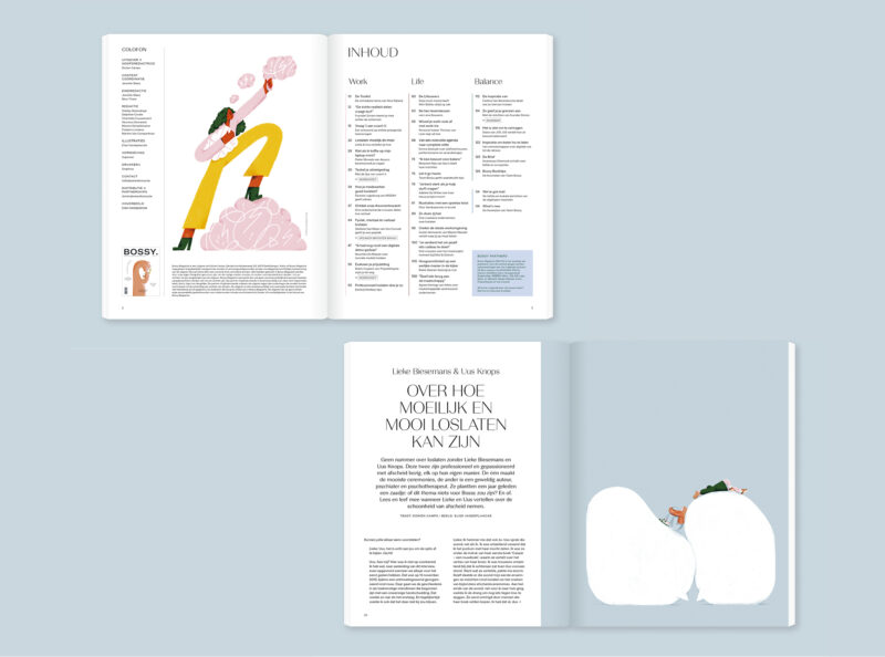
BOSSY is an on & offline platform for entrepreneurial women. Each issue focuses on a specific theme, which is translated into custom imagery in collaboration with a guest artist. Wanting to appeal to a large range of readers, the Art Direction varies for each issue, while a fixed layout keeps the branding consistent. The identity is also applied to digital (website & social media), launch events, practical tools.
See full case -
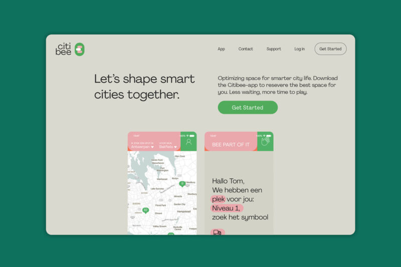
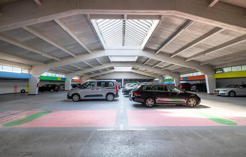
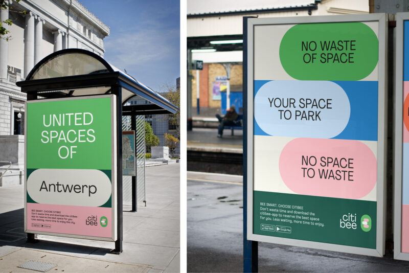
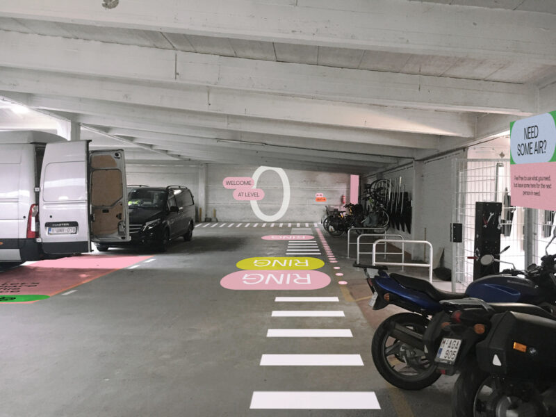
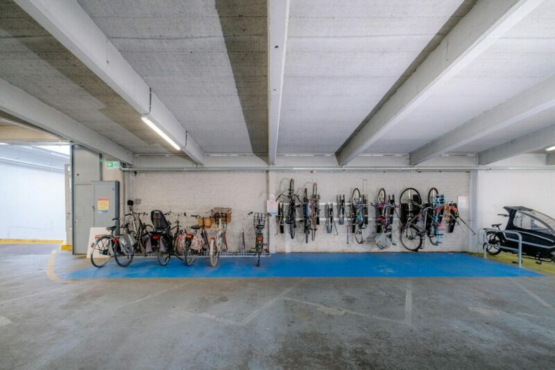
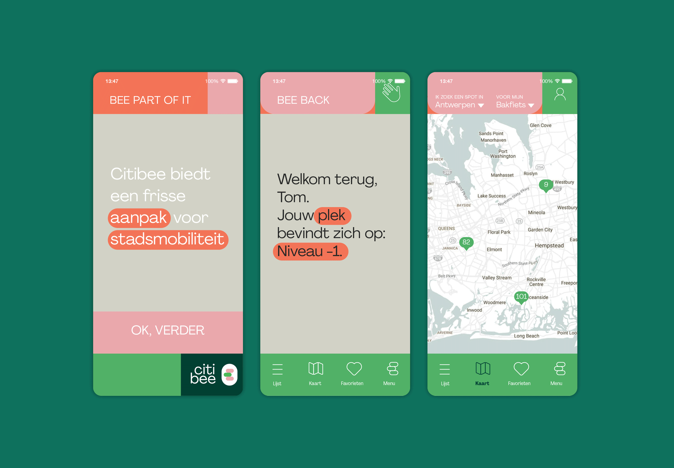

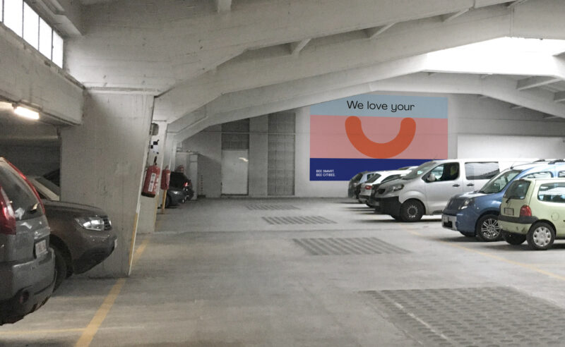
Scope of work
- Strategy
- Naming
- Identity
- Copywriting
- Website & App
- Signage
We helped citibee communicate their mission; to discharge public space by shifting street parking places towards comfortable and safe mobility hubs. The brand identity brings humanity into an otherwise grey and spiritless environment.
See full case -
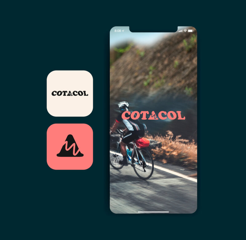
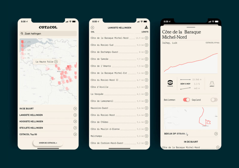
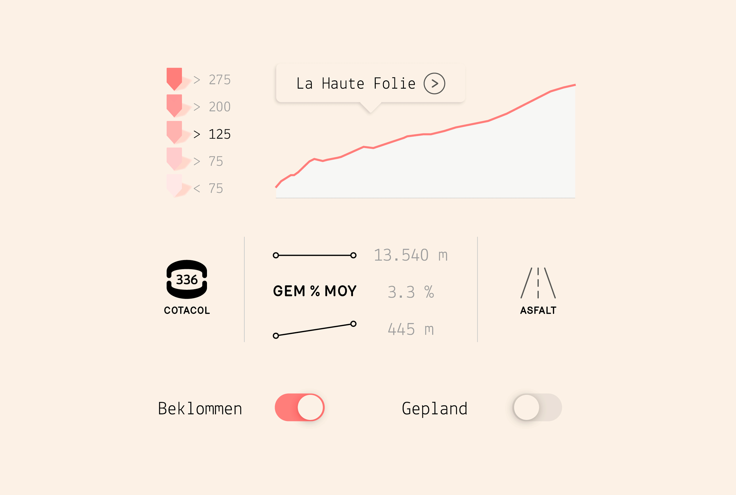
Scope of work
- App design
Cotacol is the digital version of the ‘Encyclopédie COTACOL’, a book of Belgium’s 1000 toughest cycling climbs. We were commissioned to help re-design the original content for a digital environment.
See full case -
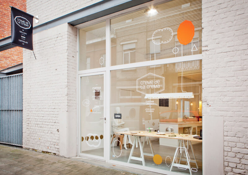
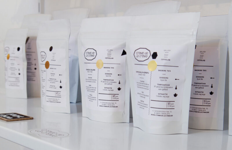
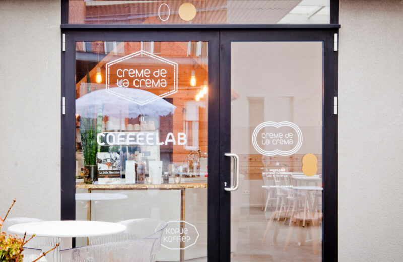
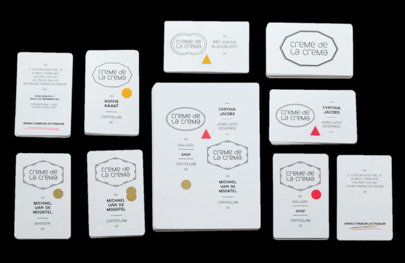
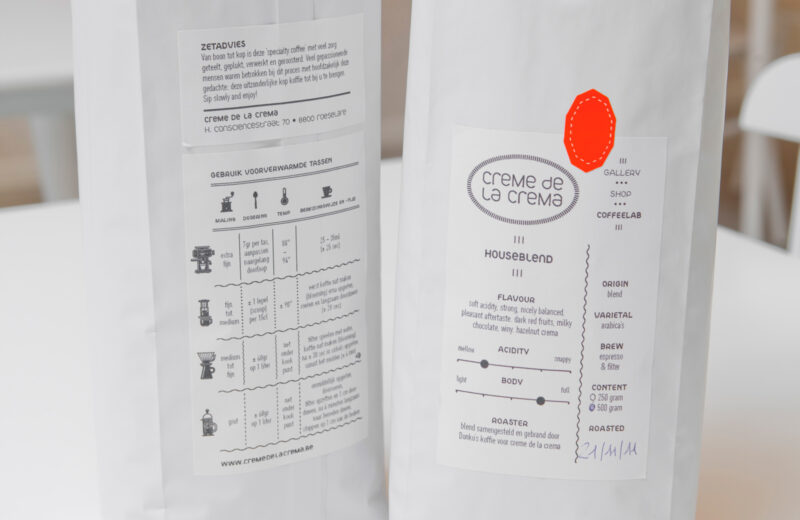
Scope of work
- Identity
- Packaging
- Signage
Creme de la crema is a gallery, shop & coffeelab in one. We helped with an identity that's multi-deployable & versatile.
-
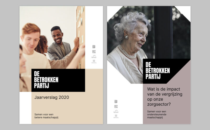

Scope of work
- Identity
- Brand guidelines
- Copywriting
- Templates
With a limited brand toolbox, De Betrokken Partij asked us to help further develop their existing identity into something more dynamic. This resulted in a range of print and digital tools and user-friendly templates. Built around the idea of ‘diverse inclusivity’, the graphic language symbolises DBP’s main aim of bringing all types of people together.
-
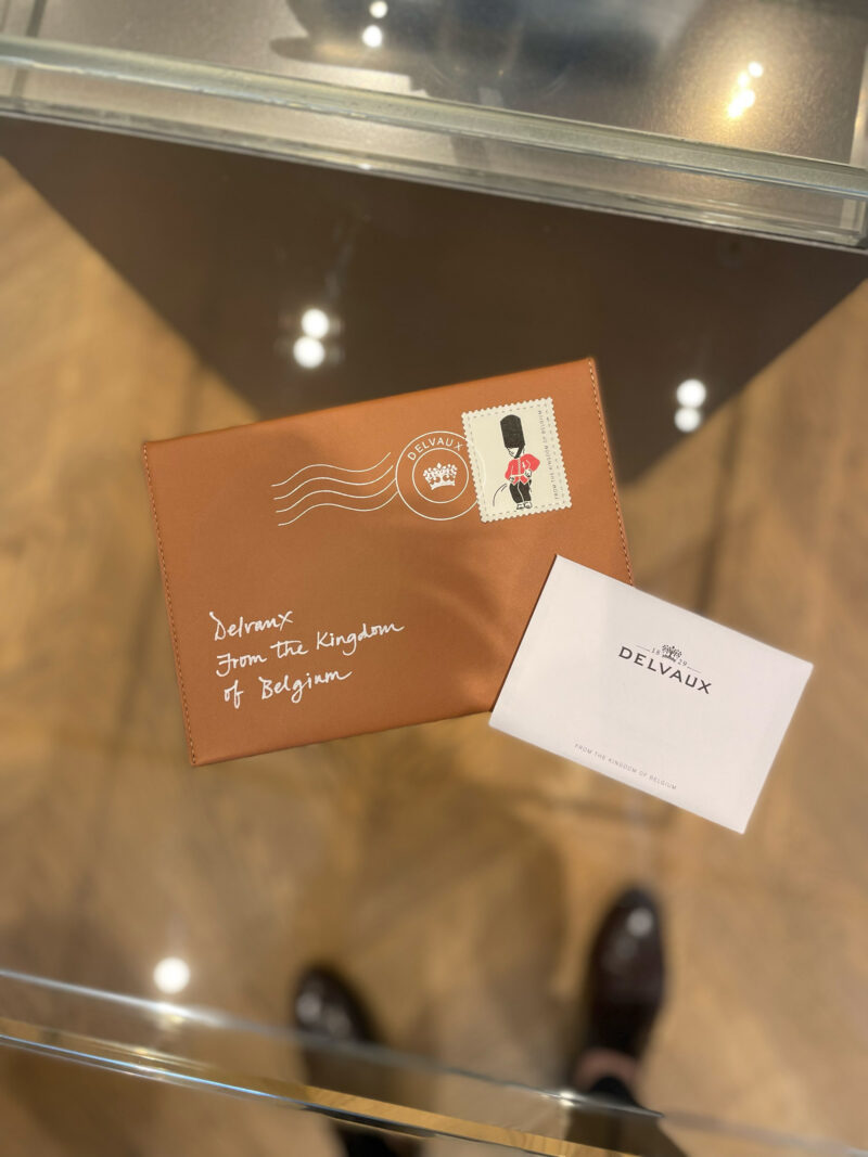
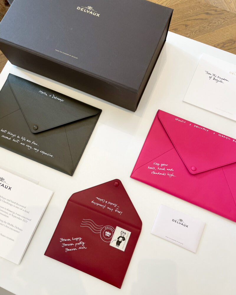
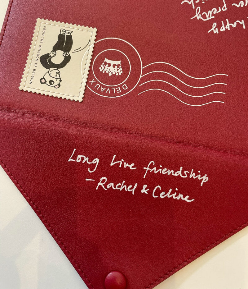
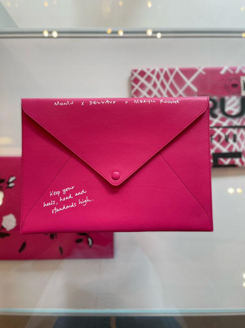
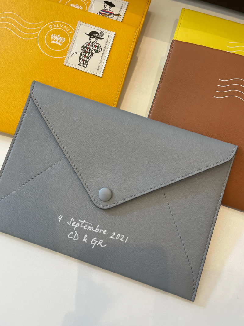
Scope of work
- Customization & handlettering
Custom handlettering for exclusive events at the Delvaux boutiques in Antwerp and Bruges.
-
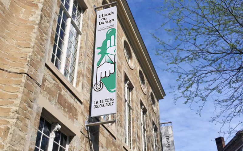
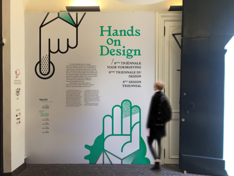
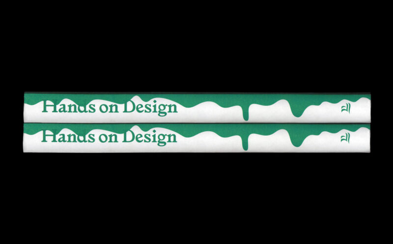
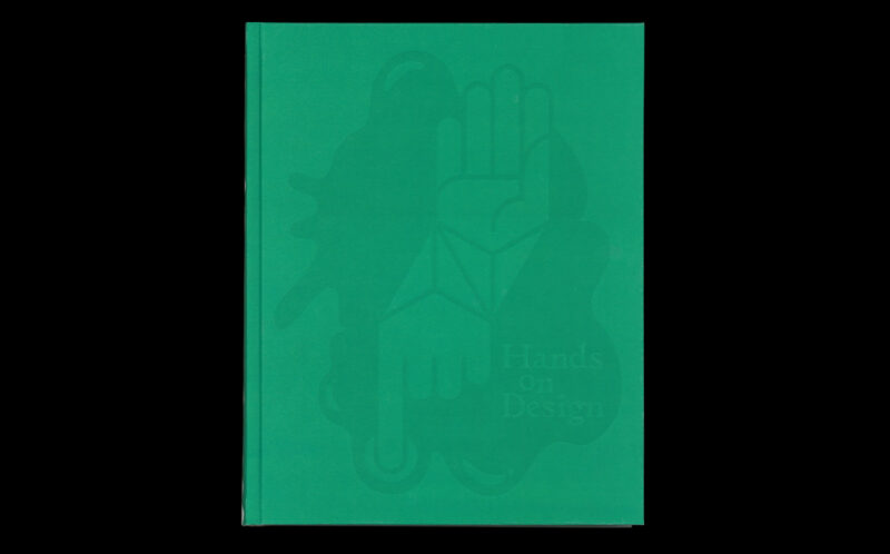
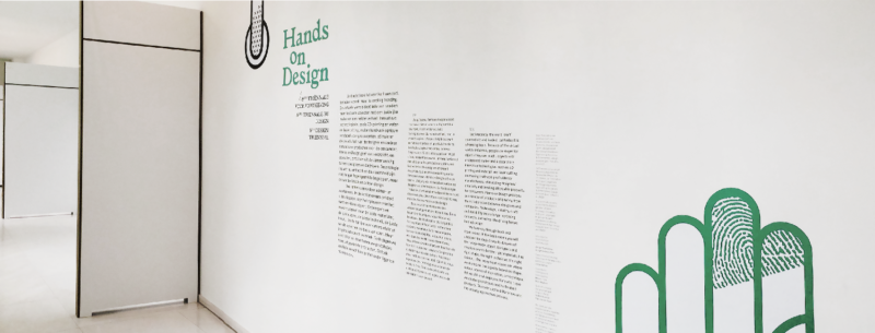
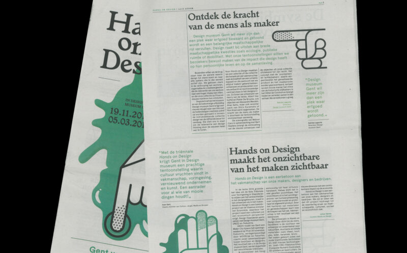
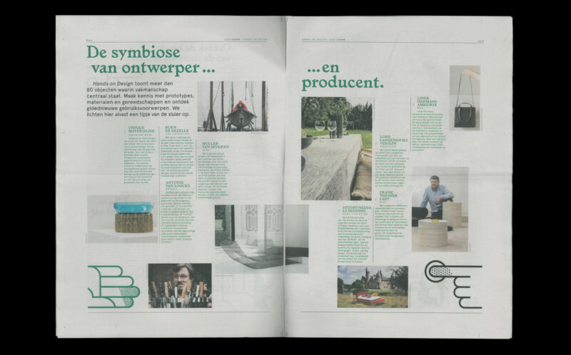
Scope of work
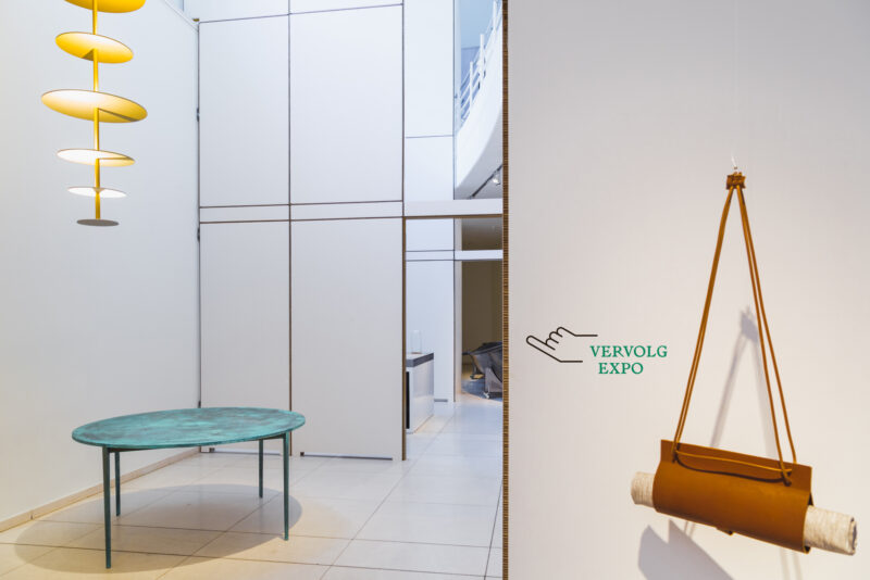
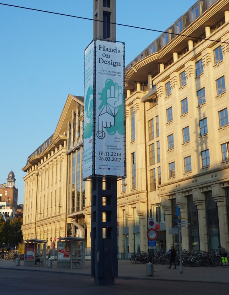
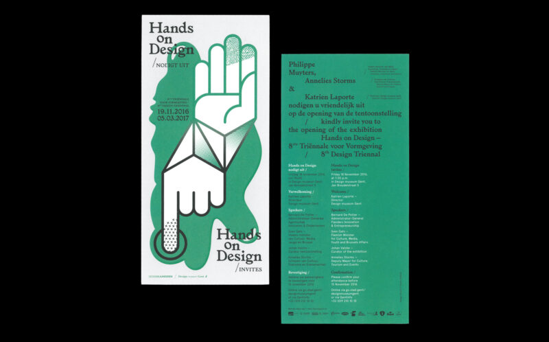
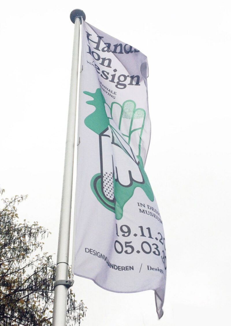
- Identity
- Exhibition signage
- Book design
- Promo material
Campaign for Design Museum Ghent called 'Hands on Design', 8th Triennial for Design. The campaign communicates the idea of the exhibited works; objects where crafts and innovative techniques meet and reinforce each other.
-
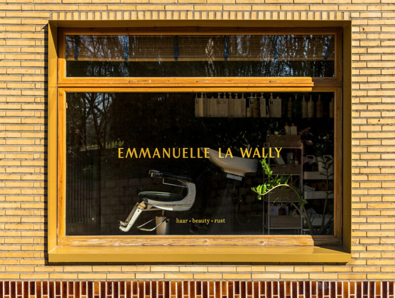
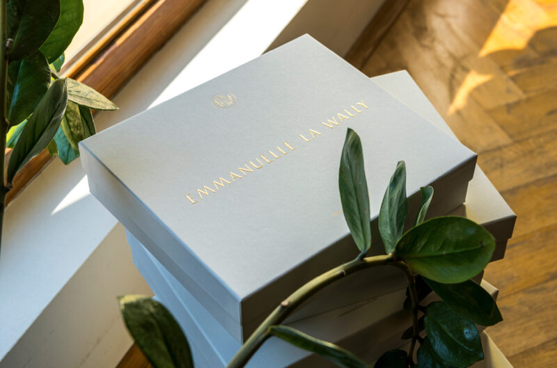
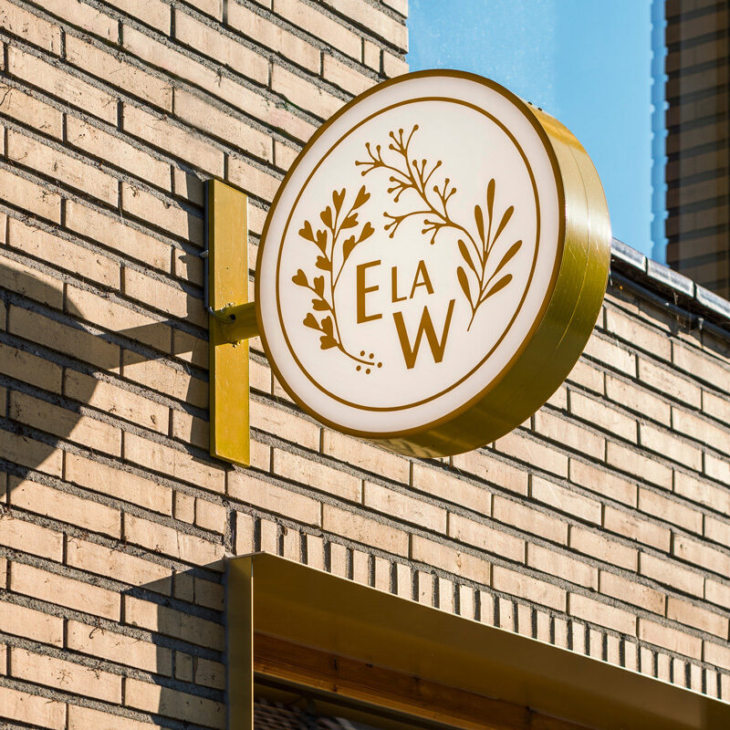
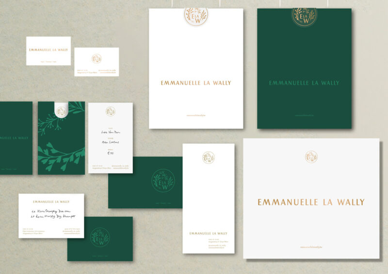
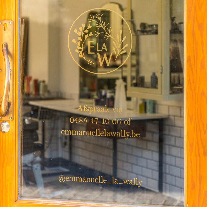
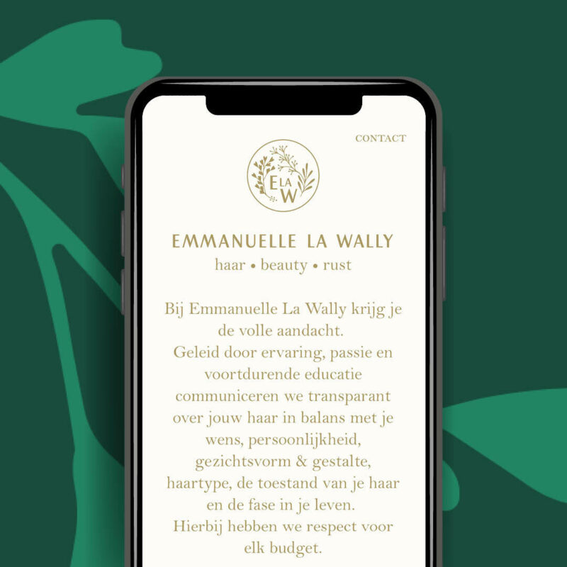
Scope of work
- Identity
- Website
- Signage
Stopping by at Emmanuelle La Wally means a natural treat for hair, face and mind. The identity needed to feel elegant and natural at the same time.
See full case -
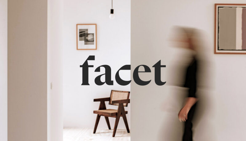
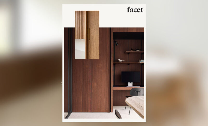
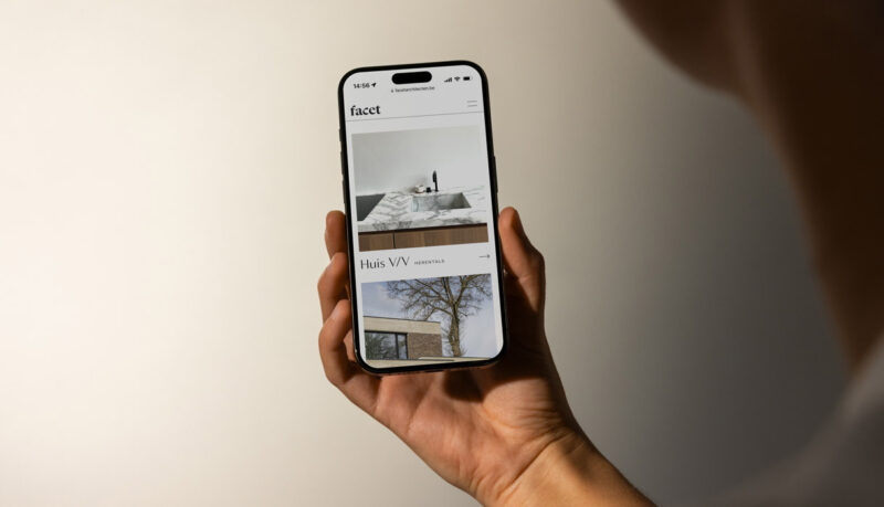
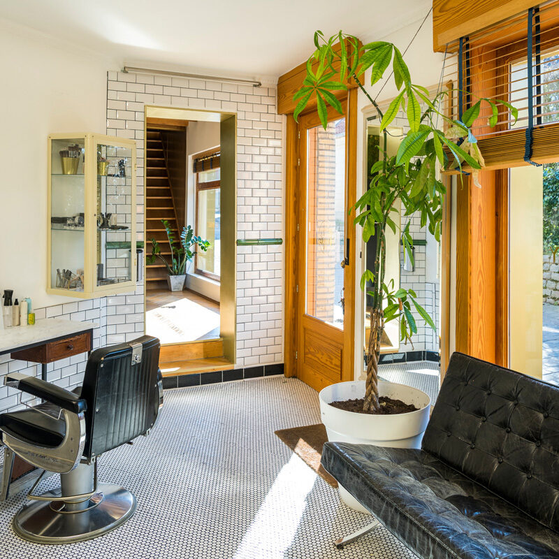
Scope of work
- Visual Identity
- Copywriting
- Website
- Signage
Facet is an architectural and interior design practice creating spaces that evoke a profound sense of home in every detail. The brand toolbox was kept essential, avoiding clutter, while still maintaining a warm, home-like feel.
See full case -
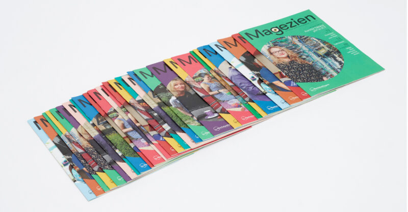
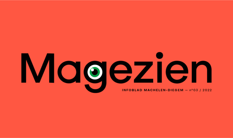
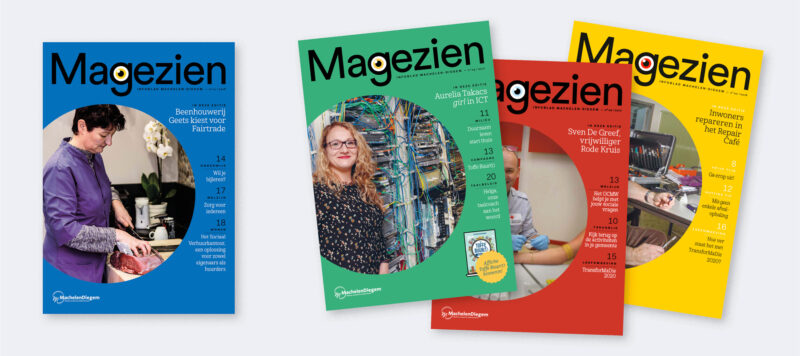
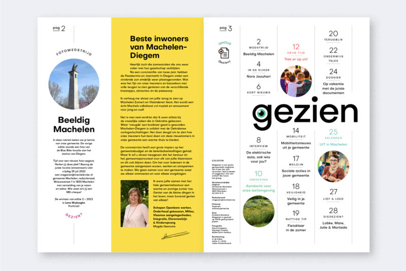
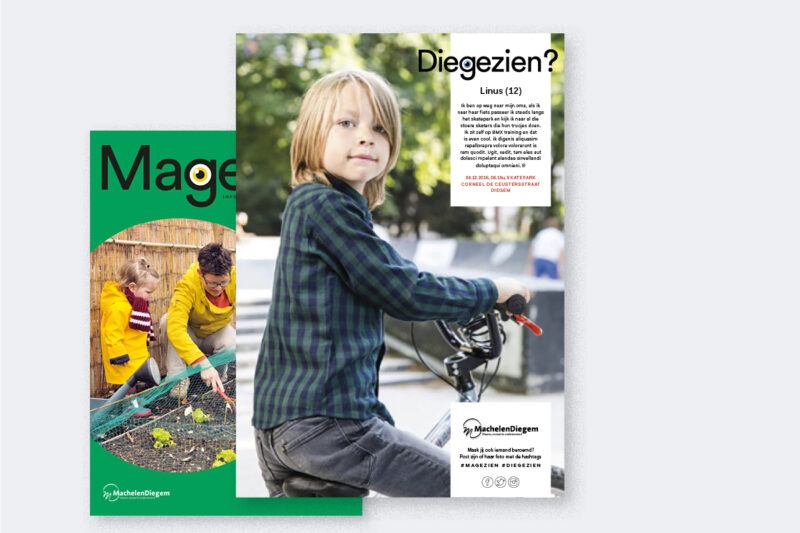
Scope of work
- Naming
- Design
- Layout
Since 2016, we've been designing Magezien, an infozine published by the city of Machelen. Rather than just simply inform their inhabitants, we challenged the city to equally inspire and engage the readers by fusing editorial and informational content. Naming and design add a bubbly and colourful personality. With 5 editions a year, we're close to designing our 30th edition.
-
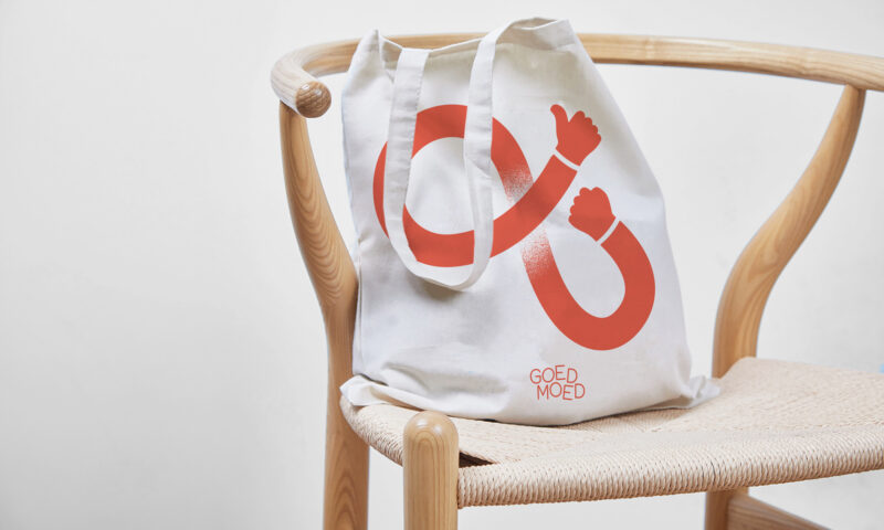
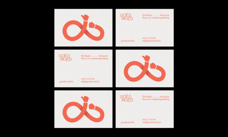
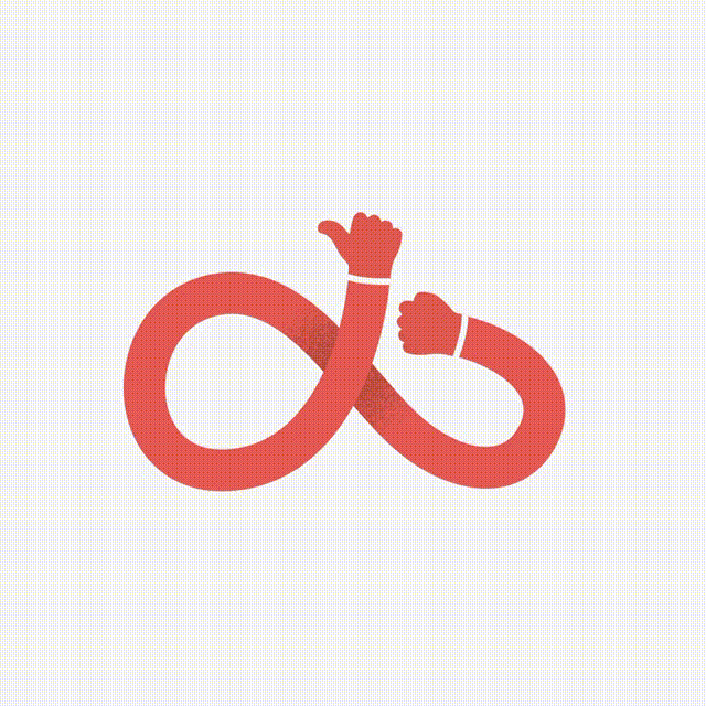
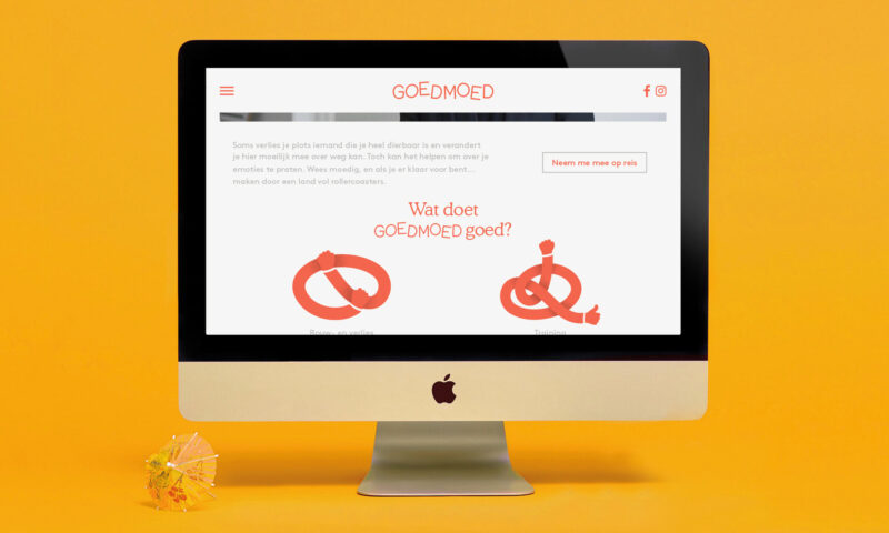
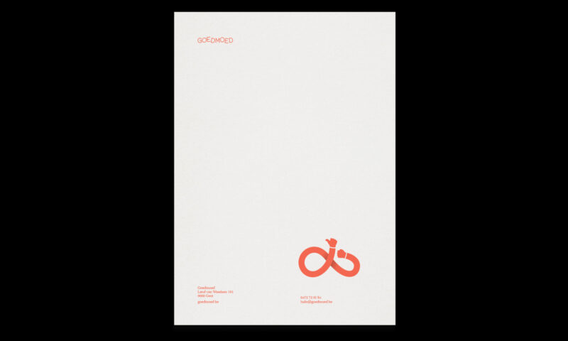
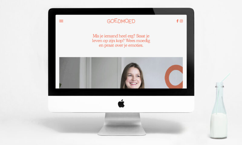
Scope of work
- Naming
- Identity
- Illustration
Goedmoed is a mourning and loss counseling practice for children. Aiming to lower the threshold for seeking professional help, we helped them create a name and identity that is friendly, approachable and supportive.
See full case -
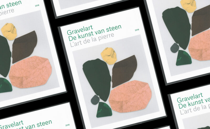
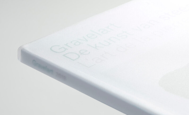
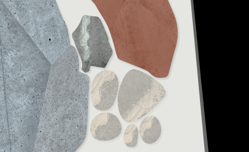
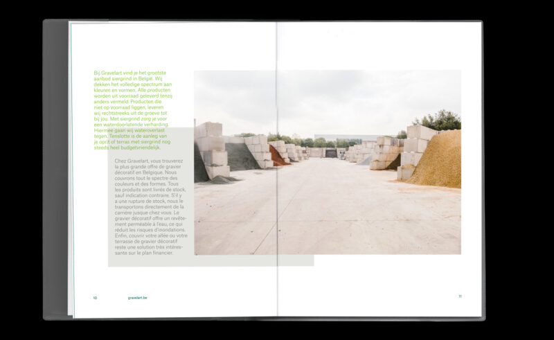
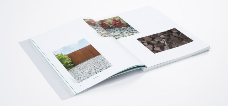
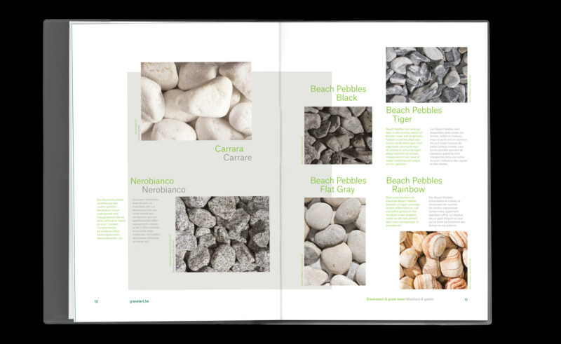
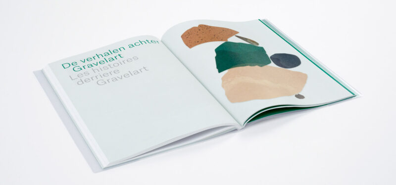
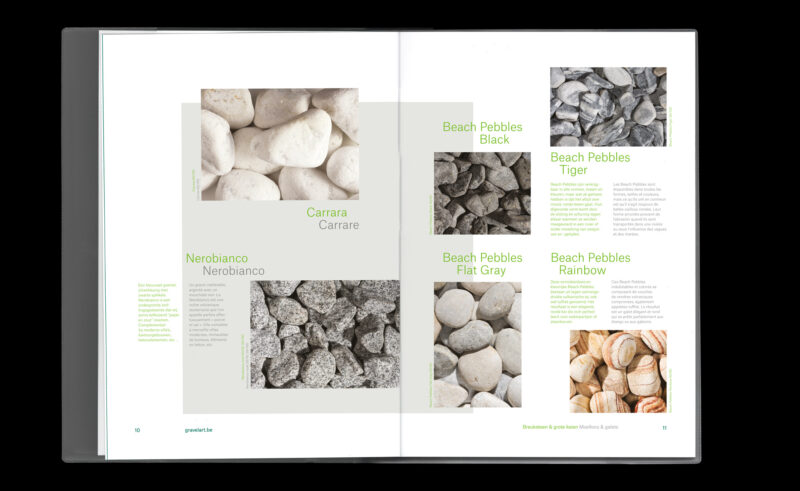
Scope of work
- Catalogue design
- Illustration
Catalogue design for stone manufacturer Gravelart enhancing the beauty of pure stone.
See full case -
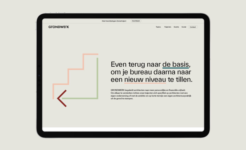

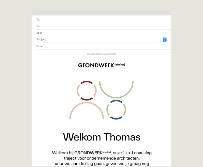
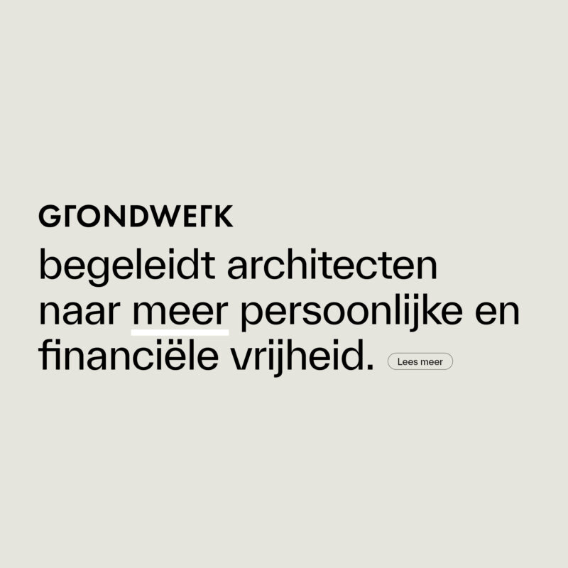
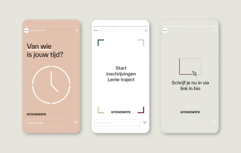
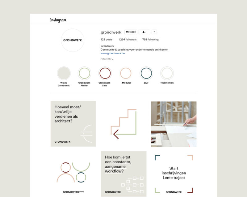
Scope of work
- Identity
- Guidelines
- Toolbox
Grondwerk is an on & offline community for ambitious architects, looking to strengthen their businesses and their sector through education and coaching. It focuses on specialised business coaching for architectural practises, as well as strategies to avoid or overcome the pitfalls of creative entrepreneurship.
See full case -
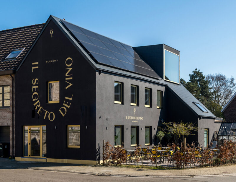
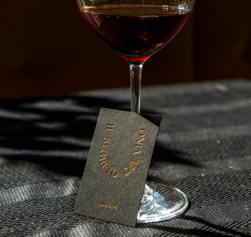
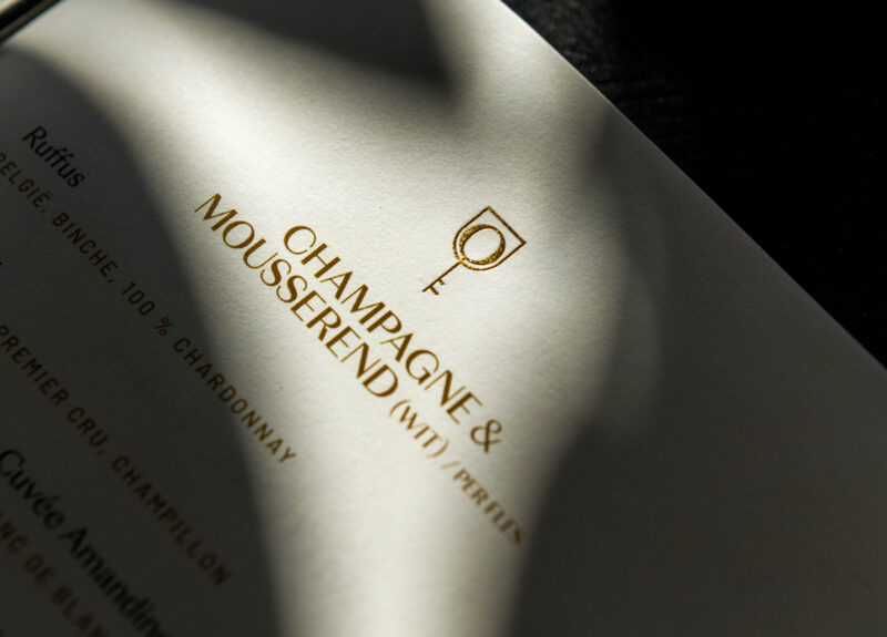
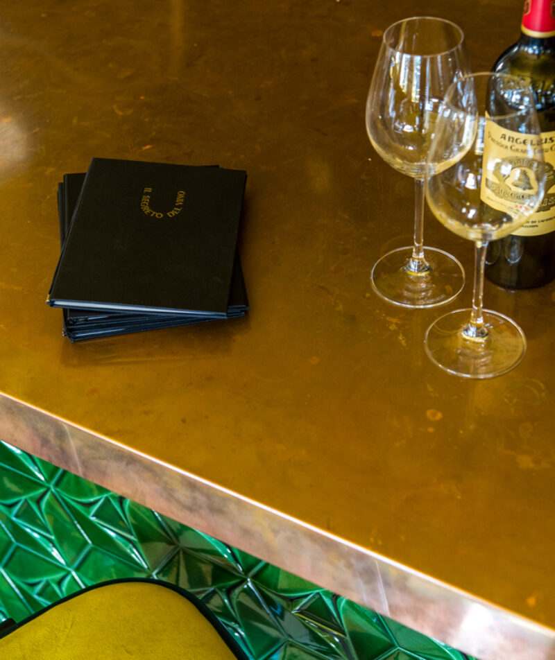
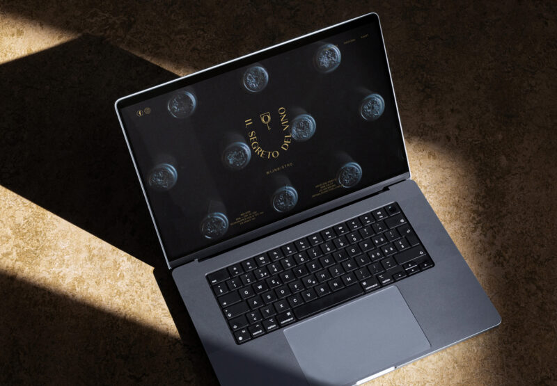
Scope of work
- Identity
- Website
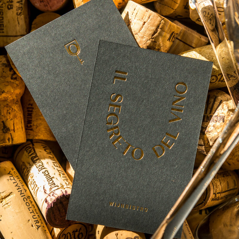
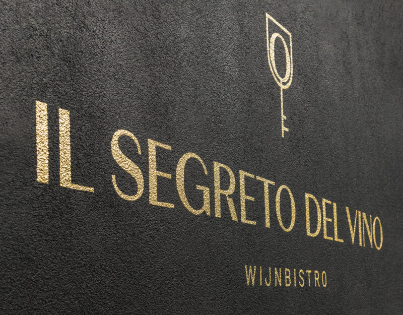
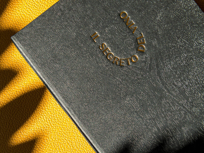
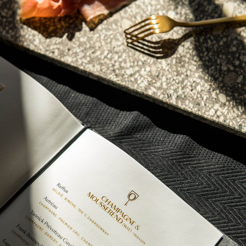
- Social Media
- Signage
How to turn a trio of colours into a tasteful identity for a wine bistro? The identity embraces the richness of the matte black; whilst elevating it with touches of gold as a reference to the yellow tones already present.
See full case -
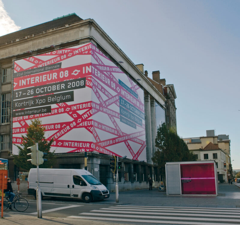
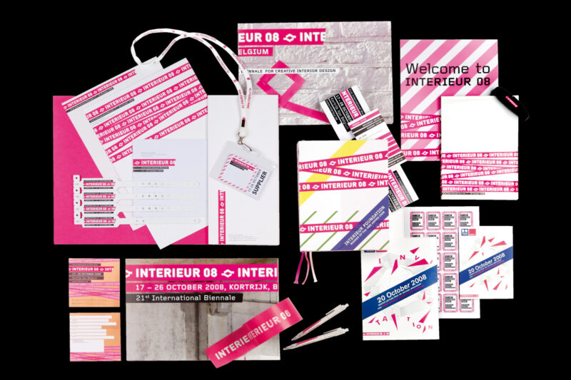
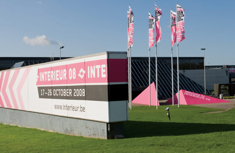
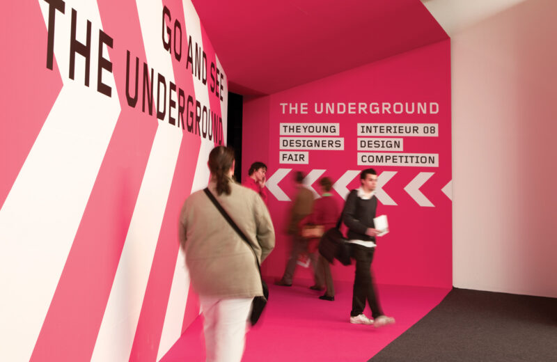
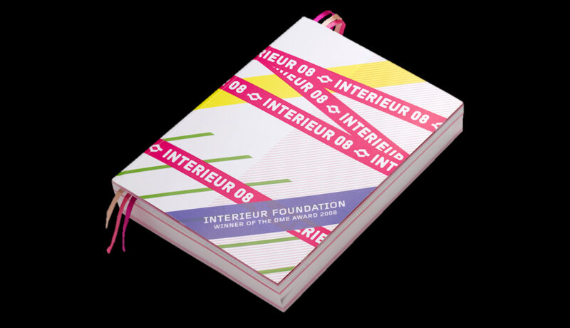
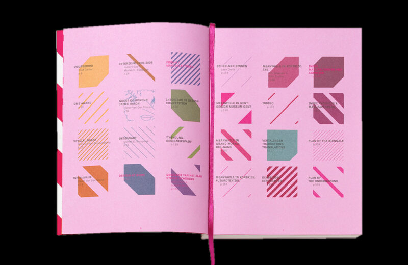
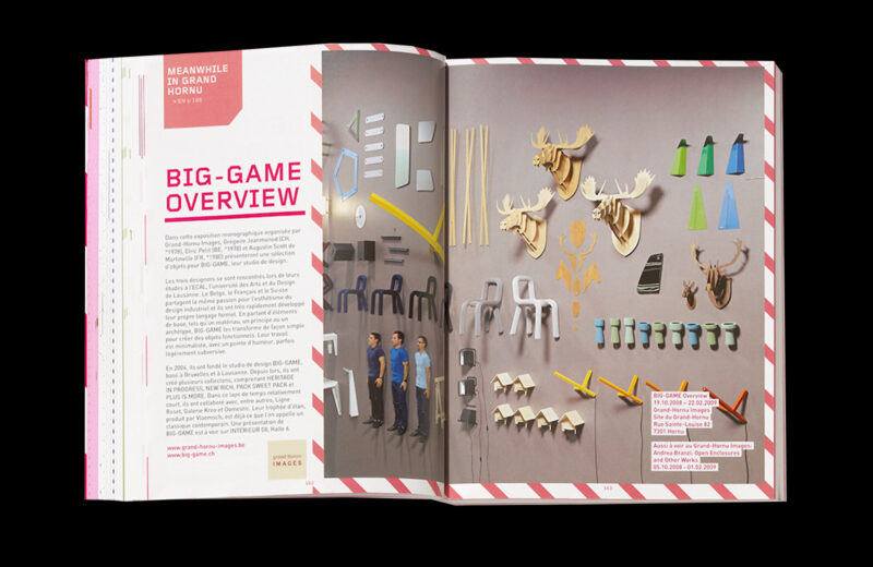
Scope of work
- Identity
- Campaign
- Catalogue
- Signage
In 2008 we had the pleasure to develop the identity for Biennale Interieur Kortrijk. From the biggest banner we ever made, over trade fair signage to a full-on catalogue.
-
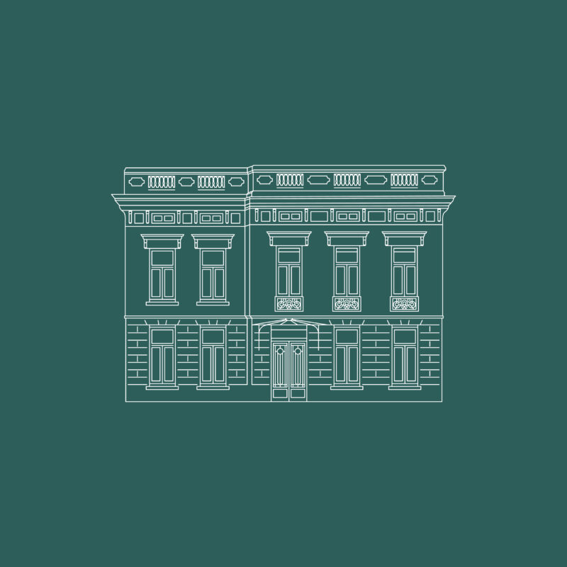
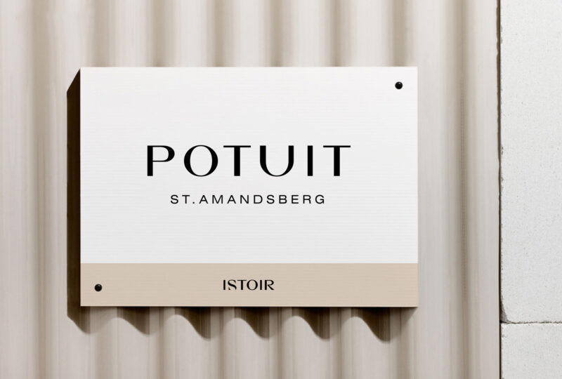
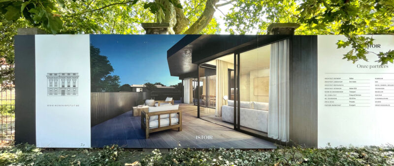
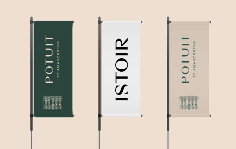
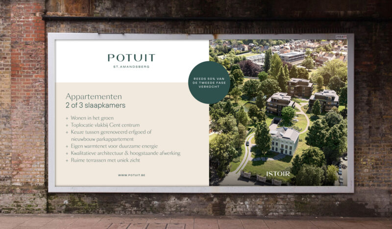
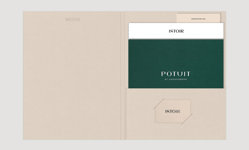
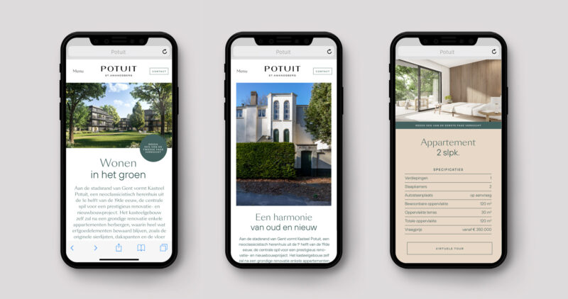
Scope of work
- Identity
- Signage
Istoir asked us to further develop their existing brand identity into (sub)identities for new site specific project. The identity focuses on integrating the history and beauty of a special building with a living experience for the future.
-
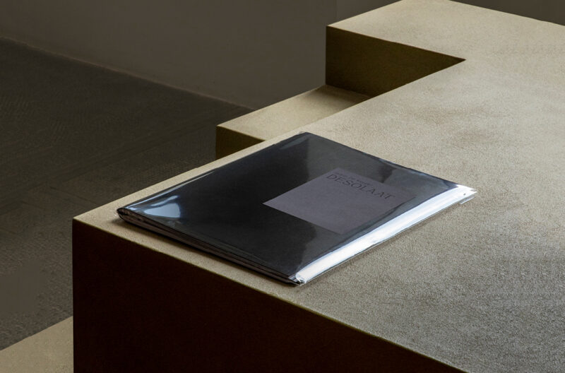
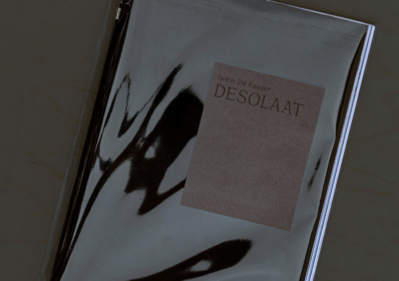
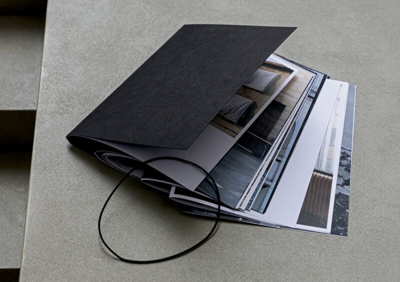
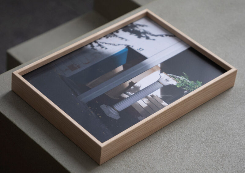
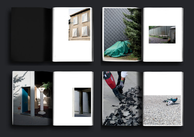
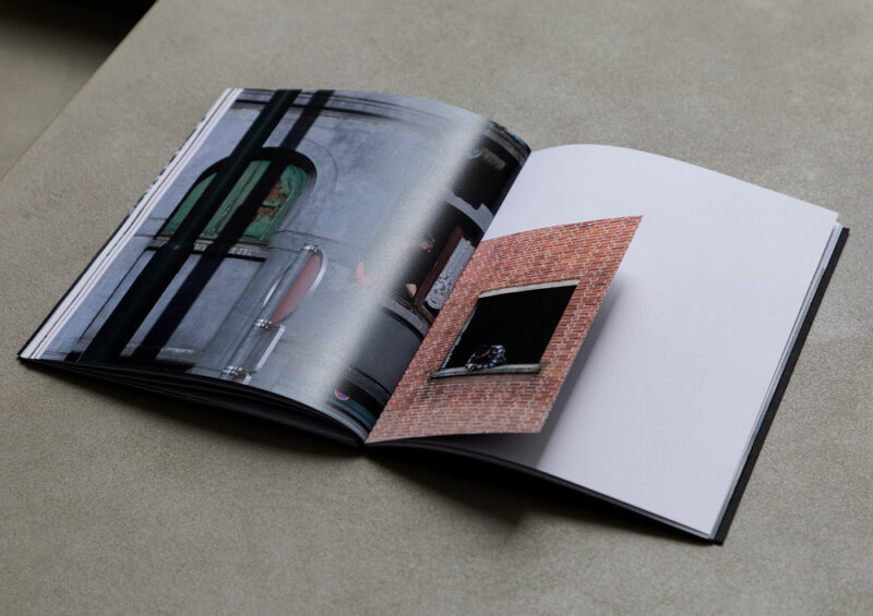
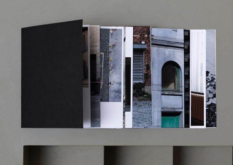

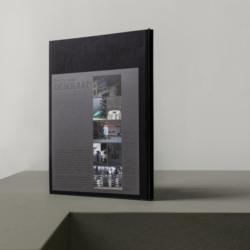
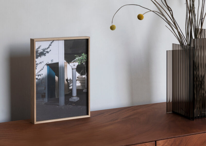
Scope of work
- Book design
DESOLAAT is a photography book with a selection of art photographer Iwein De Keyzer's most honest street imagery. Reality at its purest, it's a visual (re)discovery of the world around us. The publication itself is a versatile object. Its unbound pages allows readers to rearrange, frame or share the photos as they please.
See full case -
Scope of work
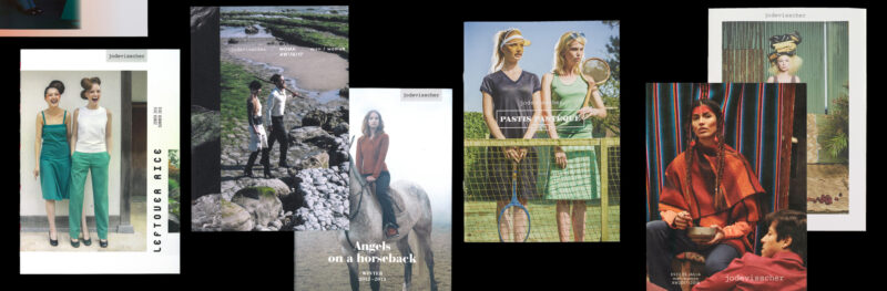
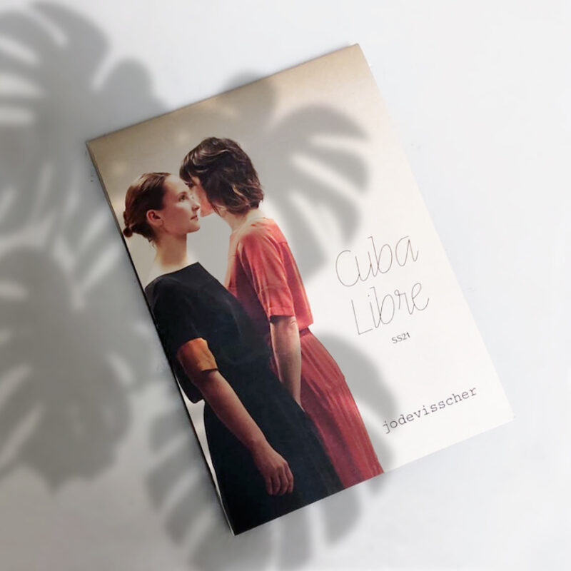
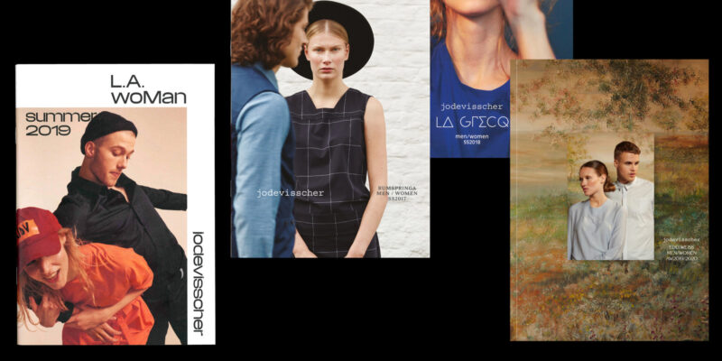
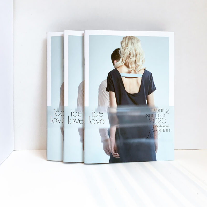
- Catalogue design
10 years of catalogues for fashion designer Jo De Visscher, 2012-2022.
-
Scope of work
- Strategy
- Naming
- Identity
- Seasonal Brochure
- Campaign
- Website
- Event Material
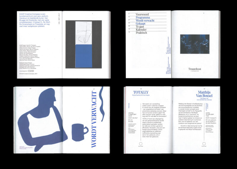
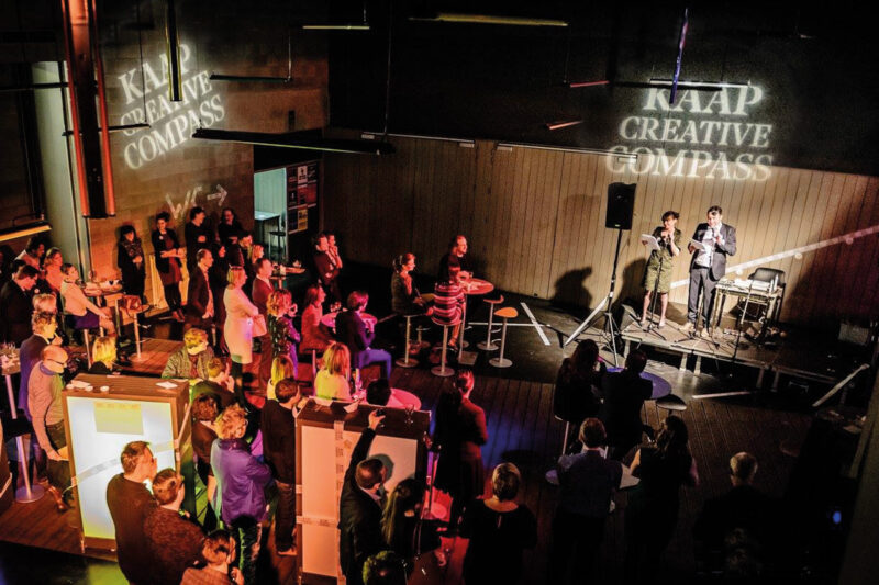
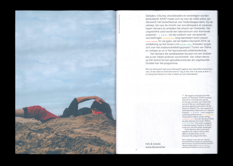
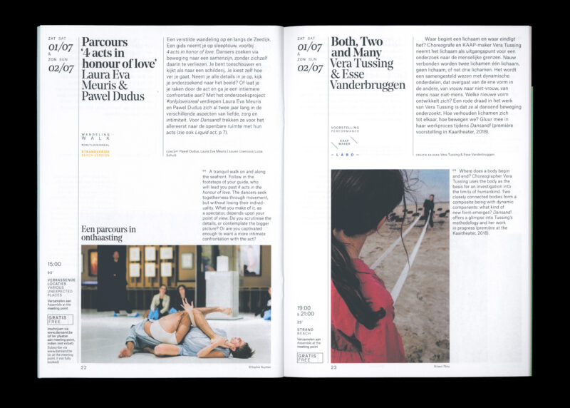
A visual identity that merges four cultural centres into one new multi-disciplinary arts centre, moving across city boundaries.
See full case -
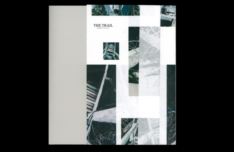
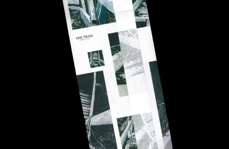
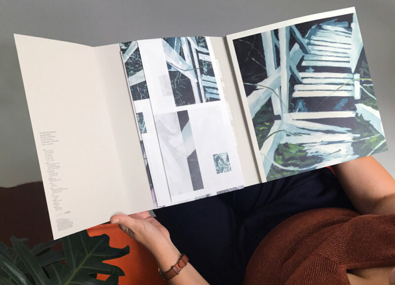
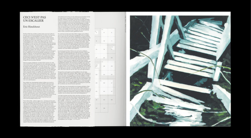
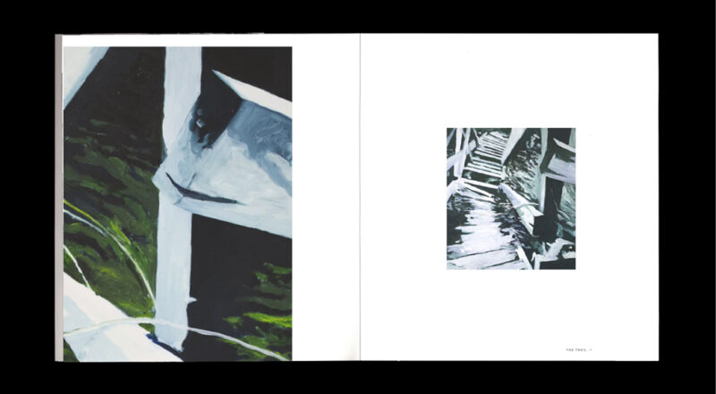
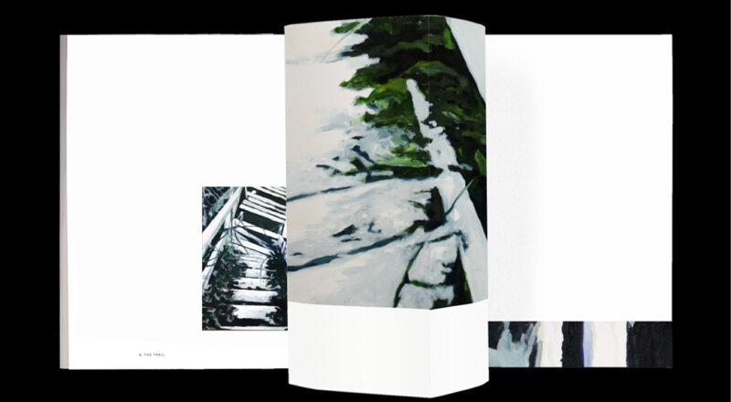
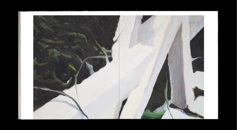
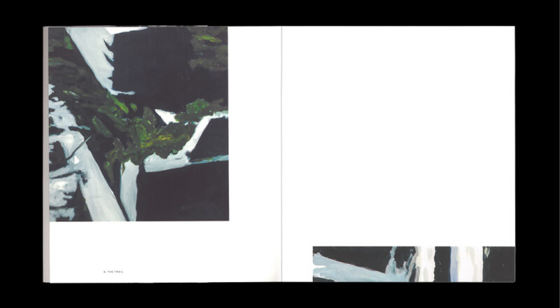
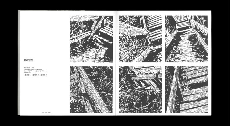
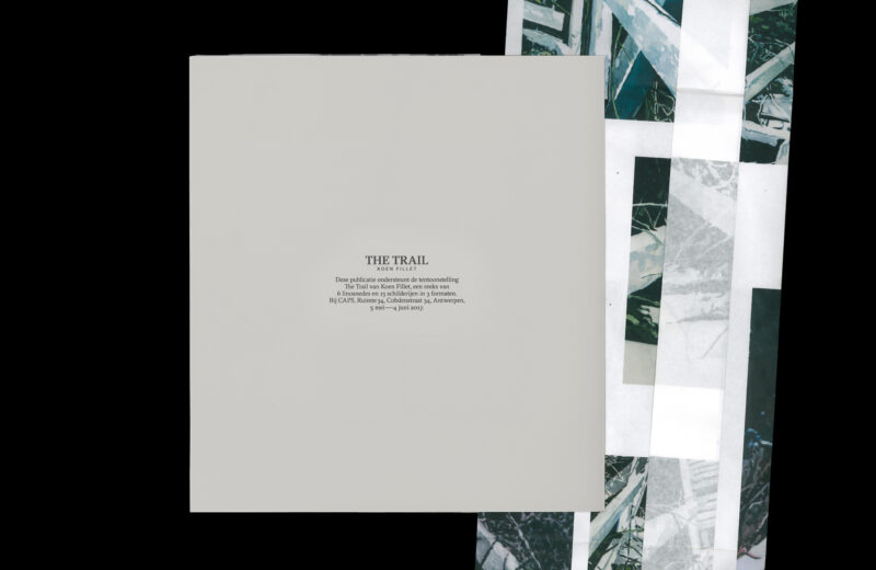
Scope of work
- Book design
The Trail is a series of thirteen paintings by Koen Fillet based on a single theme: an overgrown wooden pathway in Wales. The painter looks at the trail from different points of view; from up-close to further away. The challenge for the book design was to show 13 paintings which – at first glance – look very alike but also each have their own unique qualities within the series.
From the design to the binding, the book symbolises a path. The sleeve functions as a blueprint of the 13 paintings. The book itself is conceived as parts of this blueprint, allowing the reader to see smaller details as well as paintings in their full format.
See full case -
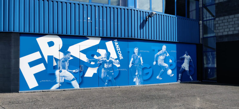
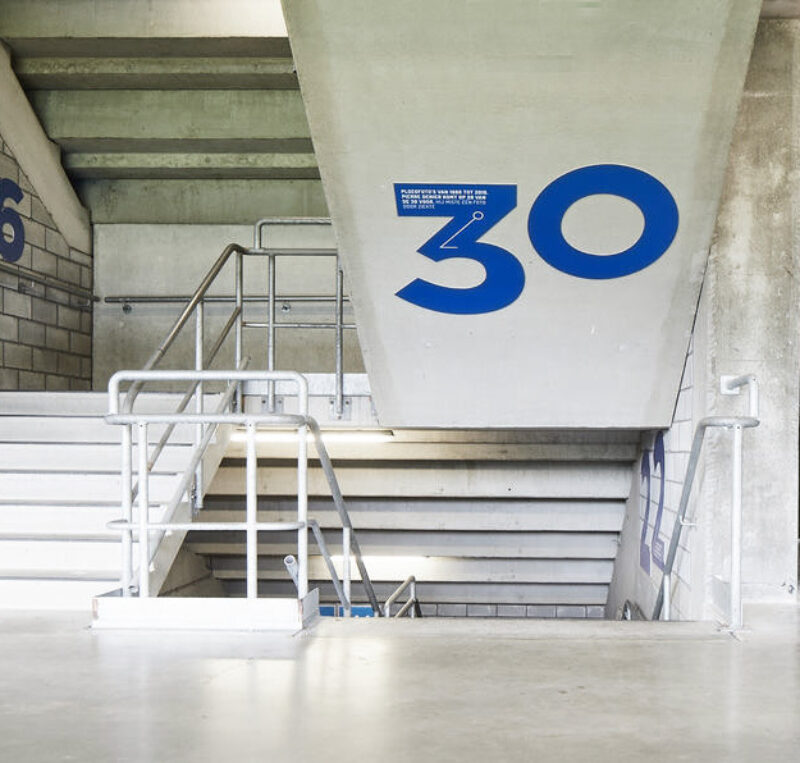
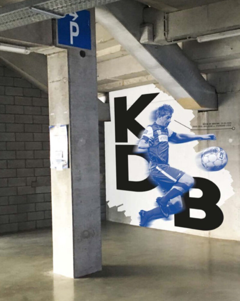
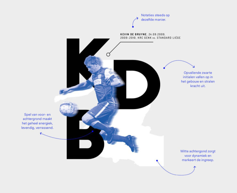
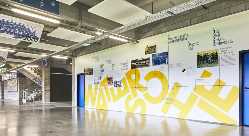
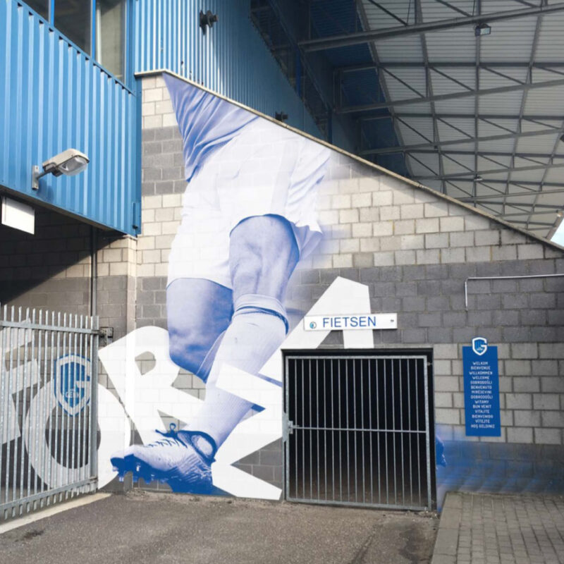
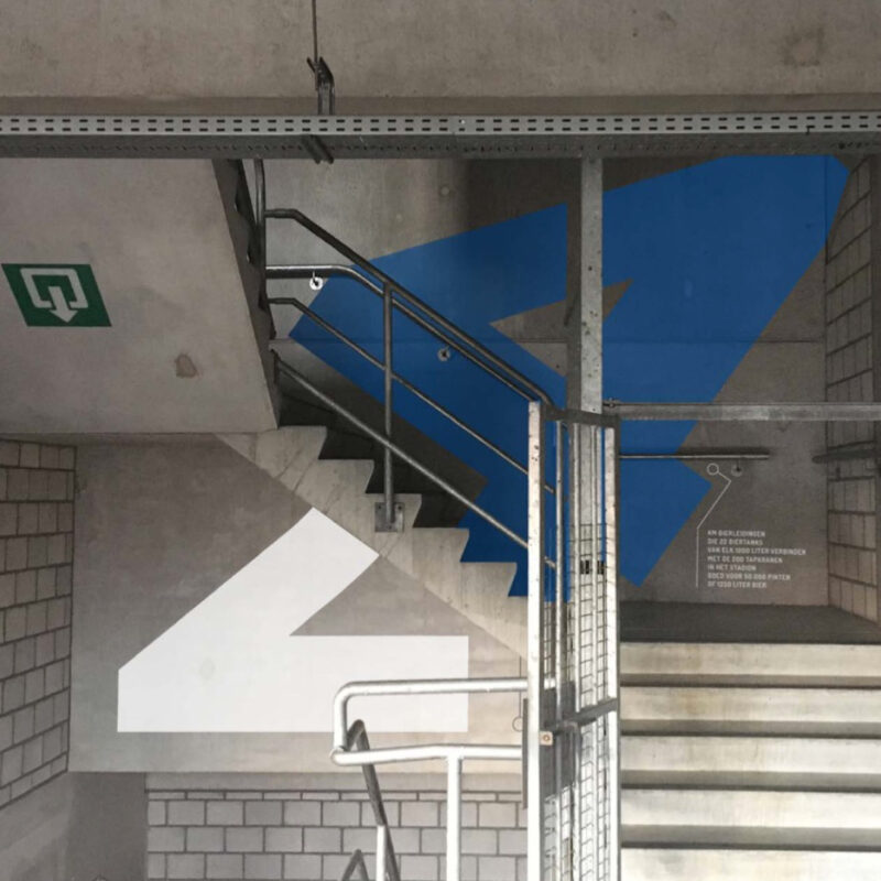
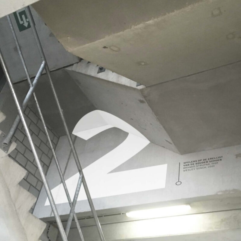
Scope of work
- Signage
We helped KRC Genk design a permanent exhibition in their stadium of 30 years of club highlights & memories. In collaboration with Exponanza, scenography.
-
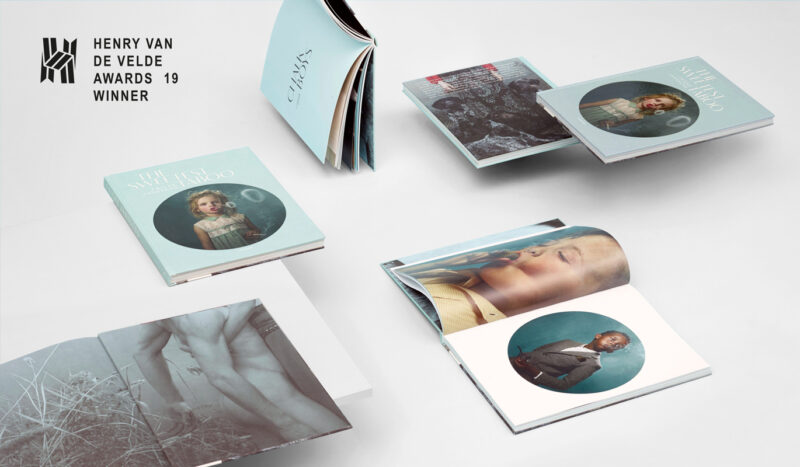
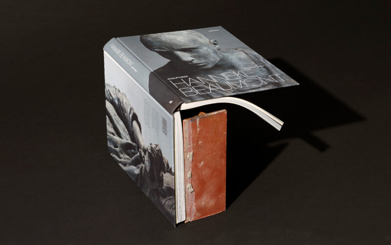
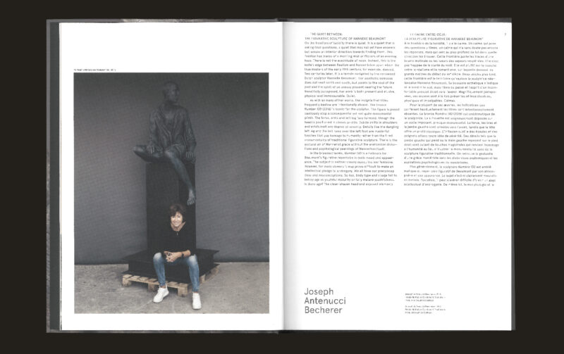
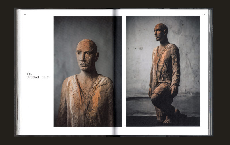
Scope of work
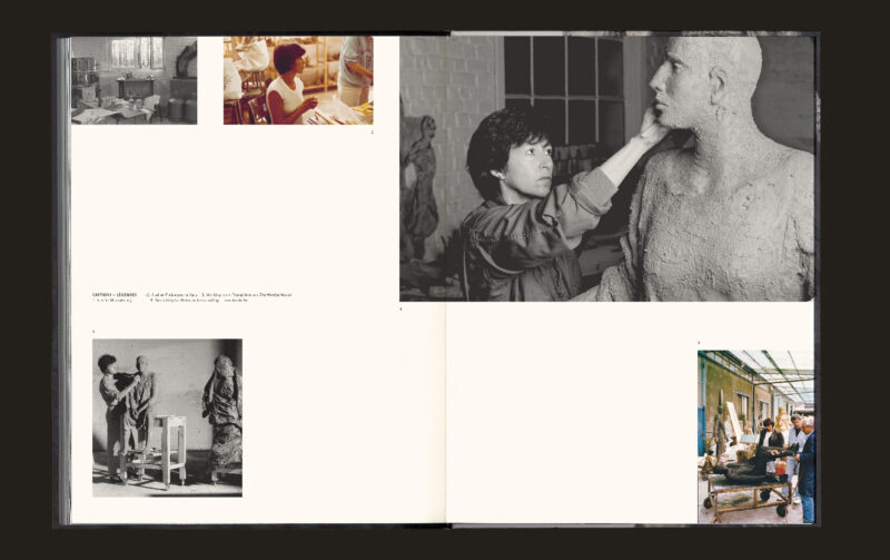
- Book design
We partnered up with Lannoo for the first time in 2017. They approached us to design a book for Frieke Janssens, a photographer with a solid reputation in staged photography. We designed her first book called 'The Sweetest Taboo', which was awarded with a Henry Van de Velde Award. Since then our relationship with Lannoo took off as a plane, working on a wide range of books for them.
-
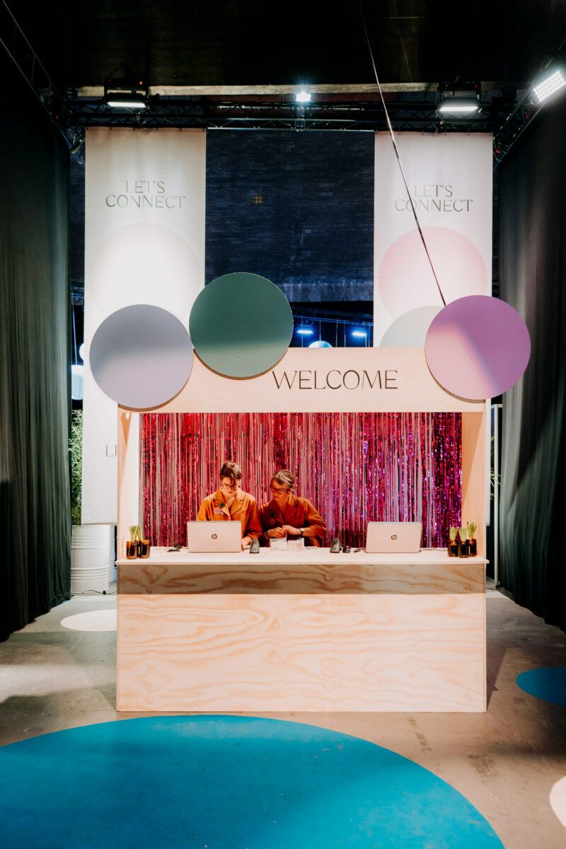
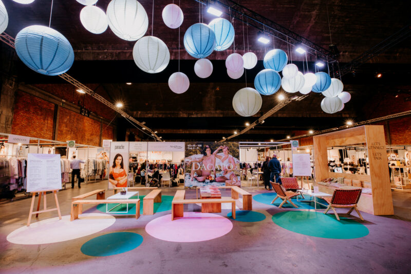
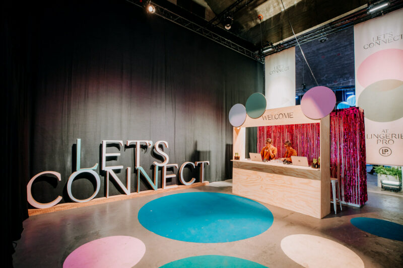
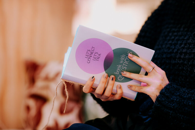
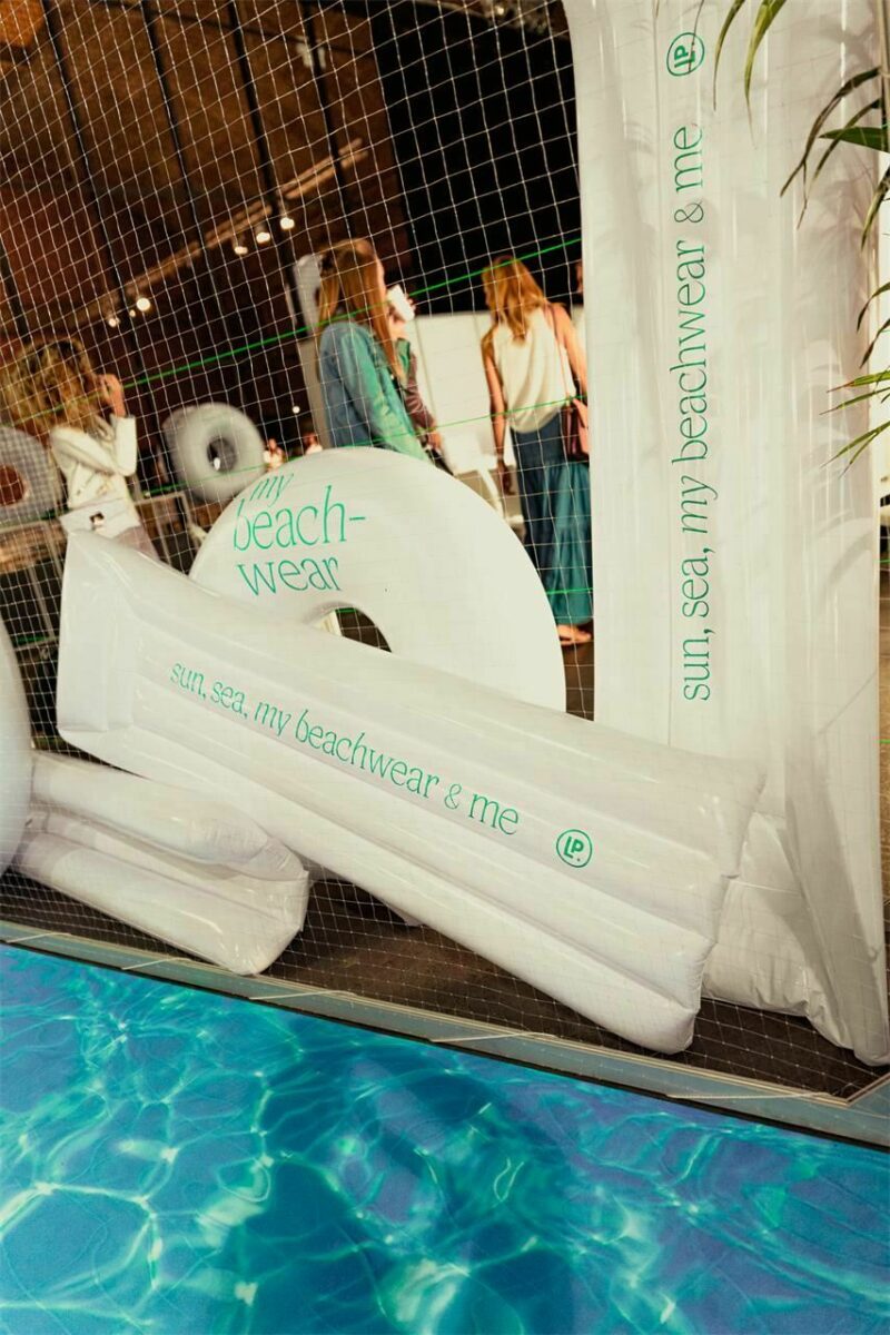
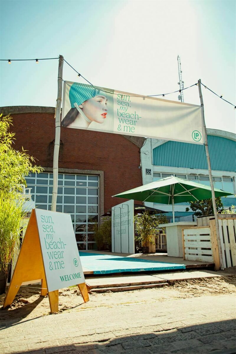
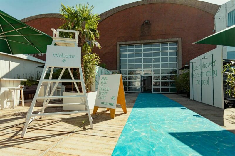
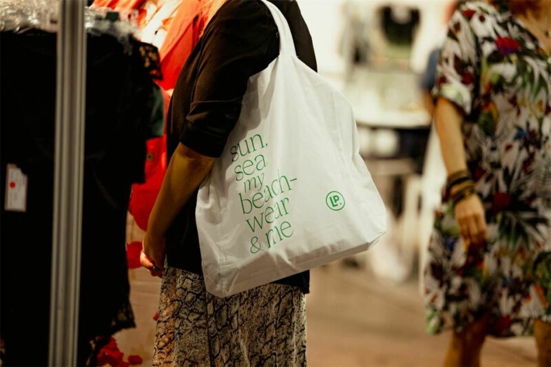
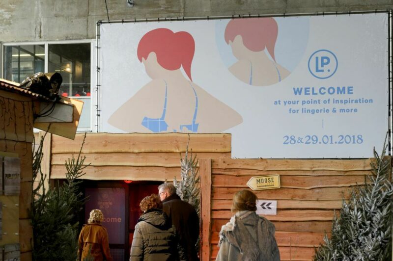
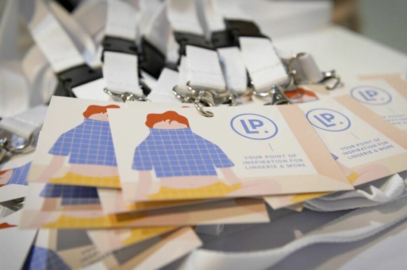
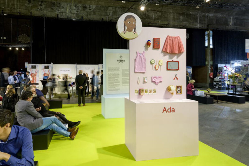
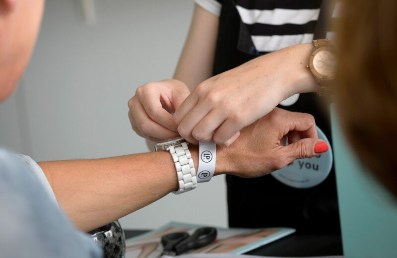
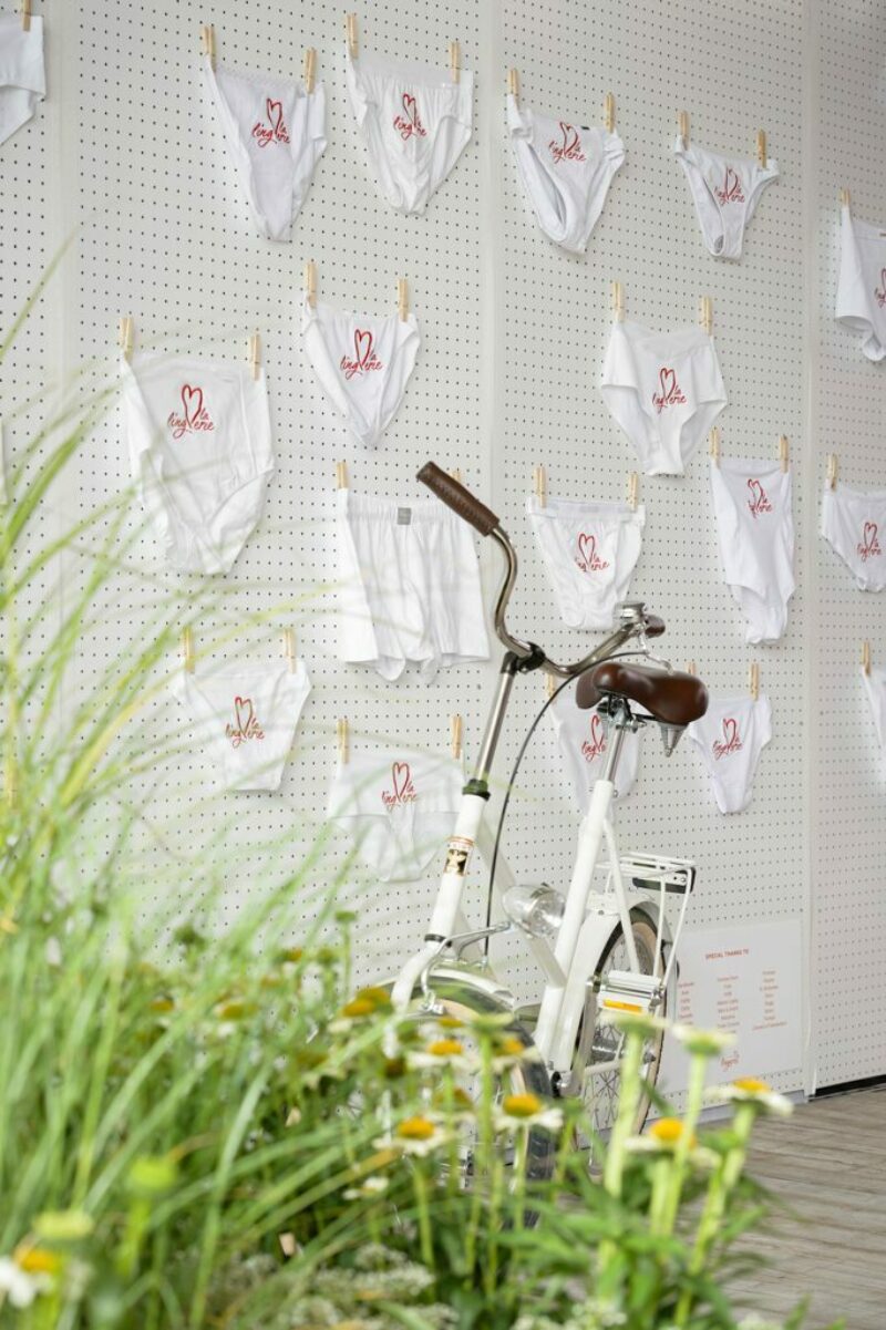
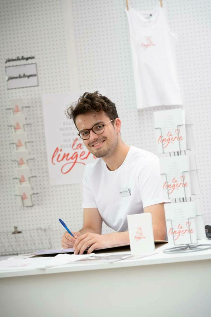
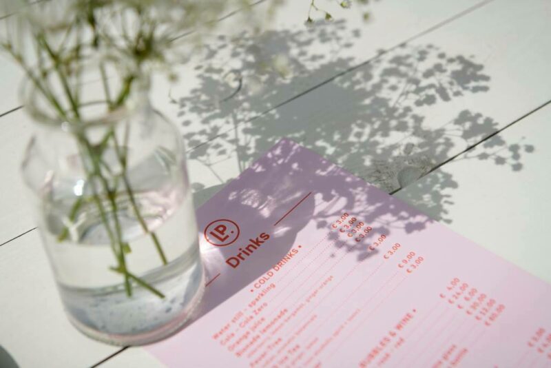
Scope of work
- Campaign
- Event Material
- Signage
Identity for Lingerie Pro, Belgium’s biggest and only fashion trade fair for lingerie, sleep and beachwear. Friendly, feminine, elegant and accessible are the recurring keywords for each campaign. Apart from that, the sky is the limit and each campaign gets its own distinctive look based on that year's theme.
See full case -
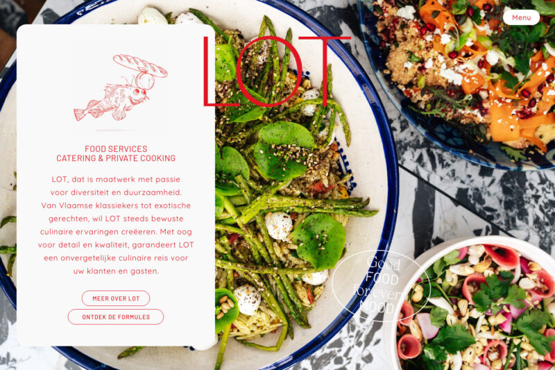
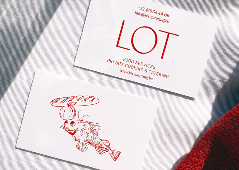
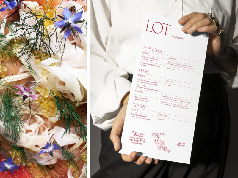
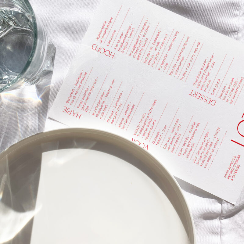
Scope of work
- Identity
- Copywriting
- Illustration
- Motion
- Website
- Social Media recommendations
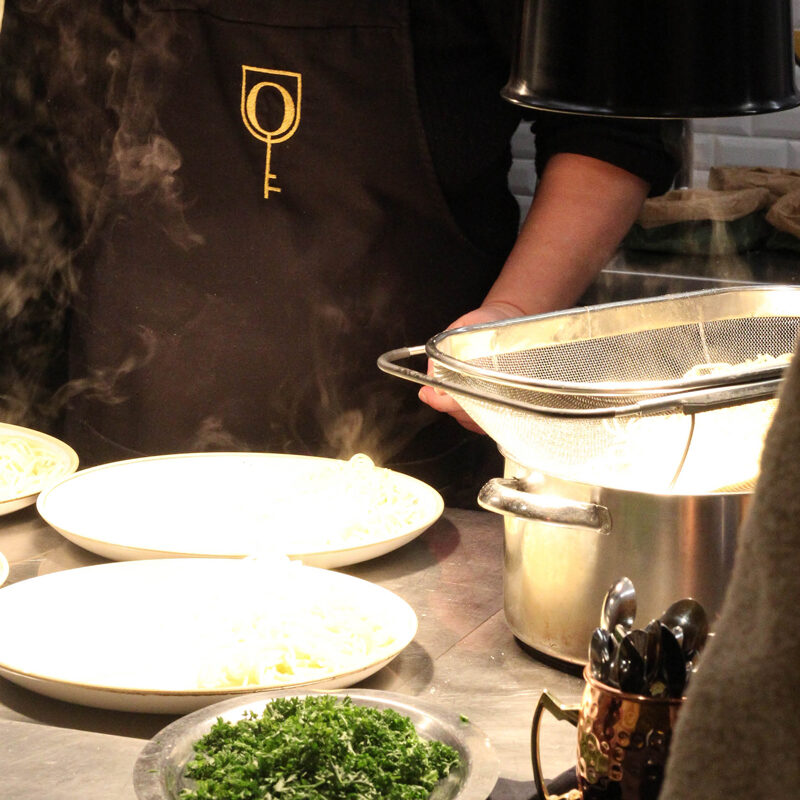
Love great food, but don't love to cook? Enter LOT, a catering concept with a finger-licking look'n feel. We created a total branding experience that brings LOT's food world to the forefront while also paving the way for future aspirations.
See full case -
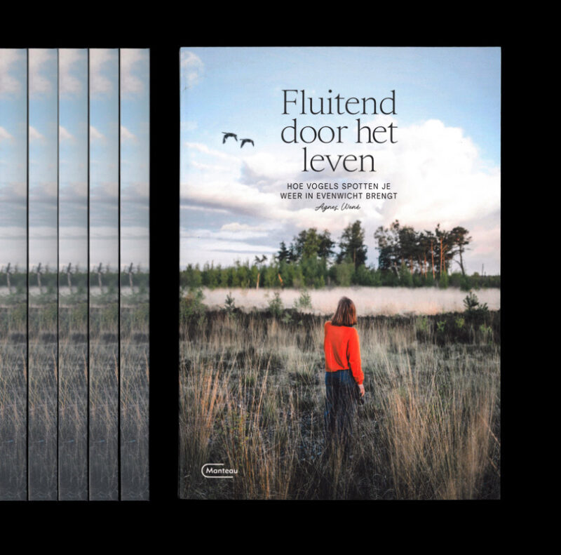
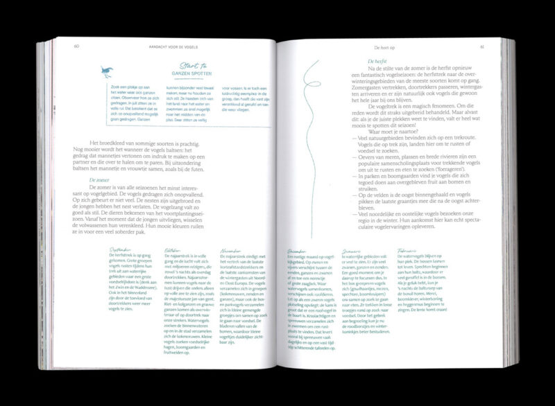
Scope of work
- Book design
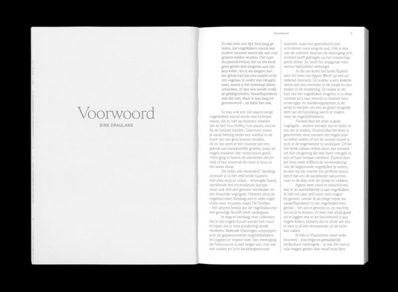
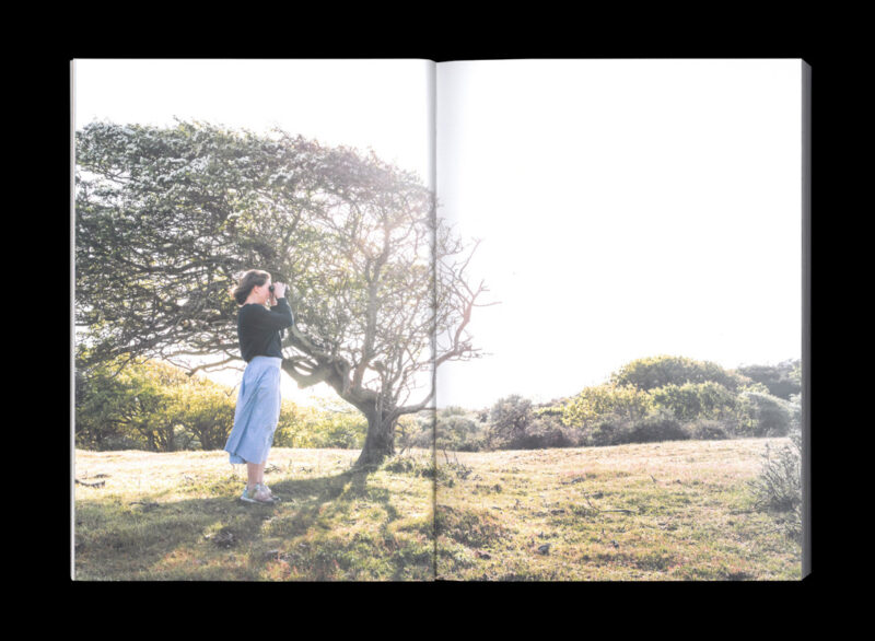
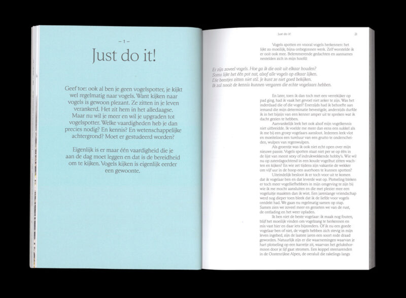
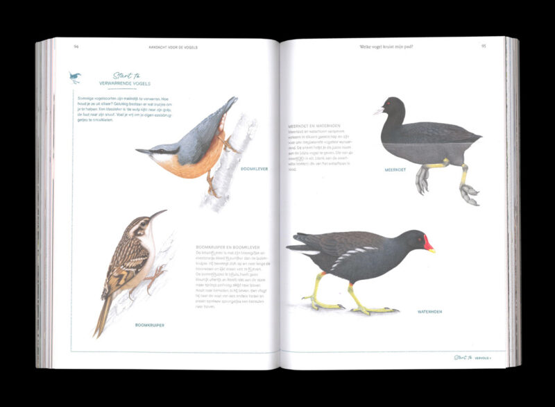
Publication design for Manteau Publishers — 'Fluitend door Het Leven', a start-to-bird book for beginners, introducing us to the positive effect birds can have on our mental state and wellbeing.
-
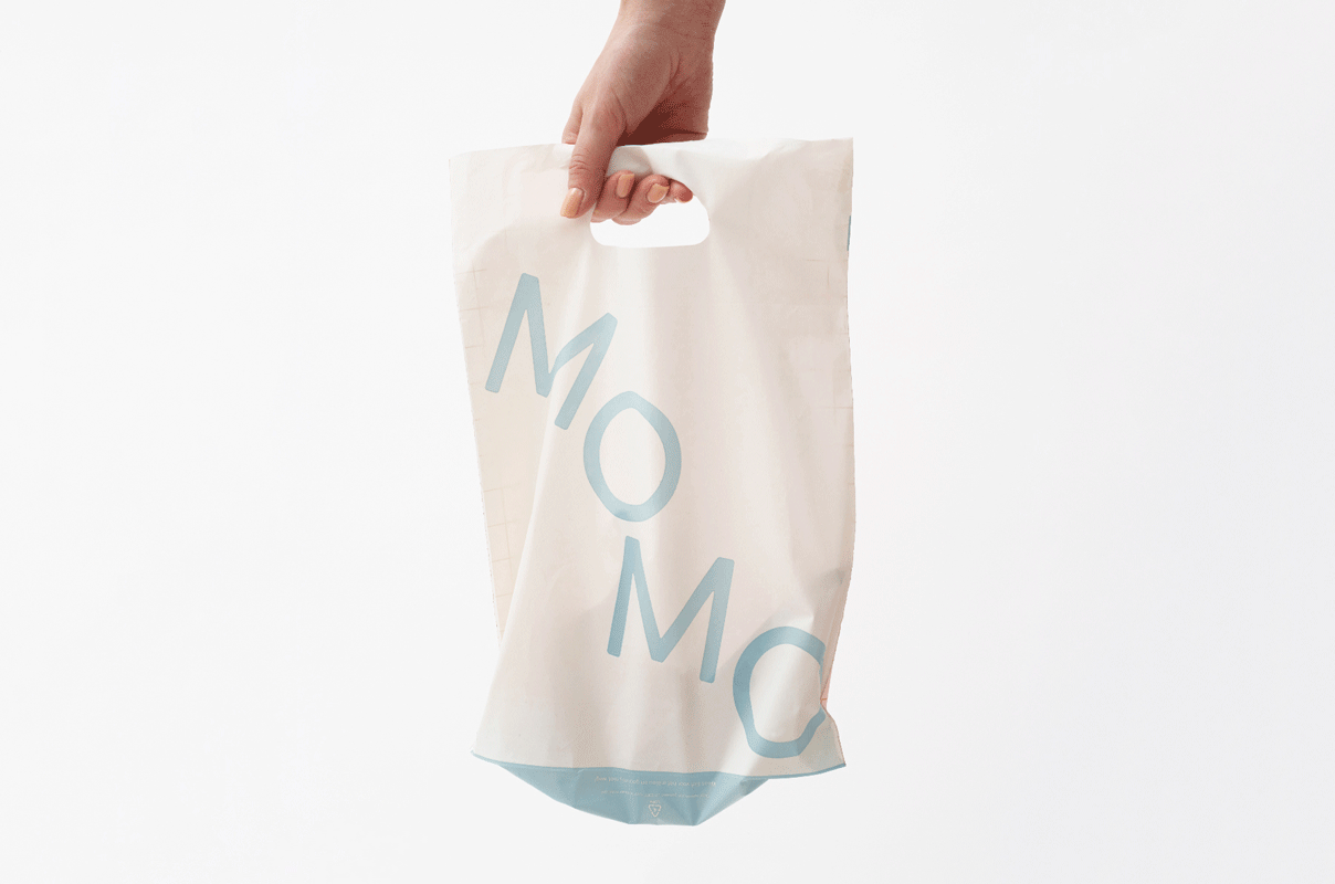
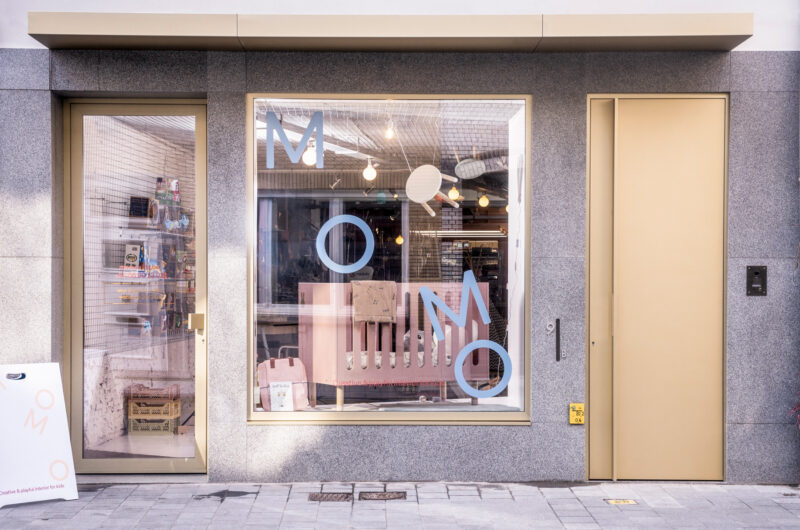
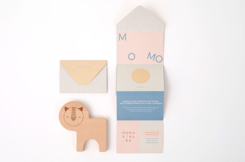
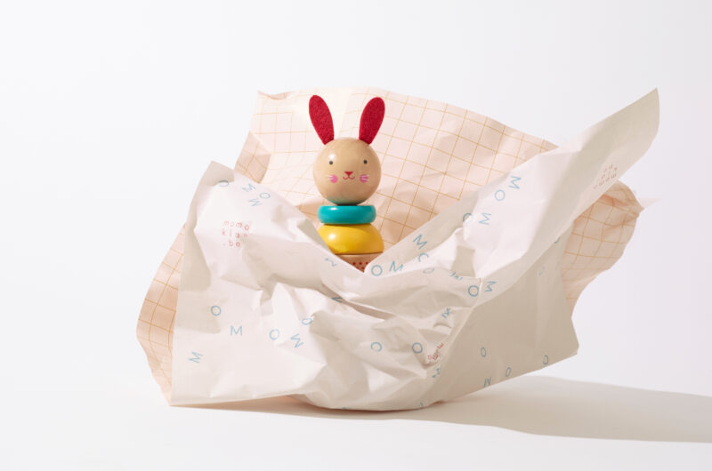
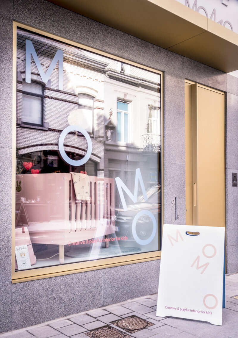
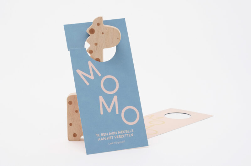
Scope of work
- Visual Identity
- Signage
MOMO, an online shop & offline store for kids interiors with a new brand identity that moves/bounces/dances/hops around the space freely, just like a child at play.
See full case -
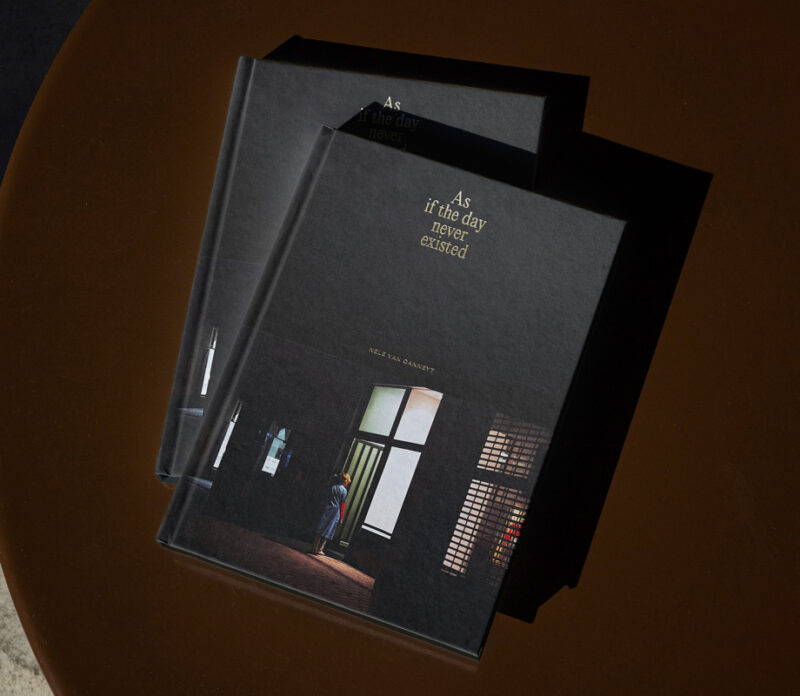
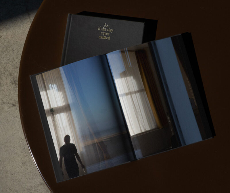
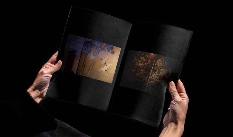
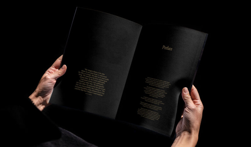
Scope of work
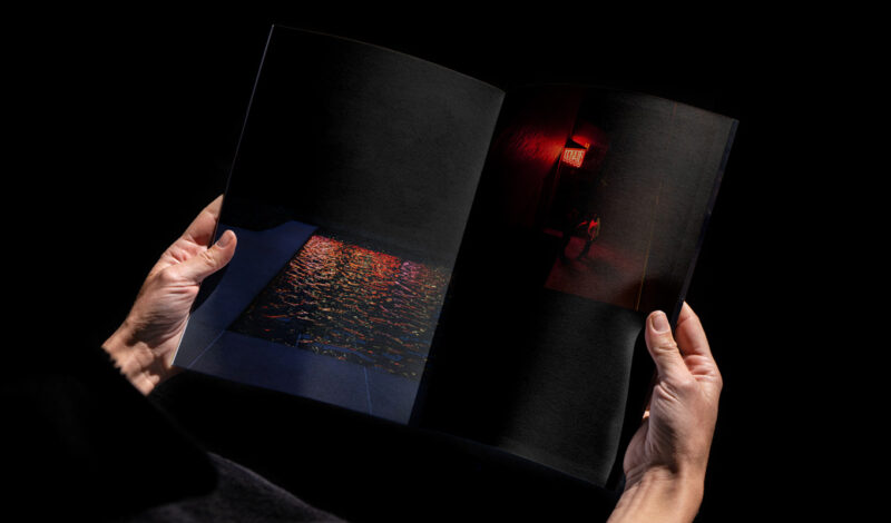
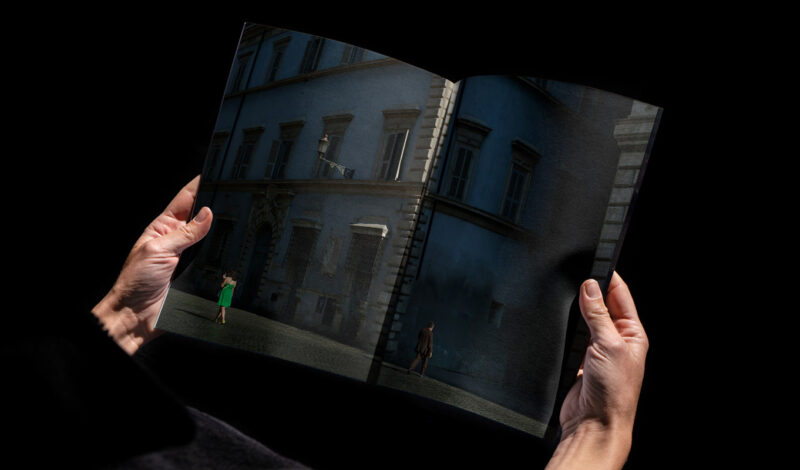
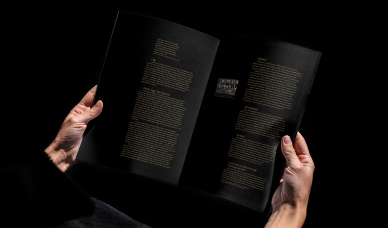
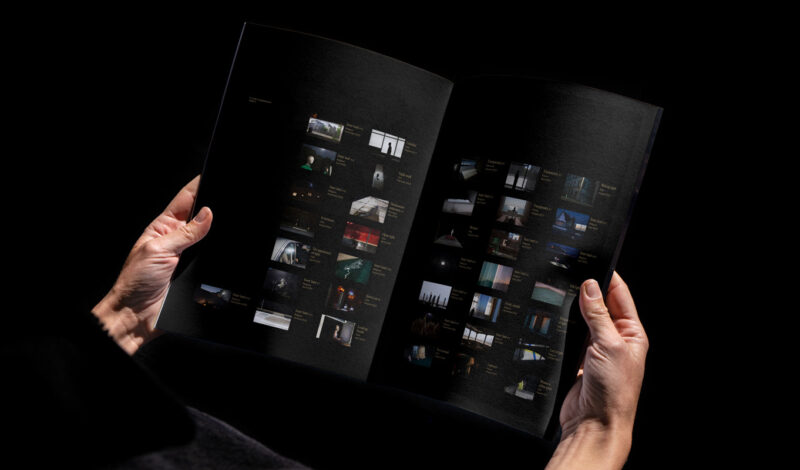
- Book design
Nele Van Canneyt’s ‘As if the day never existed’ is about the in-between zone that arises between the day and the night. As if the night never stops / the day never starts, the book design submerges you into the eternal timelessness that is found in between the two. The impeccable production exists of an illuminating spot varnish on every image, a minimised overlap for the cover, 8-page-binding for an excellent book-opening and a warm gold foil on the cover.
See full case -
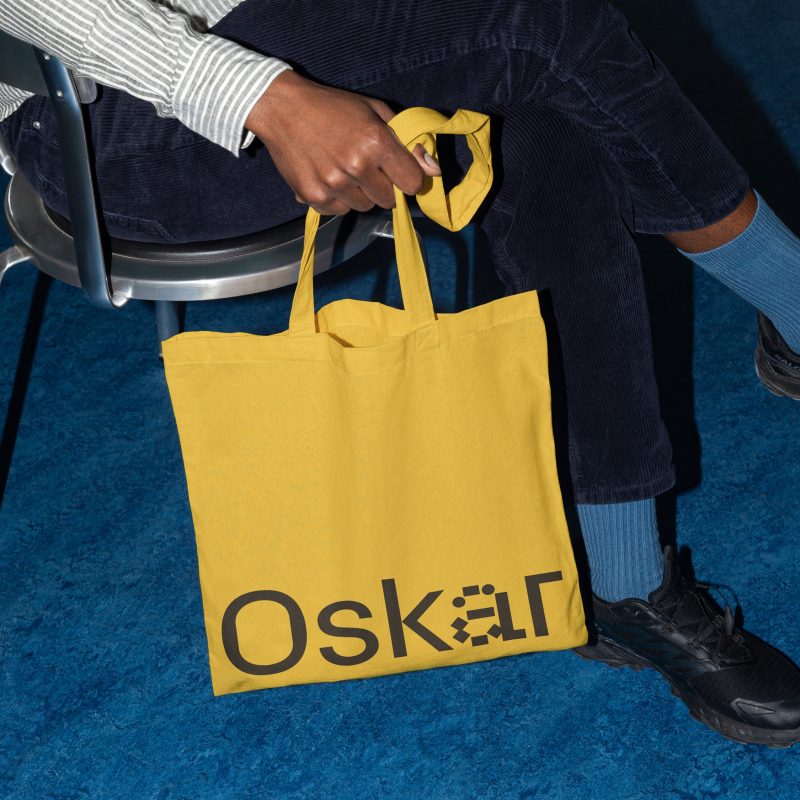
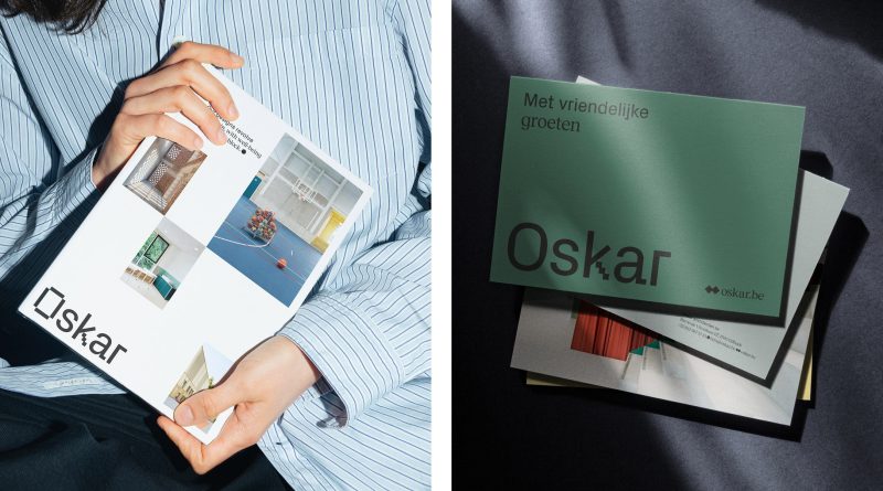
Scope of work
- Strategy
- Visual Identity
- Copywriting
- Website
- Signage
We redefined Oskar’s identity to emphasize their dual expertise in learning and living. Inspired by their human-centered philosophy, the new brand system highlights this duality through a consistent split design, applied across all touchpoints from digital to print. The result is a clear, approachable identity that cements Oskar’s place as a leader in creating spaces that prioritize people and sustainability.
See full case -
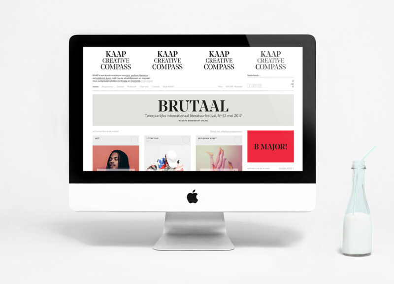
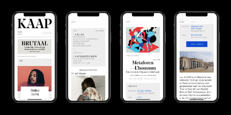
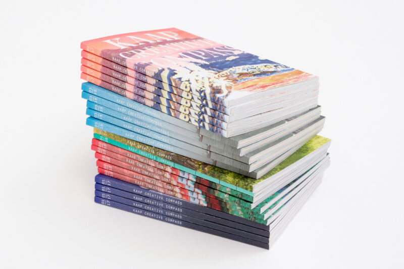
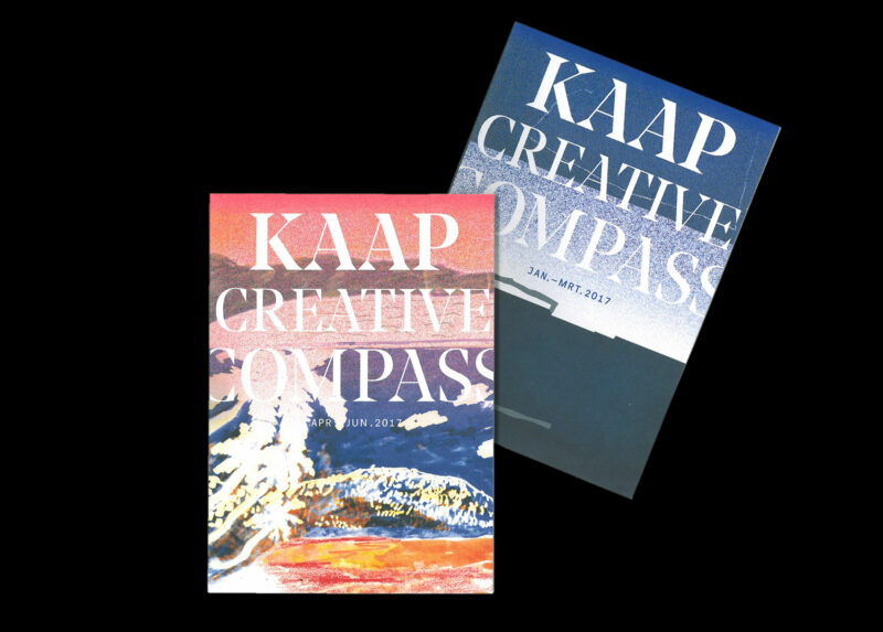
Scope of work
- Strategy
- Identity
- Digital
-
-
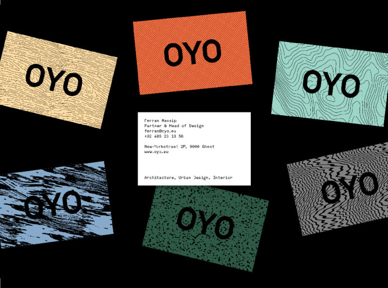
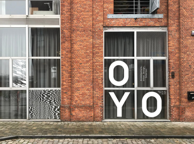
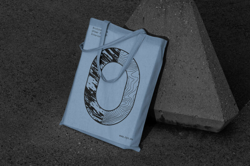
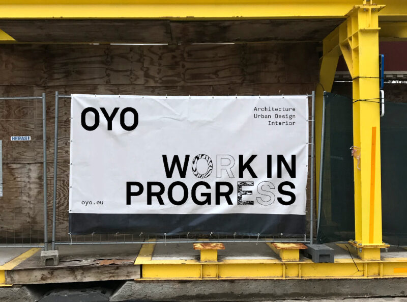
Scope of work
- Strategy
- Identity
- Website
A new visual identity and website for OYO, an architectural studio that challenges conventions to reveal the true potential of space.
See full case -
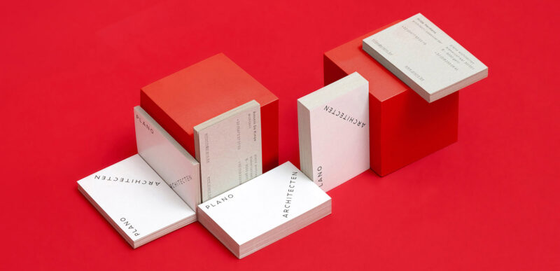
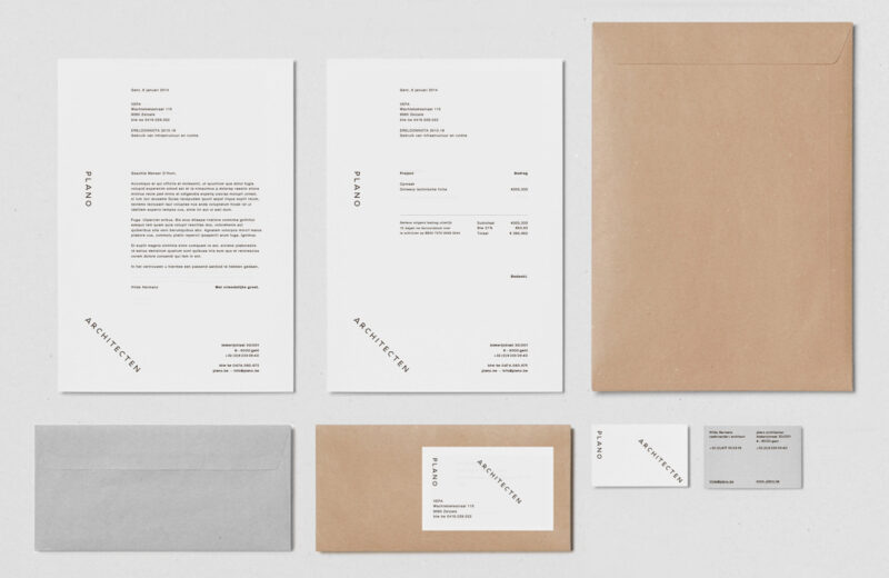
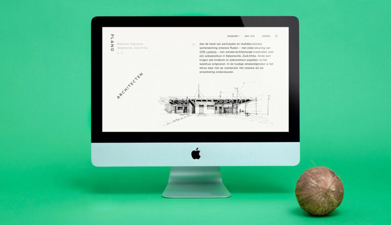
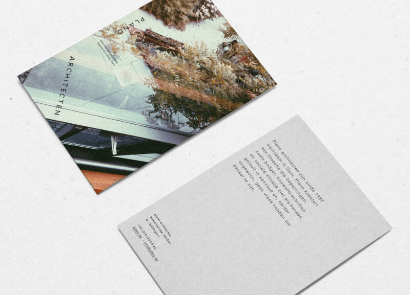
Scope of work
- Identity
- Website
Straightforward identity and website for Plano Architecten.
-
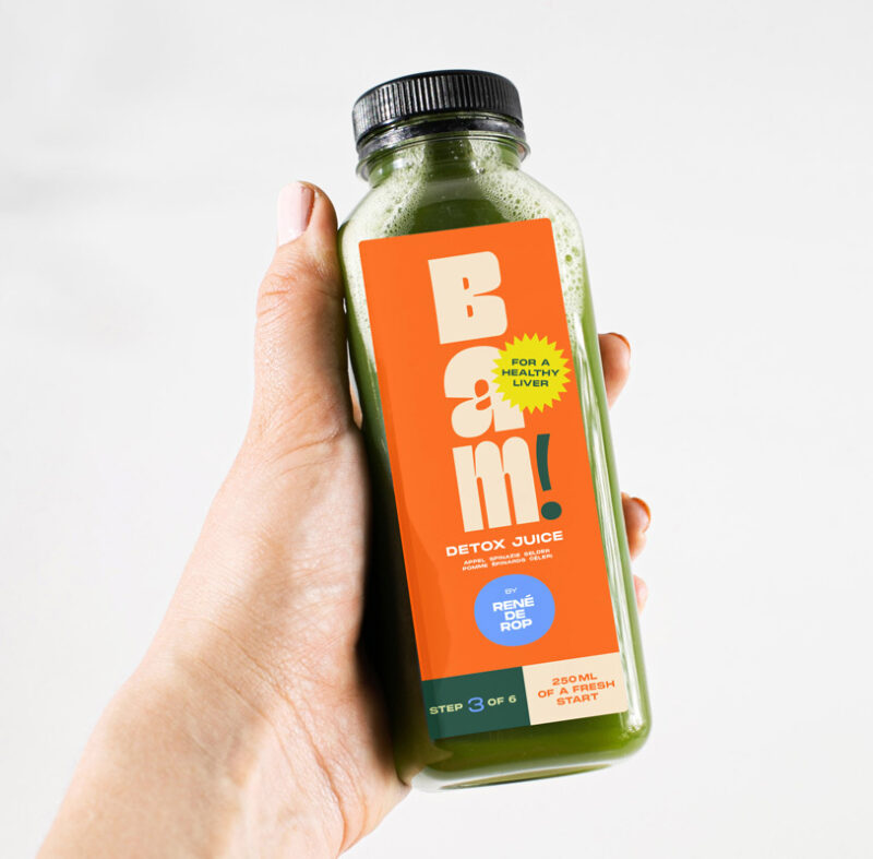
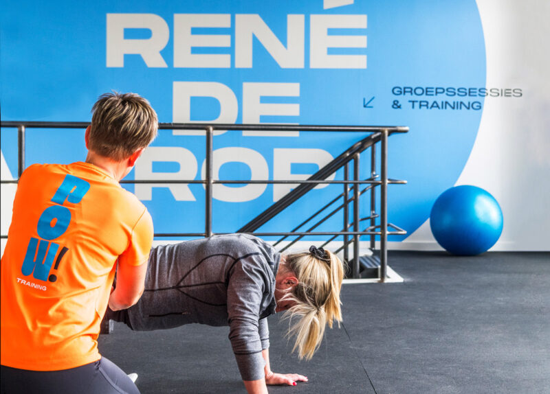
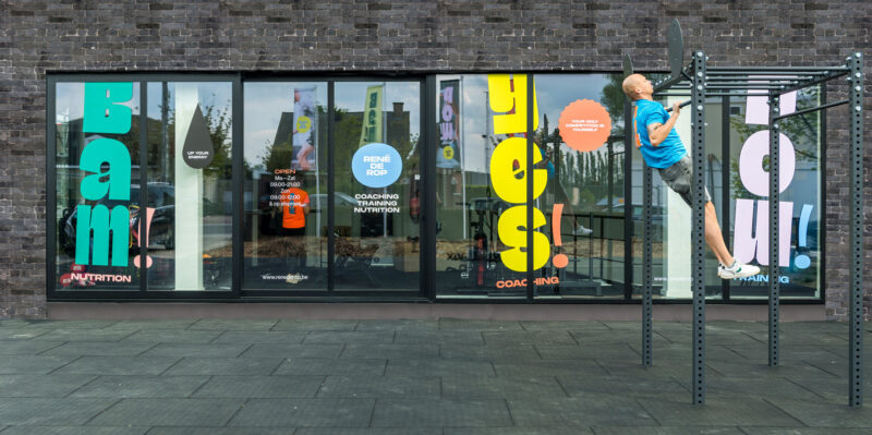
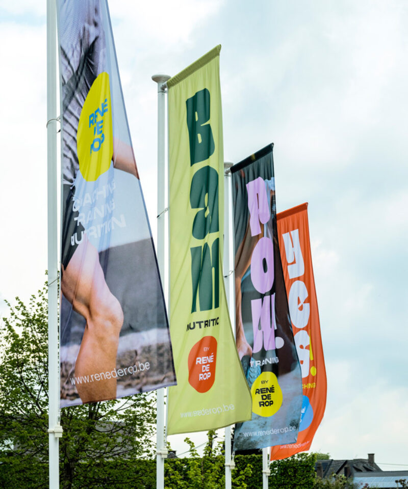
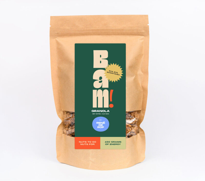
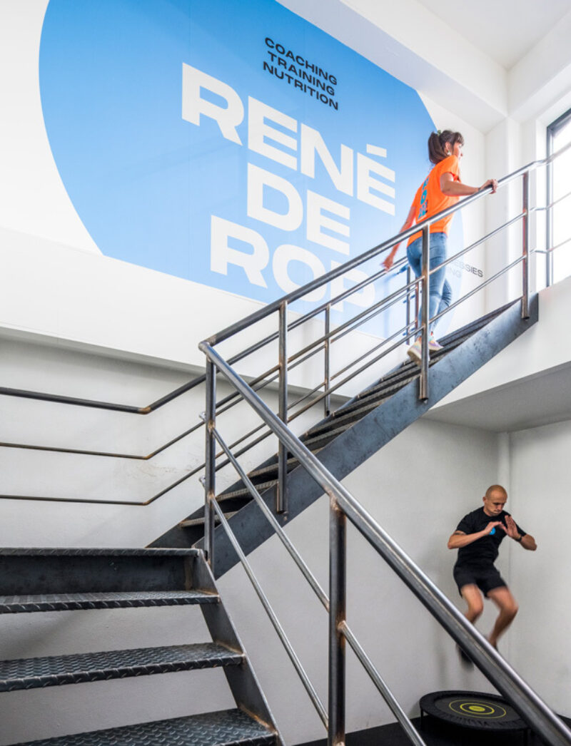
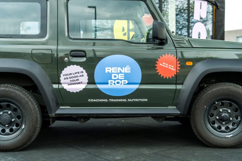
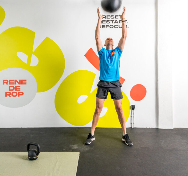
Scope of work
- Strategy
- Naming
- Identity
- Copywriting
- Packaging
- Signage
- Website
- Social Media
Identity for life coach René De Rop. While helping him grow his business from personal trainer to an overall fitness and health brand, he had only one condition: make sure it radiates the personal touch and endless energy for which he is known.
See full case -
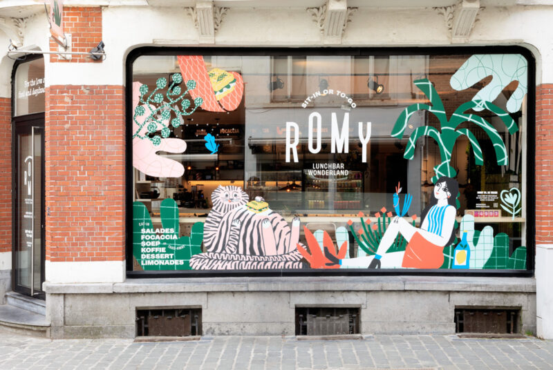
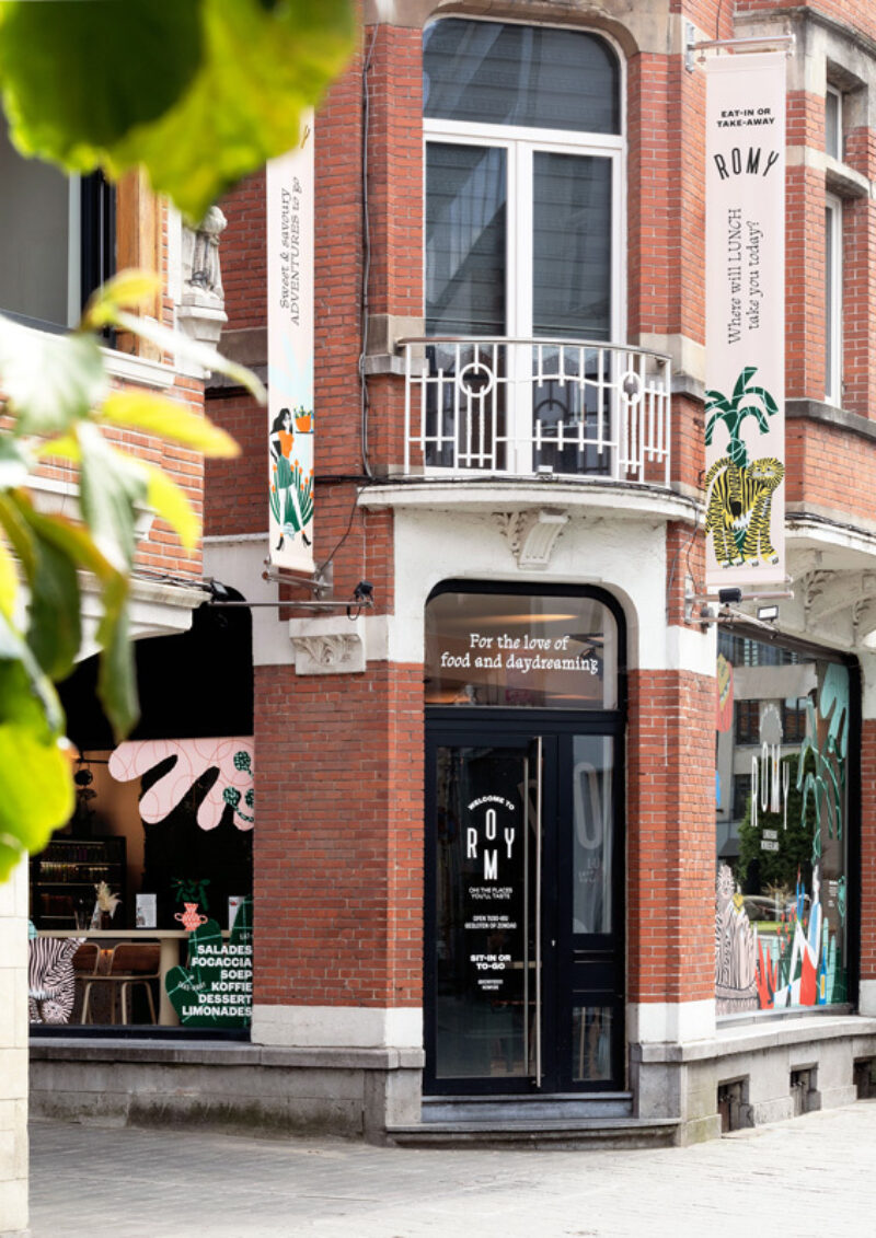
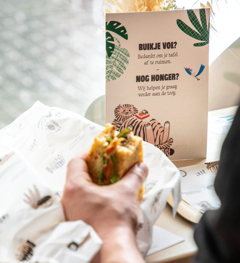
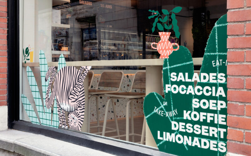
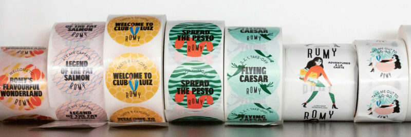
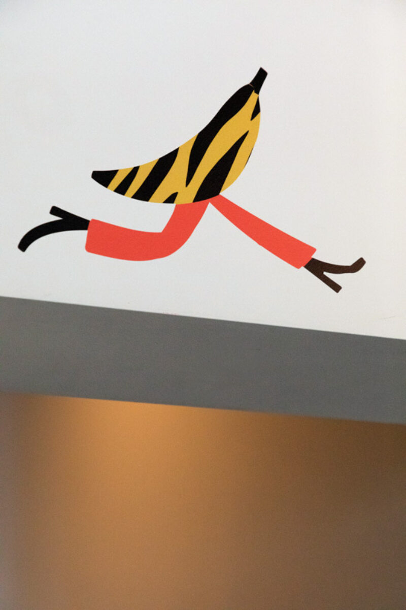
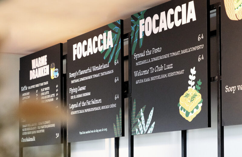
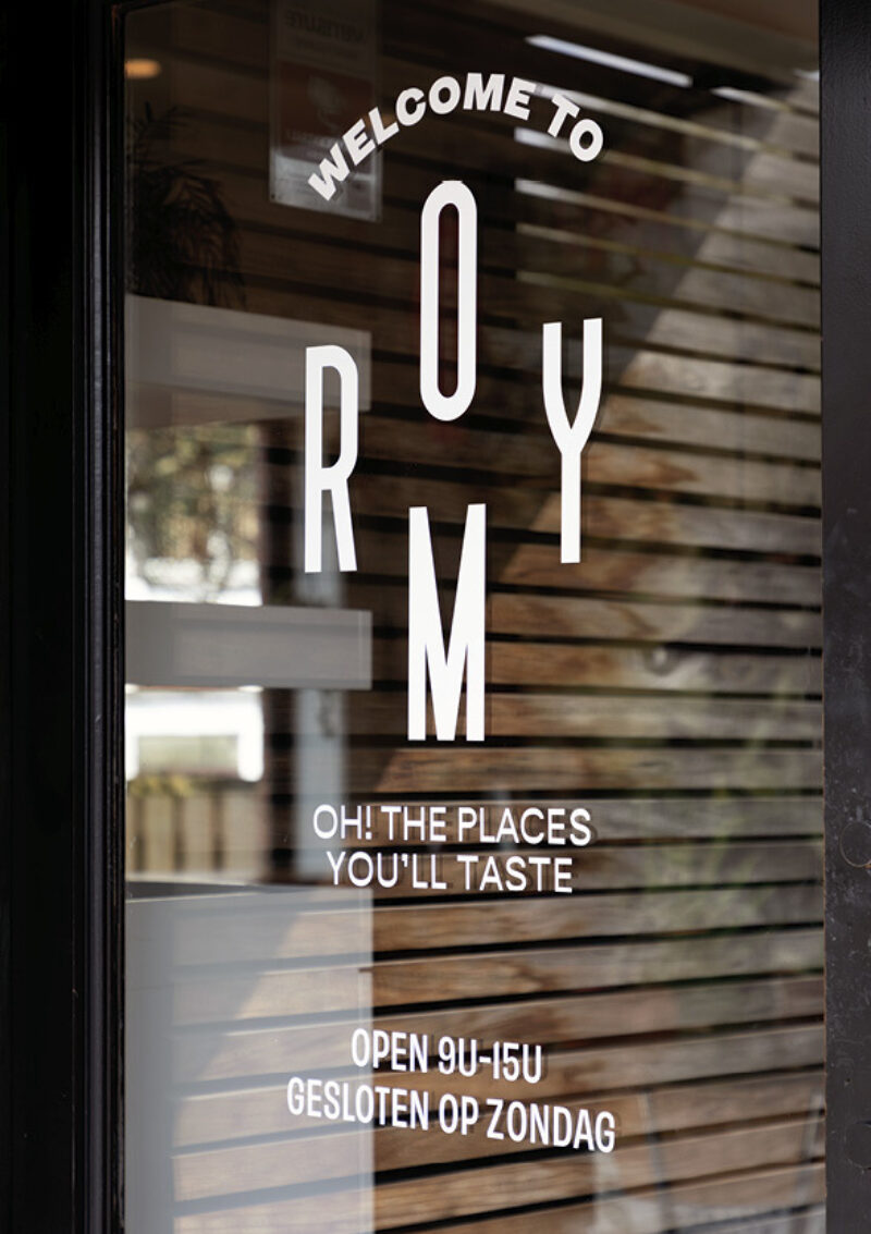
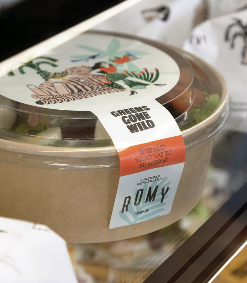
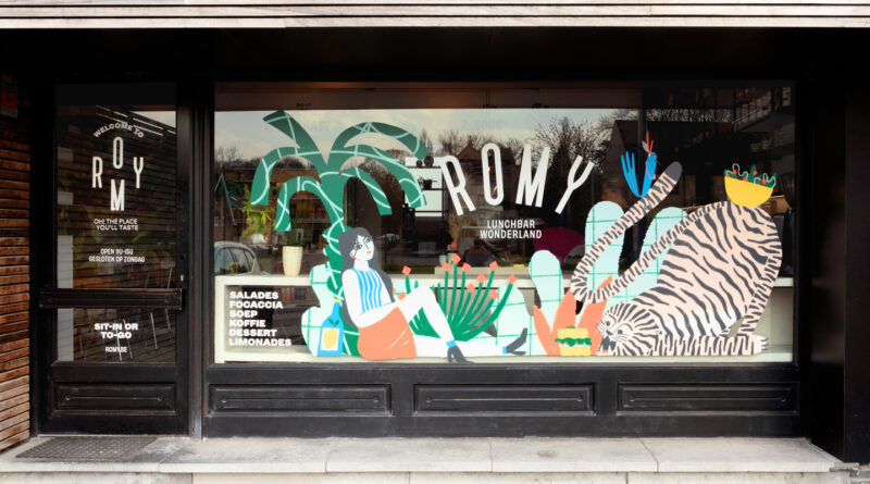
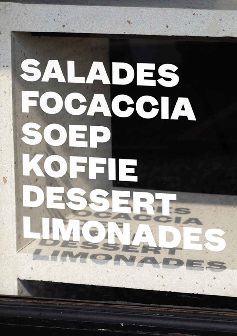
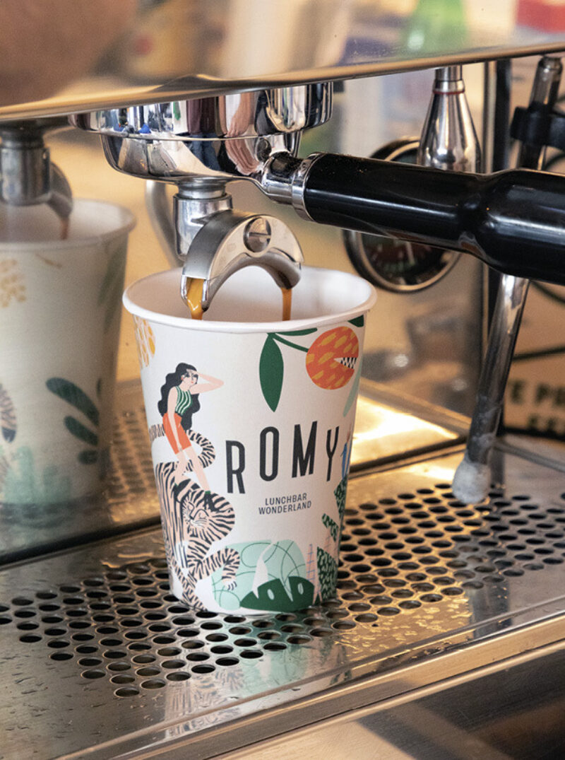
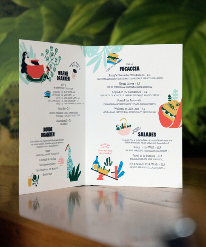
Scope of work
- Strategy
- Identity
- Copywriting
- Illustration
- Packaging
- Social Media
- Signage
ROMY is a lunchbar and brand that seeks to transport customers from daily life to a world of endless imagination through delicious, flavourful food. Our design aimed to create a magical Wonderland that seamlessly blended the realms of food and fantasy.
See full case -
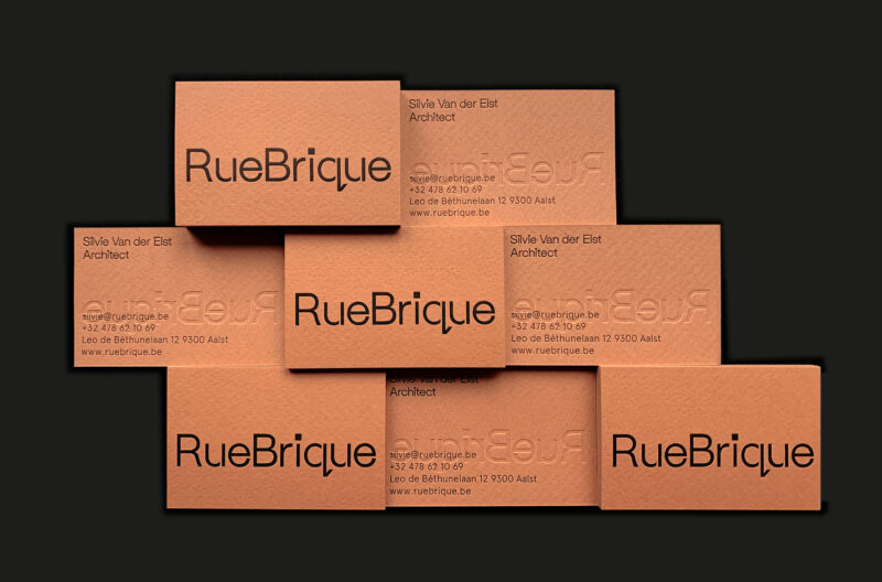
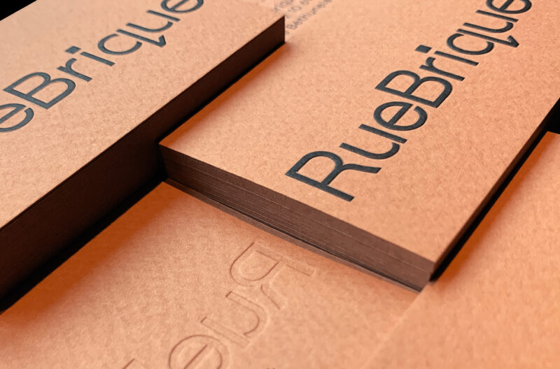
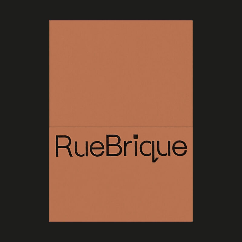
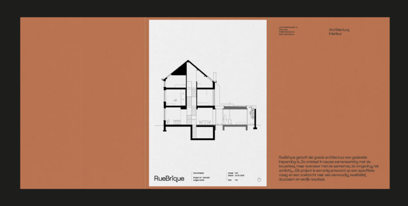
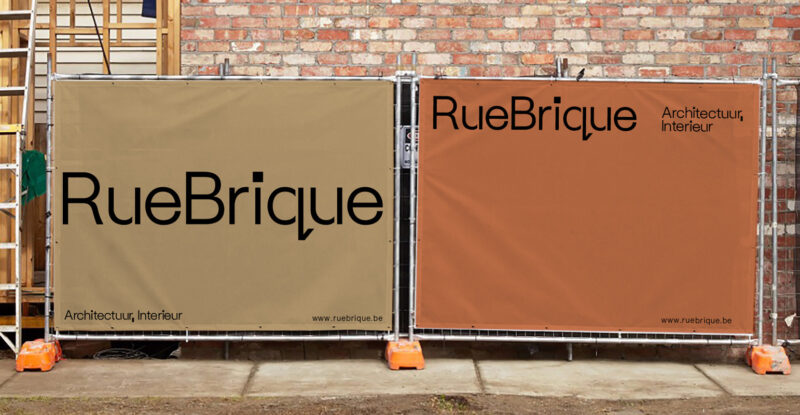
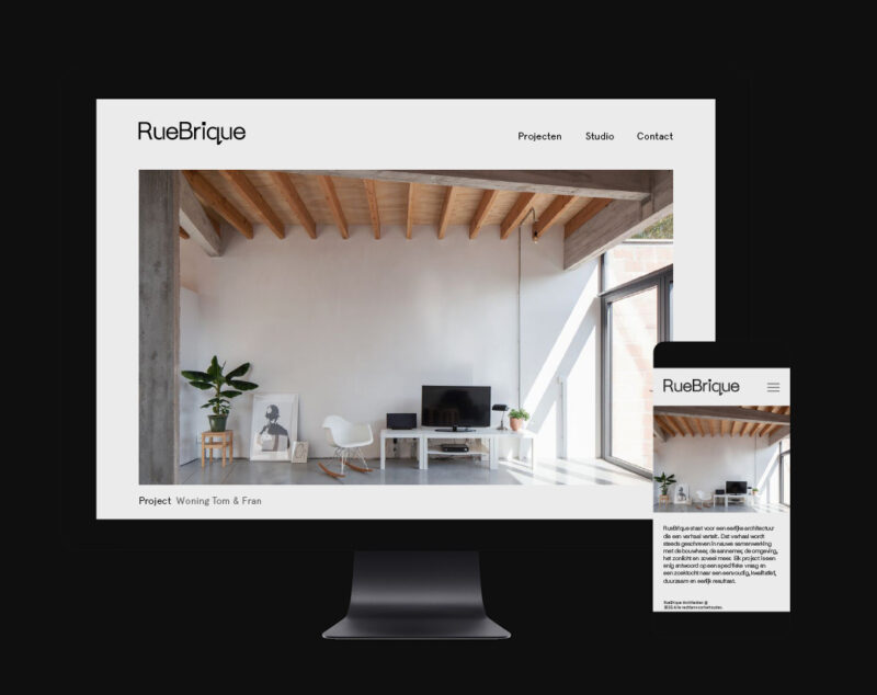
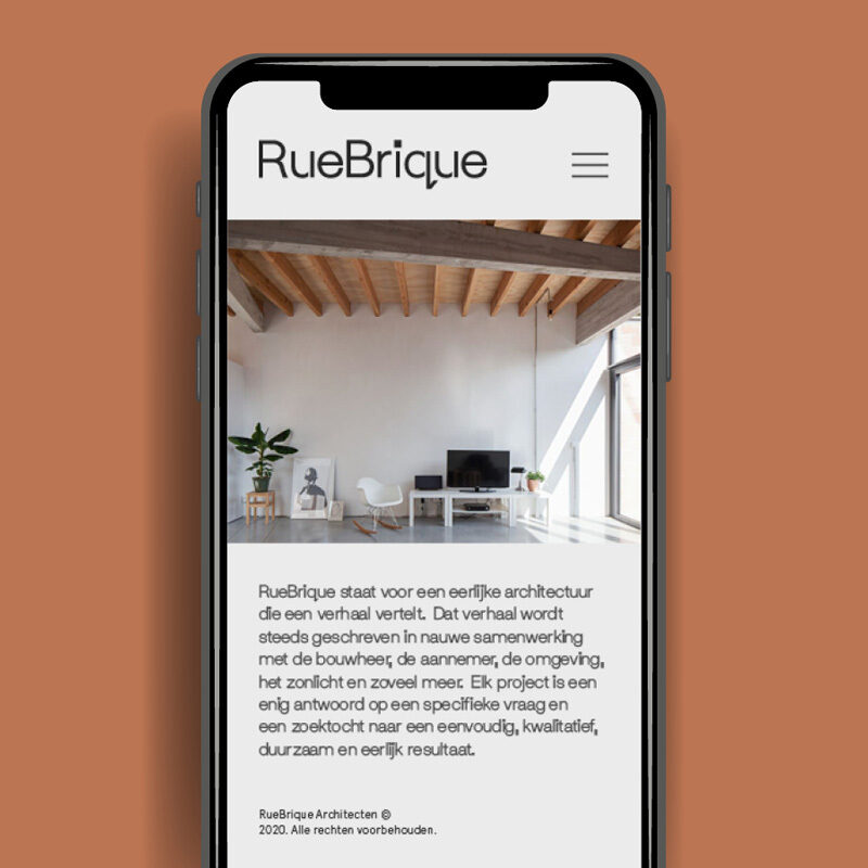
Scope of work
- Identity
- Website
Straightforward, modest identity and website for architecture studio RueBrique. Letterpressed and embossed with the greatest of care.
-
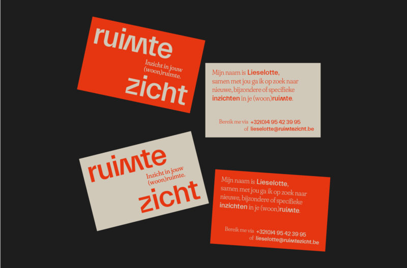
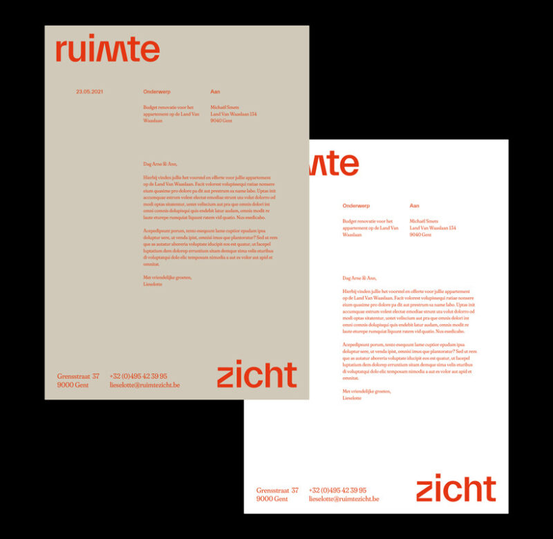
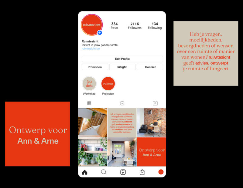
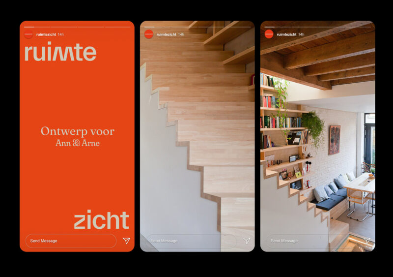
Scope of work
- Naming
- Identity
- Social Media
Identity for Ruimtezicht, a hands-on architecture & interior practice. The identity is built as a graphical system that represents the duality of a fixed idea, image or insight surrounded by a flexible framework.
See full case -
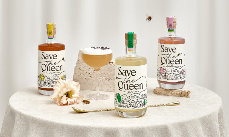
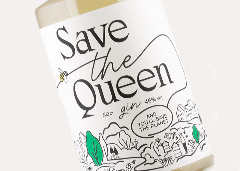
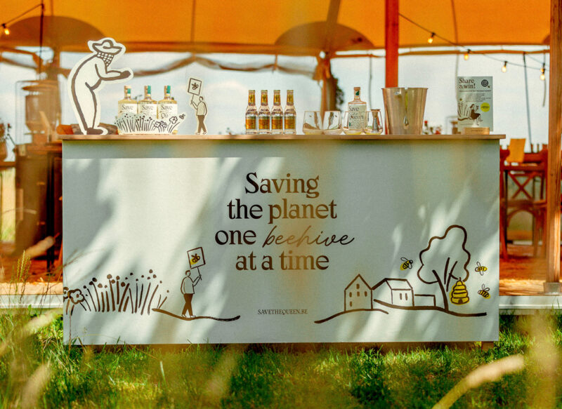
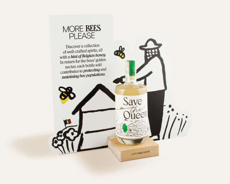
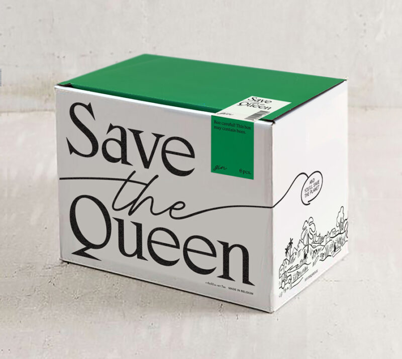
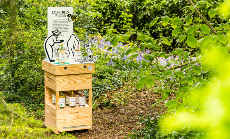
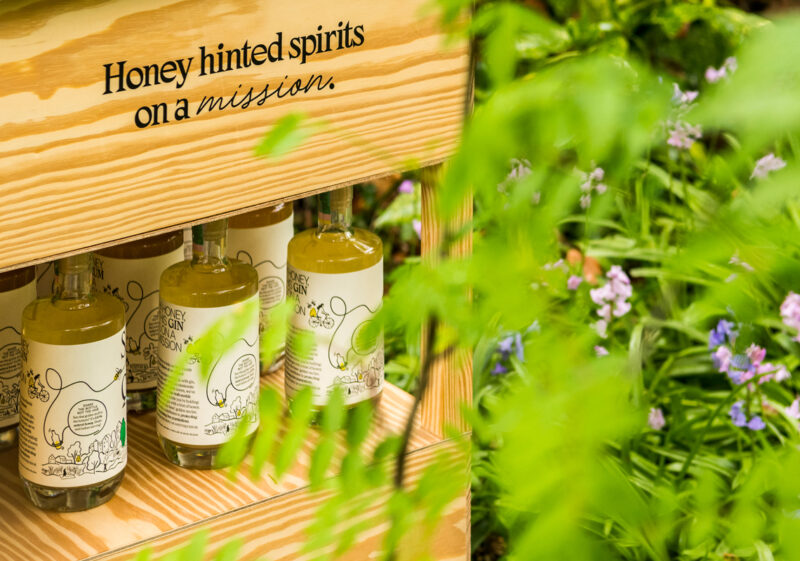
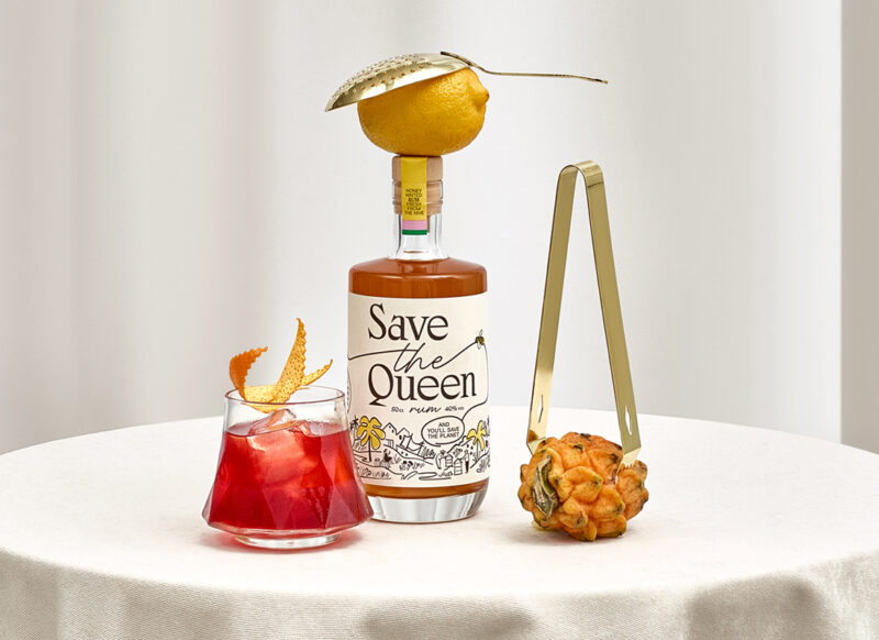
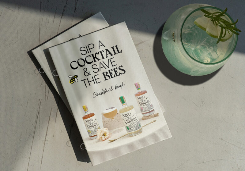
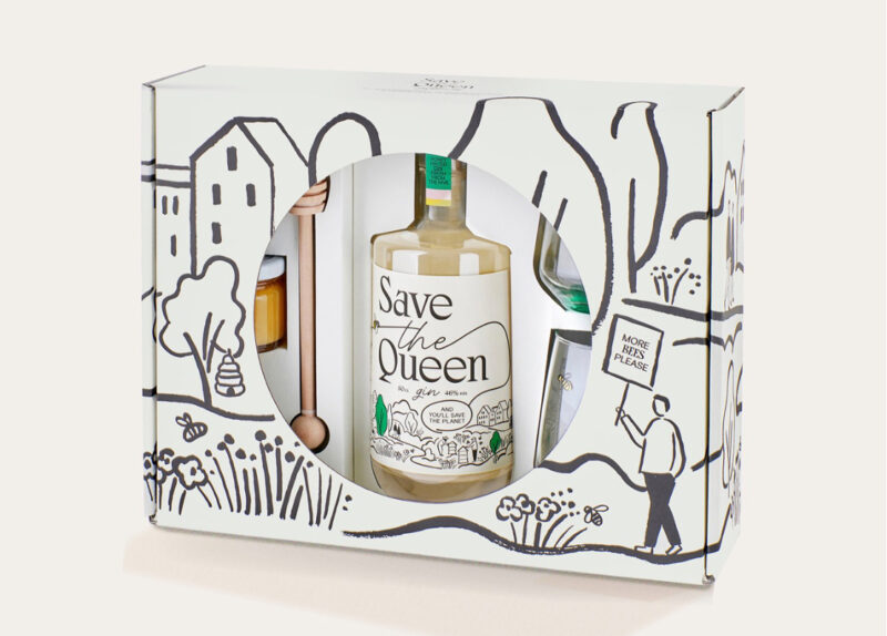
Scope of work
- Strategy
- Identity
- Copywriting
- Packaging
- Art Direction
- Social Media
- Event Material
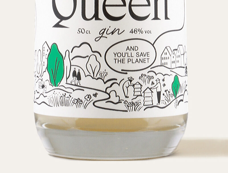
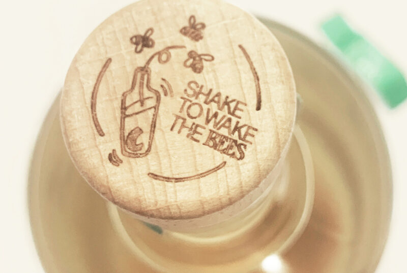
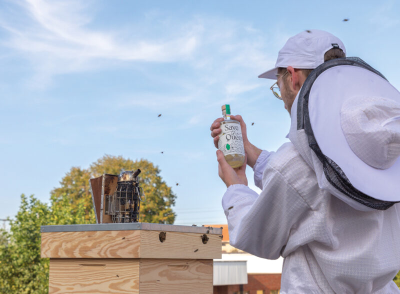
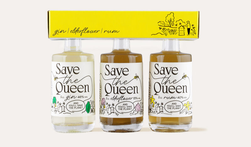
Save The Queen, a premium gin with a heart of gold. For the rebranding, we repositioned their mission as their main focus, visualising the collaboration of man & bee, spirit & honey, distillery & hive.
See full case -
Scope of work
- Strategy
- Identity
- editorial
- Digital
-
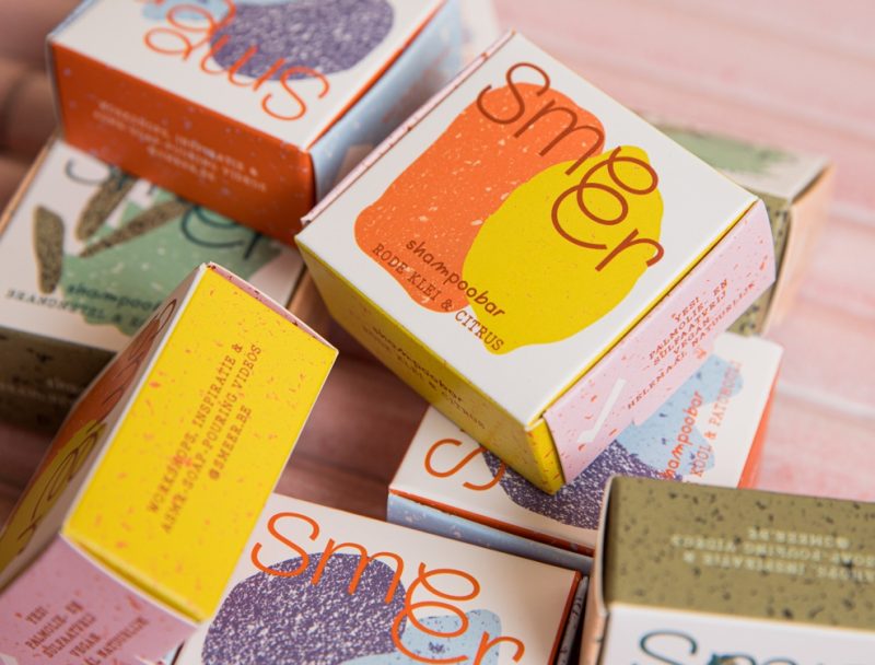
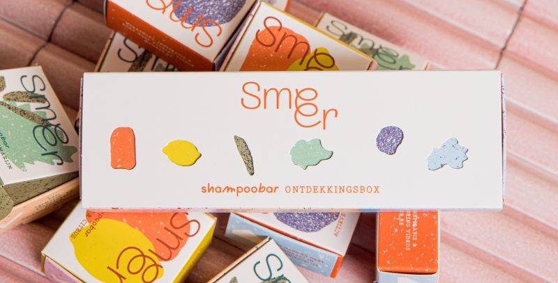
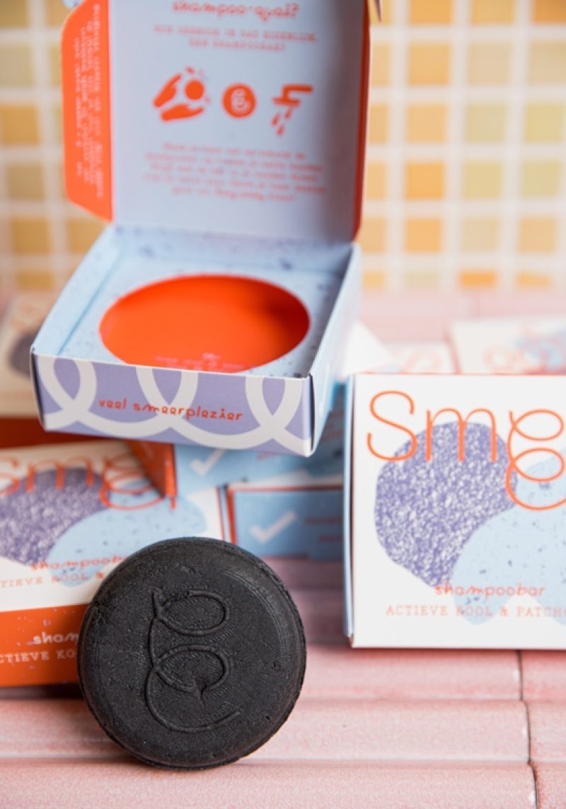
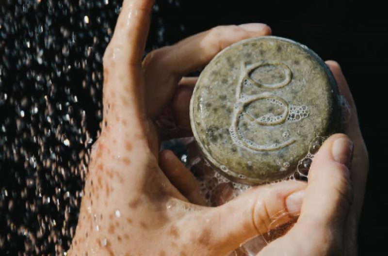
Scope of work
- Analysis & Recommendations
- Packaging
- Typography
- Illustration
- Copywriting
Suzan, founder of Smeer, crafts natural soaps in small batches from her garden atelier. For the launch of her new shampoobars, Superset expanded the existing toolbox to create a more playful, standout packaging, while ensuring a seamless fit with the existing range.
See full case -
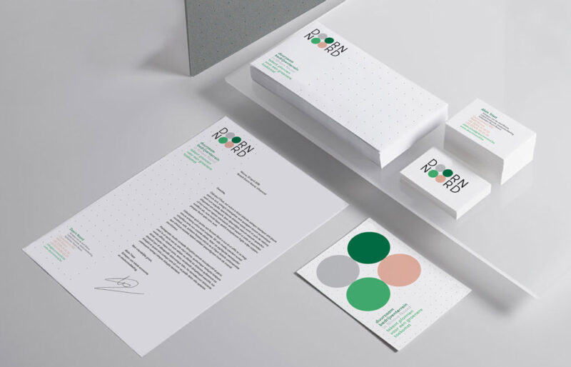
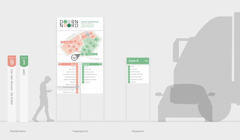
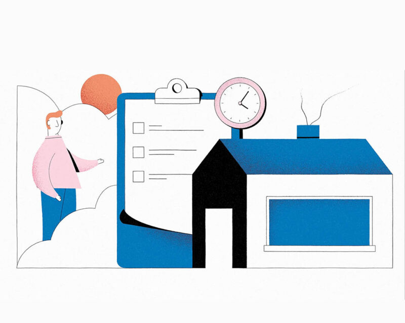
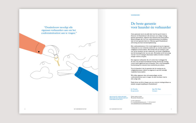
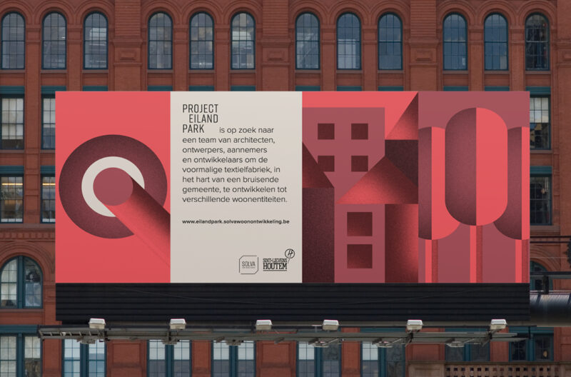
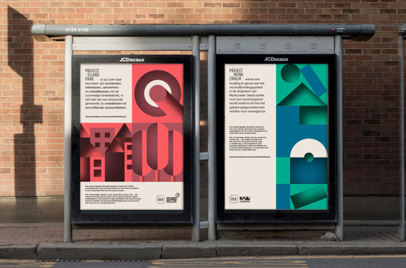
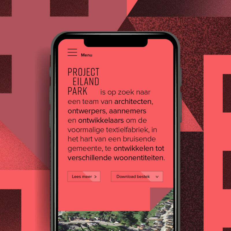
Scope of work
- Campaign
- Motion
- Signage
- Digital
- Event Material
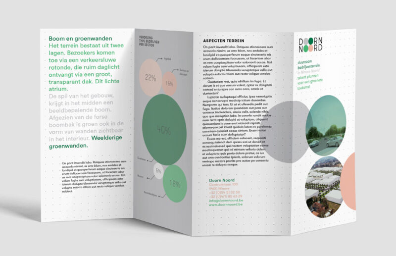
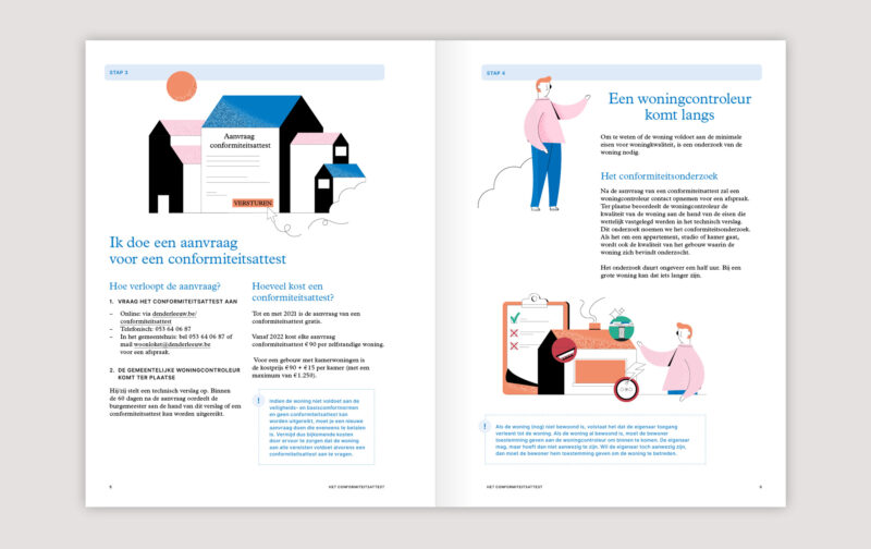
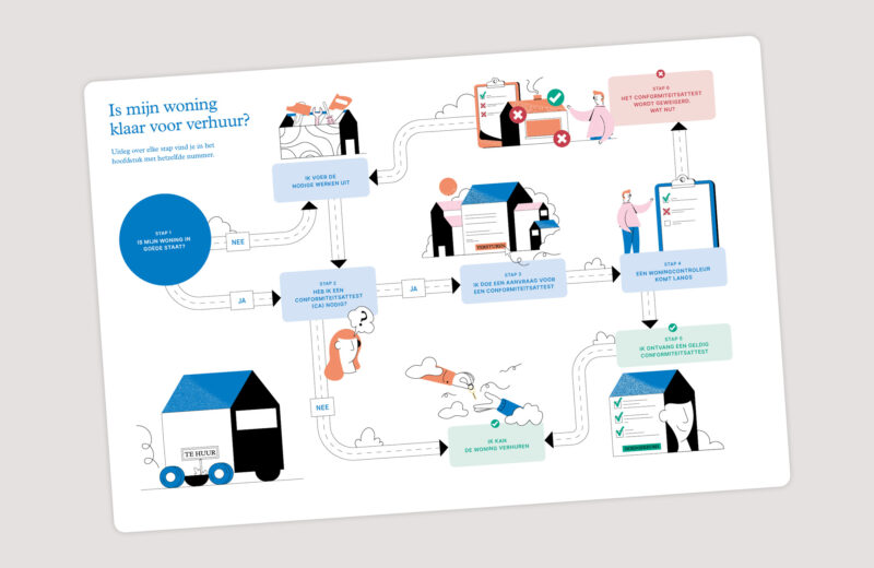
We've partnered with Solva since 2018 to work on a wide range of projects; from the identity for an ecological business park to a brochure & animation on quality requirements for rental homes.
See full case -
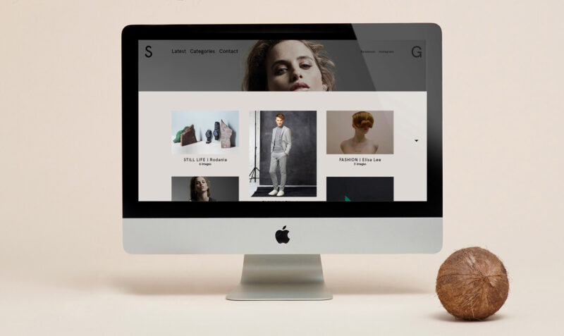
Scope of work
- Website
Website for photographer Stefanie Geerts with her work as the star of the show. In the galleries a custom back-end colorpicker enables her to add the right mood to the series.
-
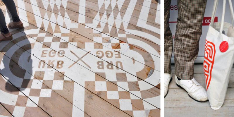
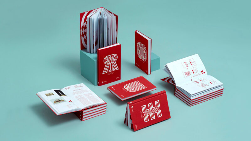
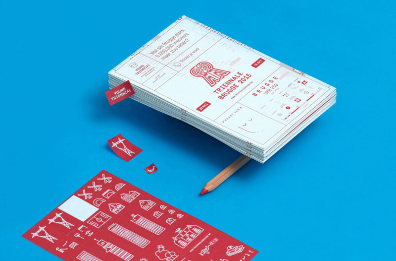
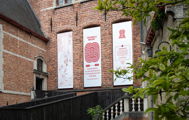
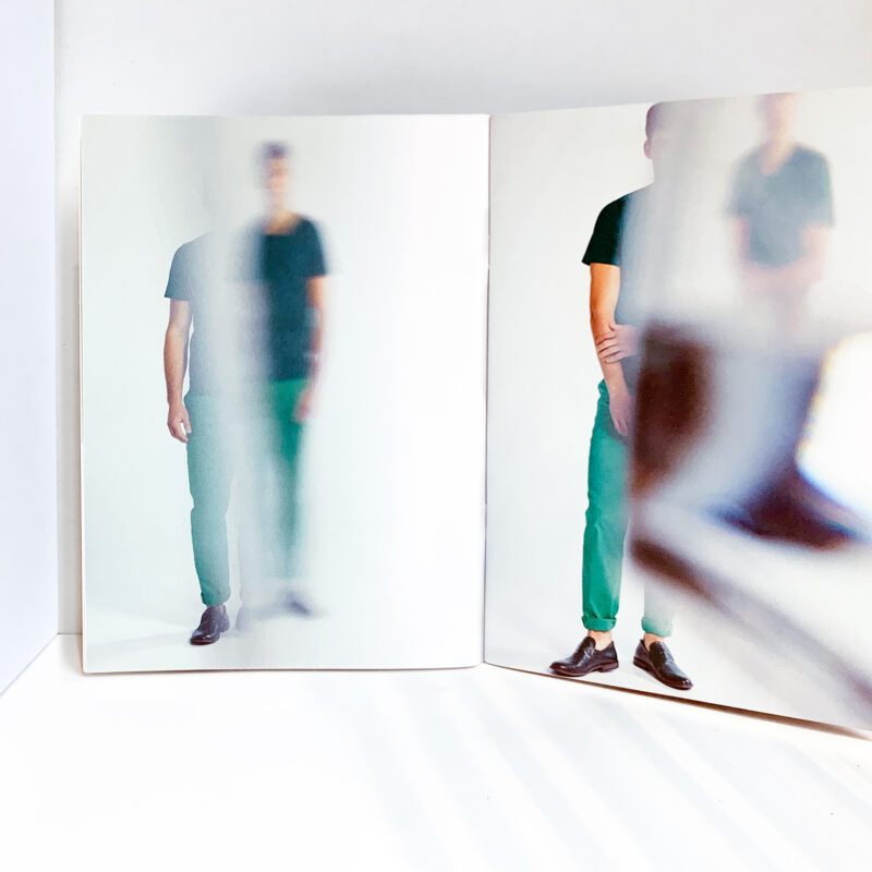
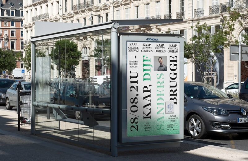
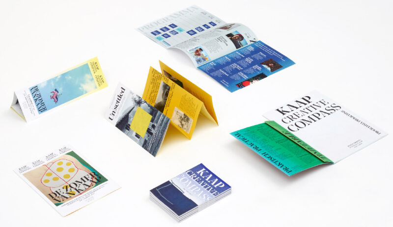
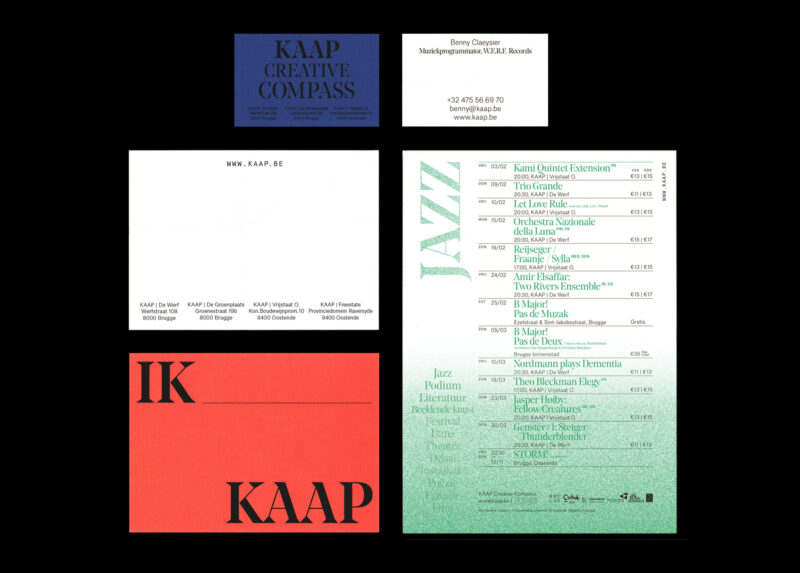
Scope of work
- Strategy
- Identity
- Campaign
- Book design
- Signage
- Website
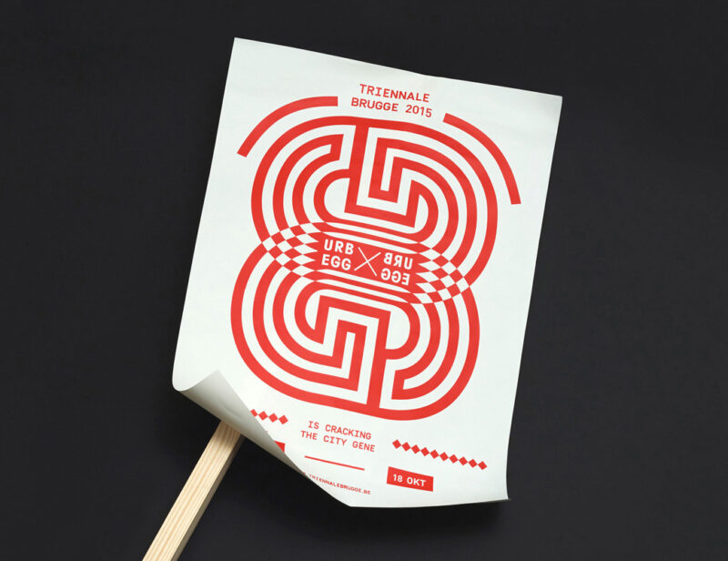
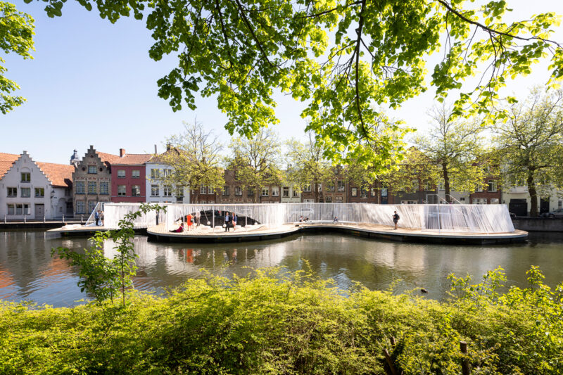
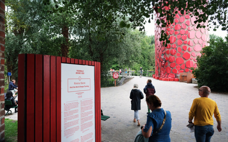
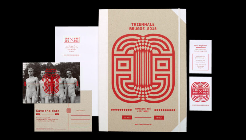
Identity and campaigns for the first contemporary art and architectural triennial of Bruges. Designed around five symbols based on the letters of "Brugge", it visualises the city's growth and explosive, expansive nature.
See full case -
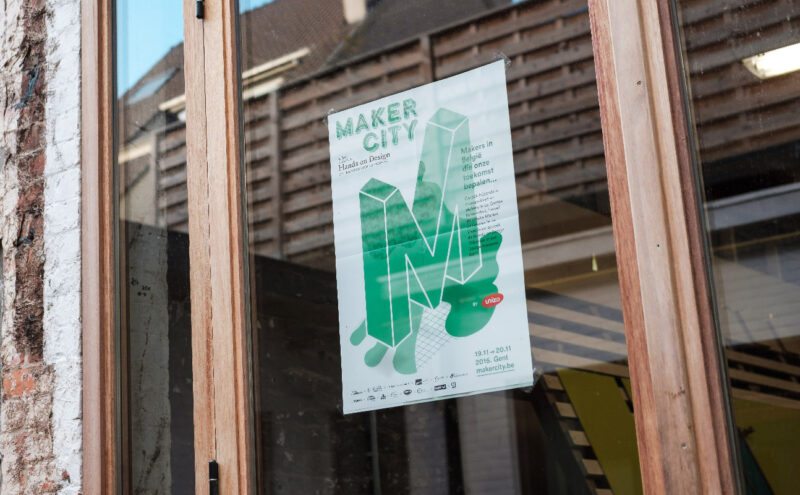
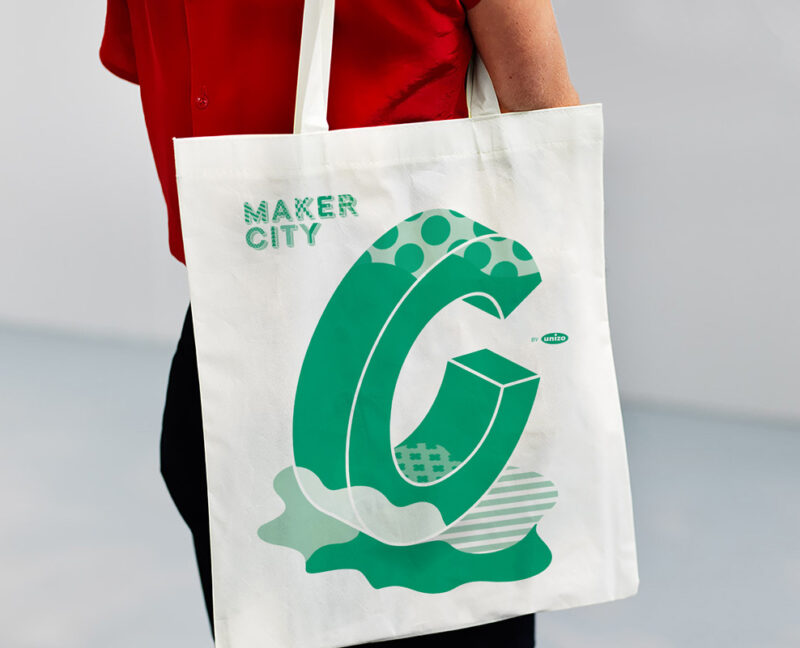
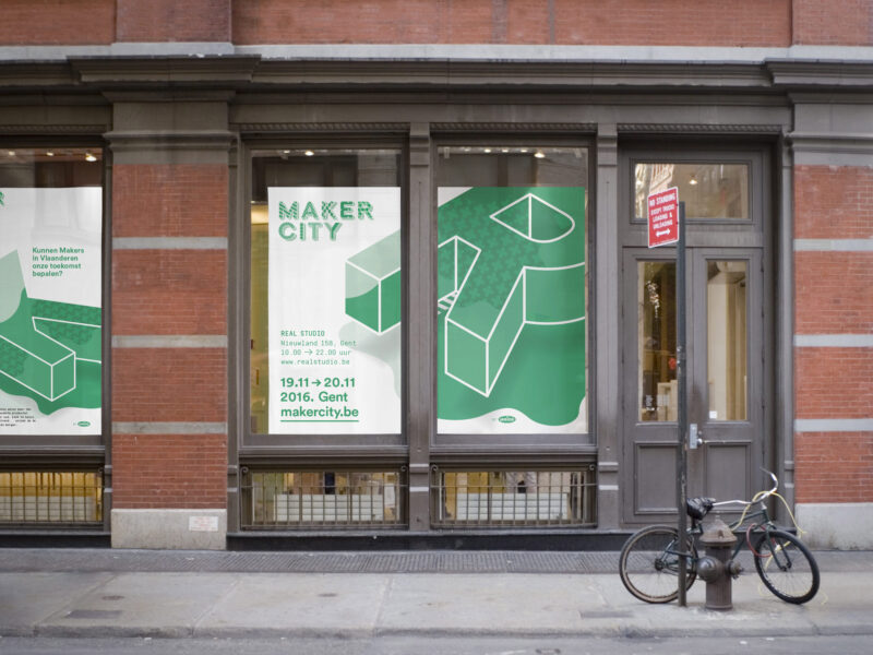
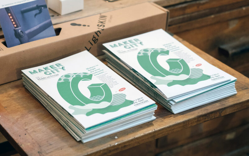
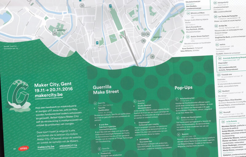
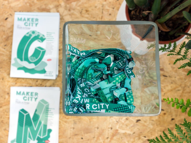
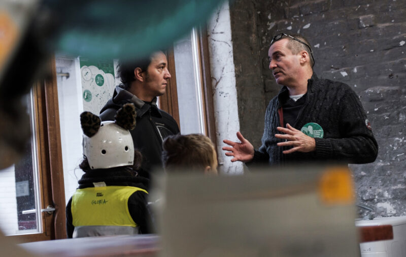
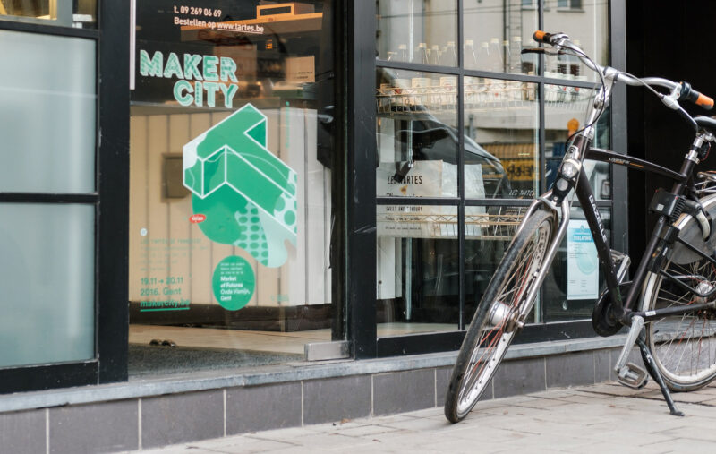
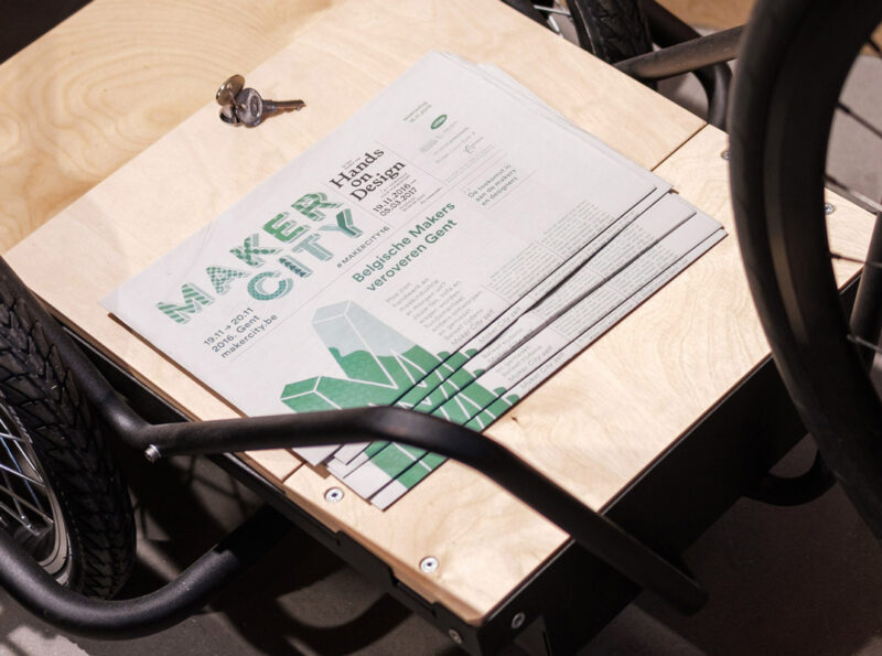
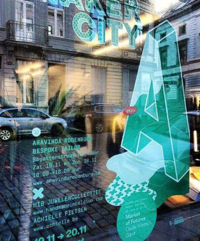
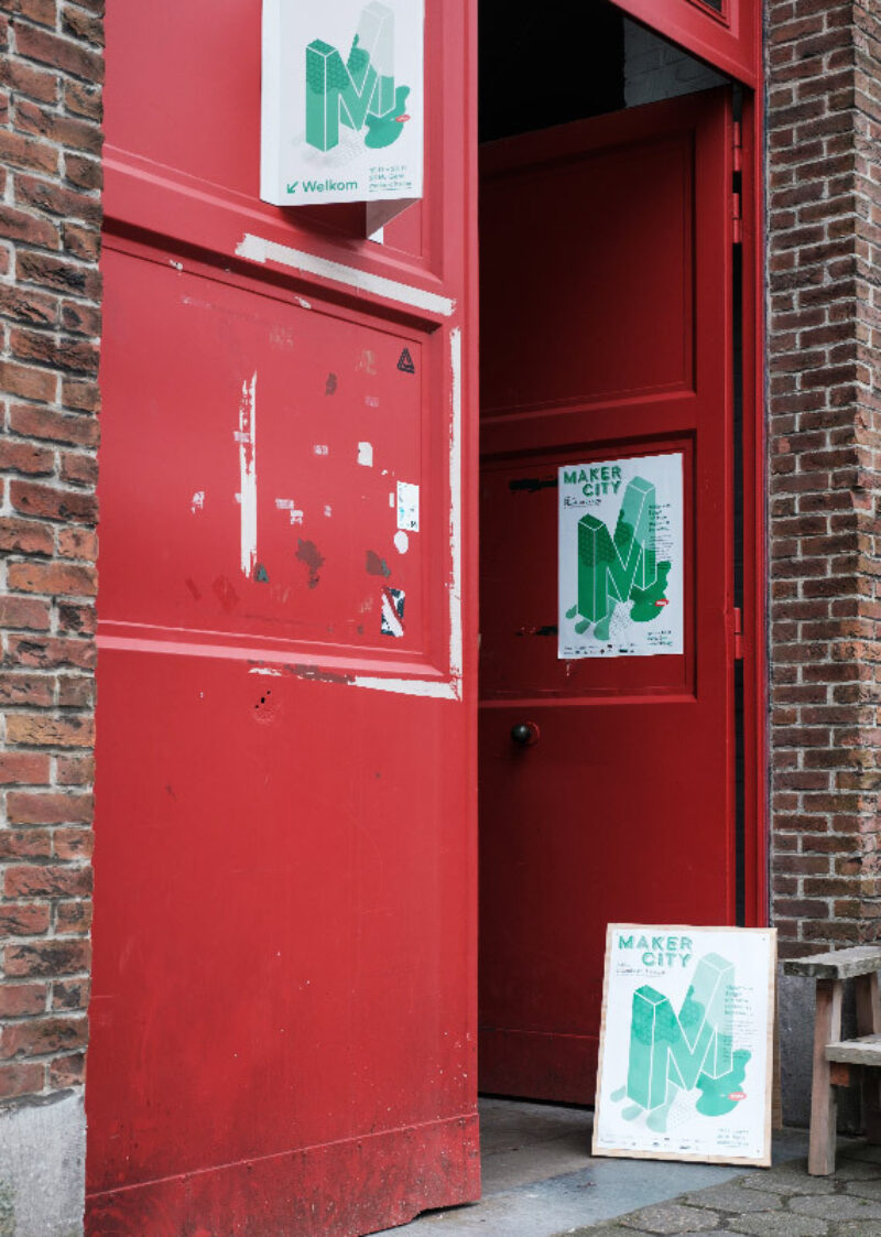
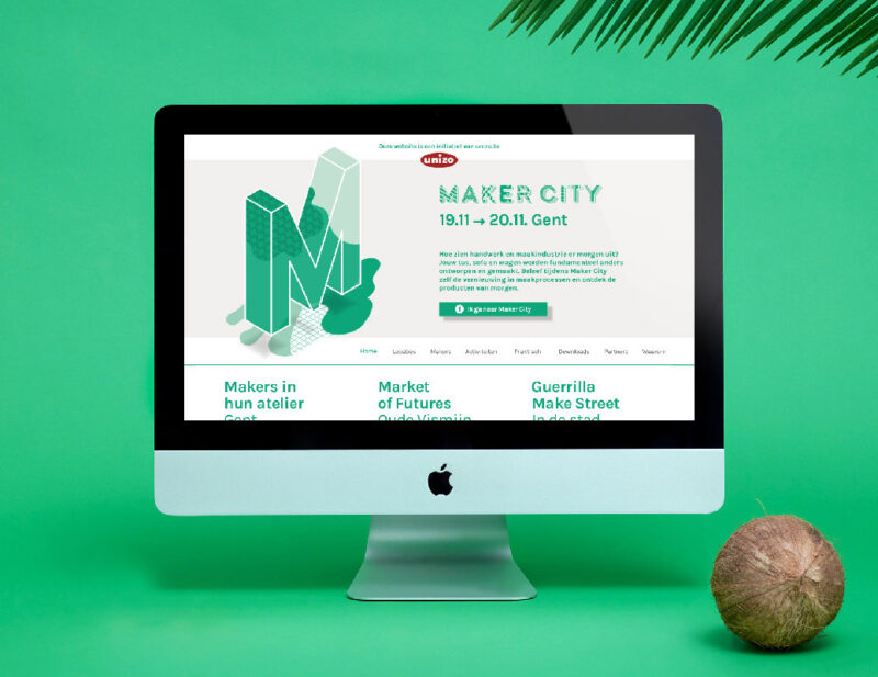
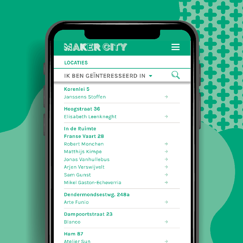
Scope of work
- Campaign identity
- Signage
- Website
- Promo material
Campaign identity for Maker City, a two day event and route through the city by Unizo about the future of crafts in design.
-
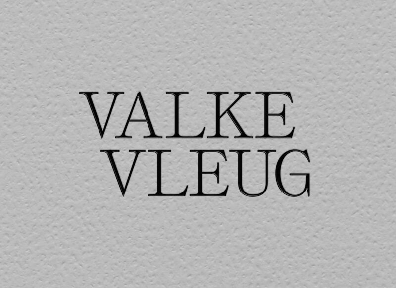
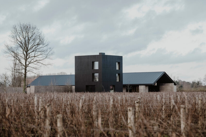
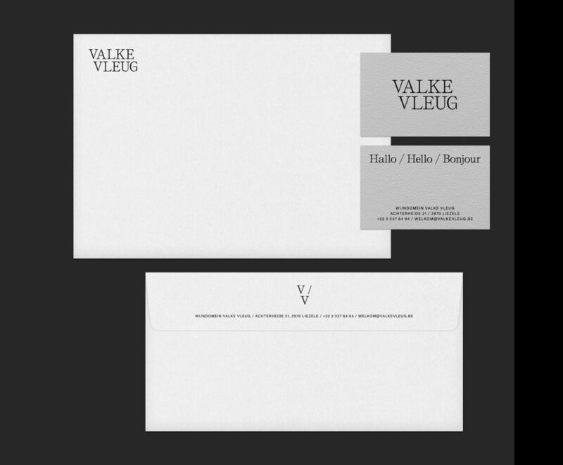
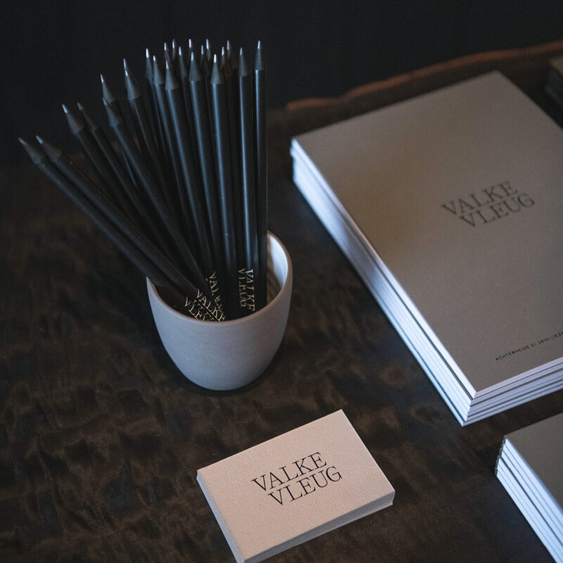
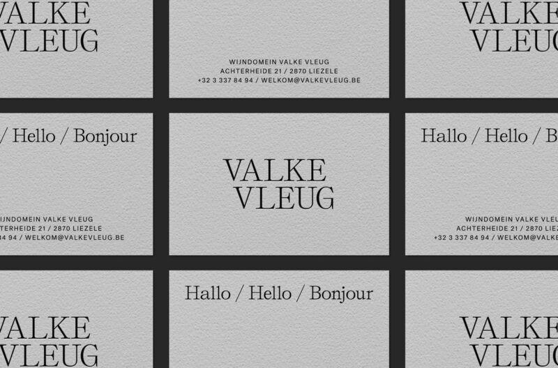
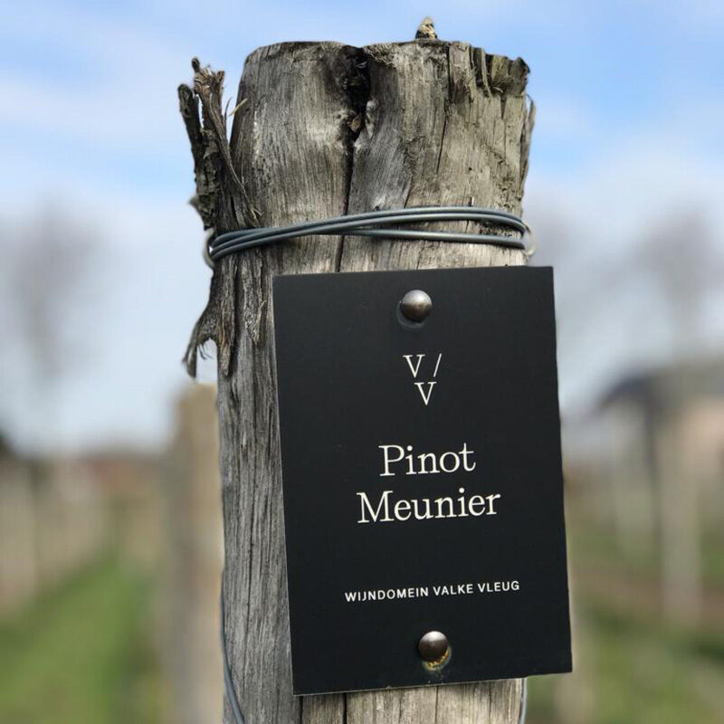
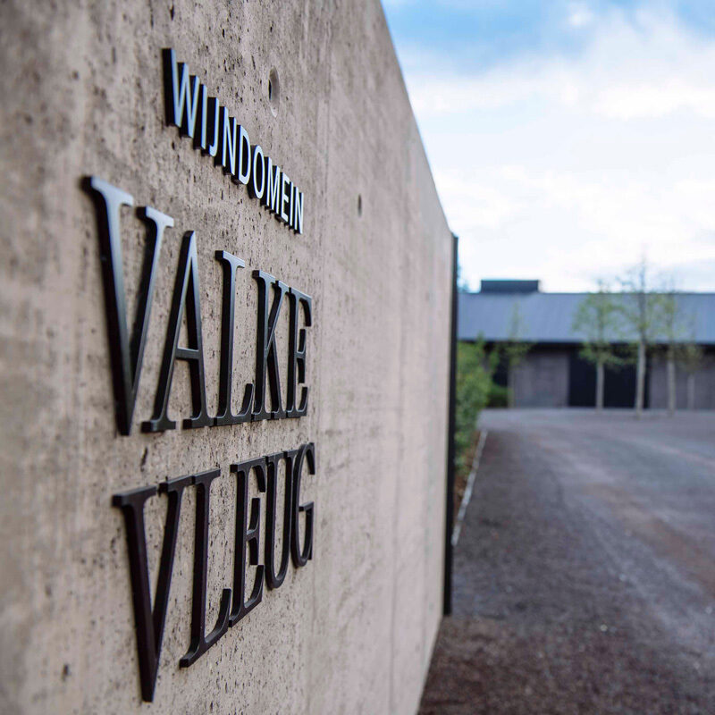
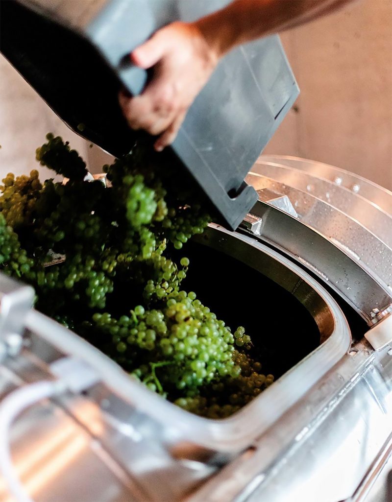
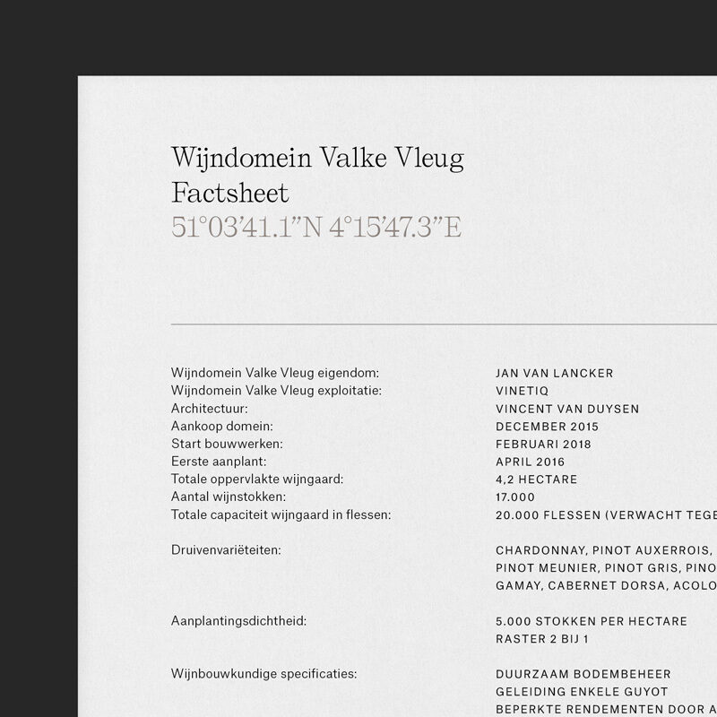
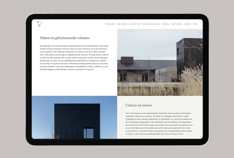
Scope of work
- Identity
- Website
- Signage
- Promo material
The contemporary winery Valke Vleug designed by architect Vincent Van Duysen is a wine estate based in Liezele, Belgium. The identity is inspired by the iconic architecture of the estate consisting of a wide range of greys and earth tones, along with natural textures and minimal typography.
See full case -
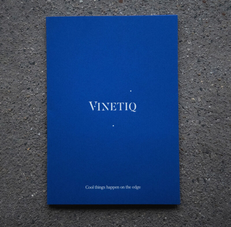
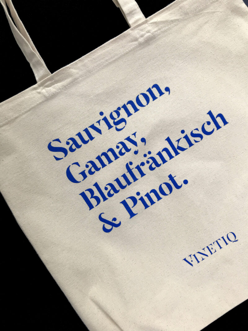
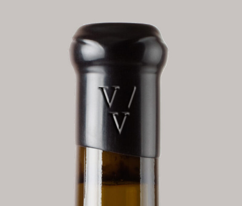
Scope of work
Brand development tools for wine boutique Vinetiq.
-
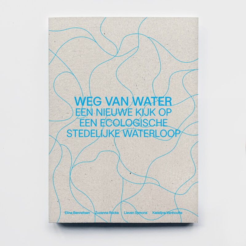
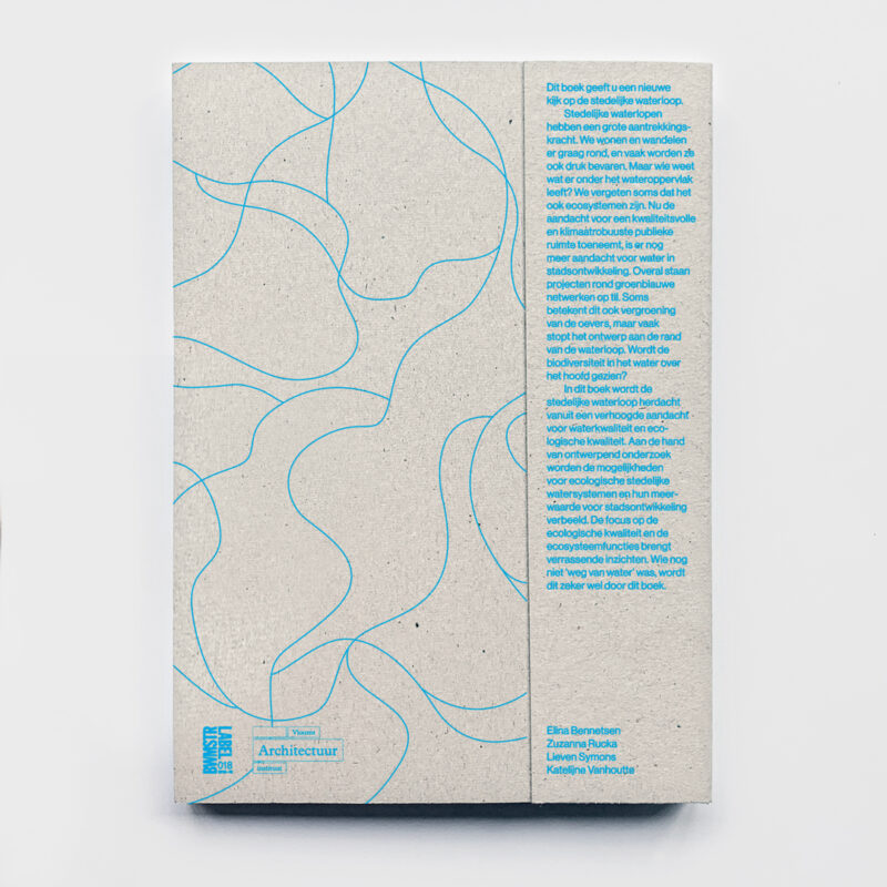
Scope of work
- Book design
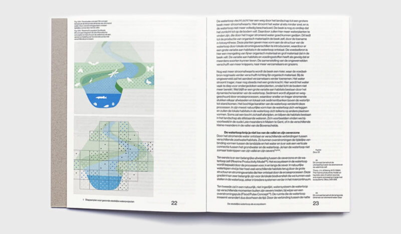
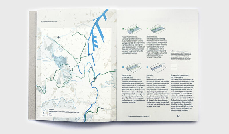
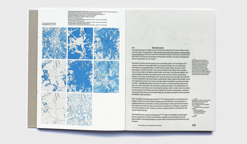
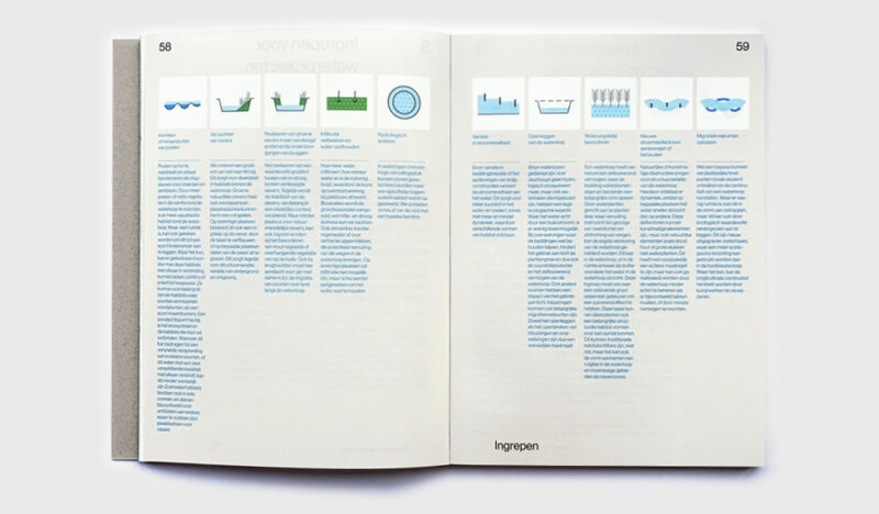
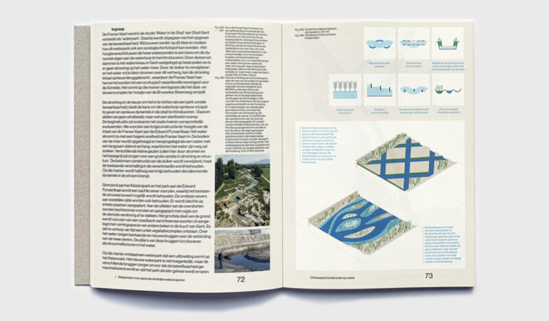
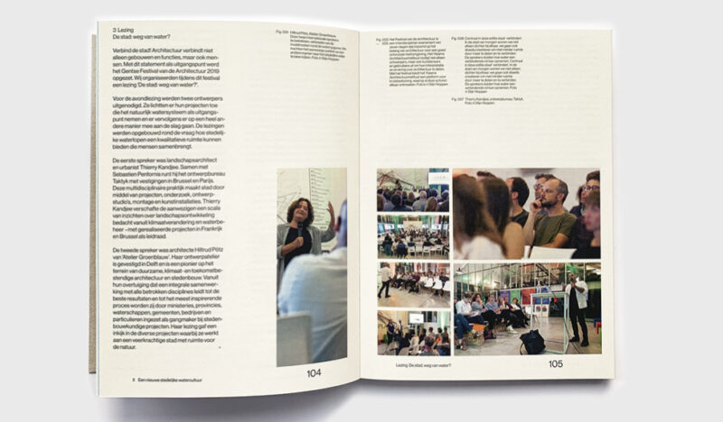
'Weg van Water' ('Away from Water') is a book by Waterland as a part of the BWMSTR label project for Vlaamse Bouwmeester. The book offers a new view on urban water, rethinking our waterways with a strong focus on ecological quality. We helped structuring content into a design that's easy and fun to read.
-
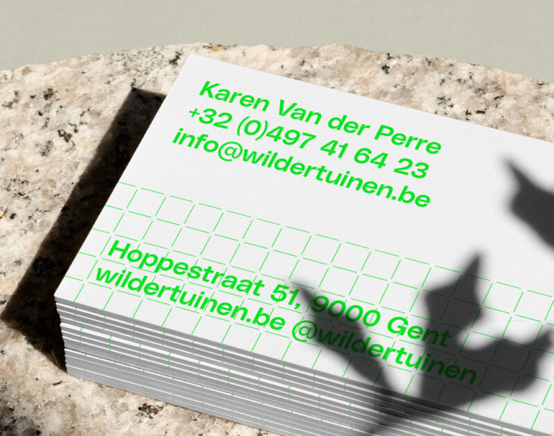
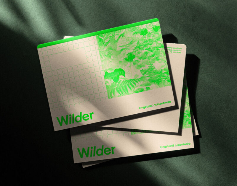
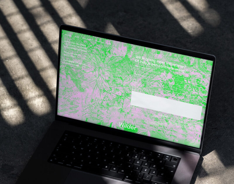
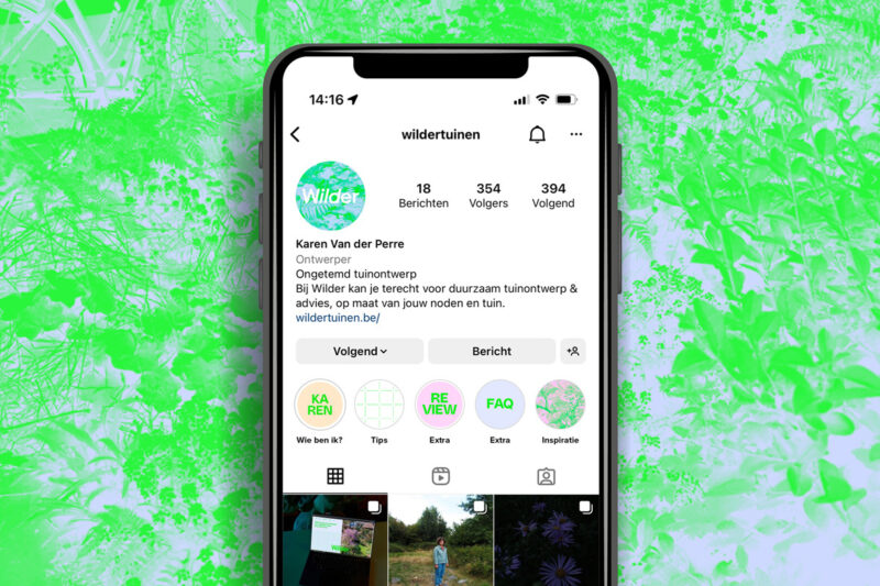
Scope of work
- Identity
- Copywriting
- Website
- Social Media
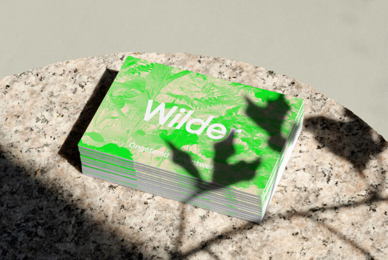
Wilder brings the beauty of untamed nature back to your garden, focusing on connecting context with nature, concept with emotion, thinking with feeling. The identity aims at visualising these dualities by combining the idea of structure with a sense of beauty.
See full case


